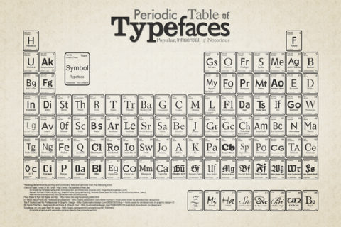
The Periodic Table of Typefaces is obviously in the style of all the thousands of over-sized Periodic Table of Elements posters hanging in schools and homes around the world. This particular table lists 100 of the most popular, influential and notorious typefaces today.
(thank you jake)
This is fun, except these aren’t arranged in Periods! The whole point of the Periodic Table is to group similar [typefaces] based on their properties. If there were holes, you’d be able to deduce the characteristics based on the existing samples in that Period.
But like I said, it’s fun.
Mar 10th, 2009 / 1:17 pm
I love this!!!
Mar 10th, 2009 / 1:17 pm
Rad!
Mar 10th, 2009 / 1:23 pm
I agree with Prescott… very fun overview of type, but it would have been cool if the groupings had more to do with similar properties.
Mar 10th, 2009 / 1:45 pm
I think it’s so right that Helvetica takes the #1 spot.
Mar 10th, 2009 / 2:24 pm
I’m with Prescott and Scott — It seems like someone eventually does one of these for everything, but they always seem to miss the point. The original is great because of how clearly it communicates so much information. Relying on the form of the original just kind of makes it an exercise in kitsch…
but i also agree that it is pretty cute.
Mar 10th, 2009 / 3:17 pm
That is the beauty of being a high school chemistry flunky. I never did understand the original, so any organizational failings in this one elude me!
Mar 10th, 2009 / 3:33 pm
saw this on behance and almost squealed. okay, so it’s not true to the original intent of the periodic table, but it’s really fantastic and the fact that its led with helvetica and futura makes me all the happier. LOVE it!
Mar 10th, 2009 / 5:48 pm
No love for Georgia or Verdana? I know they were designed at MS and all but Georgia is almost the de facto web serif these days.
Mar 10th, 2009 / 7:28 pm
No Comic Sans, listed as an unstable and deadly element of nature?
Mar 11th, 2009 / 9:11 am
I have a red t-shirt of the Periodic Chart of Elements from Brooklyn Industries that I love – if only they had a Typefaces version!
Good points Prescott and Scott – what does Ott think? (I kid, I kid).
Mar 11th, 2009 / 1:52 pm
Thanks for the nice words all.
To all those confused about the periodic nature, I completely understand. To get a bit more information about the reasons and thought process, please read the copy I posted at Behance (linked at the top as the source).
If you are the least bit interested in the FURTHER thought process, see this conversation in the comment section I had with someone that hated the design for very good reasons: http://punya.educ.msu.edu/2009/03/11/yet-another-periodic-table/
Again, thanks for the write up Tina!
Mar 13th, 2009 / 5:15 pm
Hey we just got permission from the designer Camdon Wilde to produce this as a wall decal. You can check it out here:
http://www.scribbleoneverything.com/typefaces/prod_108.html
Mar 24th, 2009 / 9:28 pm
Prints, source files and other stuff now finally available!
here:
http://www.squidspot.com/Periodic_Table_of_Typefaces.html
Thanks for all the kind comments and support!
– Cam
Apr 4th, 2009 / 3:39 pm
Look at that through ClosR widget:
http://www.closr.it/show/NTx8Clj1wL4
Apr 23rd, 2009 / 12:12 pm
Hey there is a new version of this print, black paper with silver metallic ink.
http://www.scribbleoneverything.com/prints/misc/black-periodic-table-typefaces-poster/prod_180.html
Jul 7th, 2009 / 9:08 pm
Hey All, we just did a new run of the original out of print camel hair paper version of this this poster.
http://www.scribbleoneverything.com/prints/periodic-table-of-typefaces-poster/prod_137.html
Cheers, Jon
Dec 22nd, 2009 / 2:47 pm