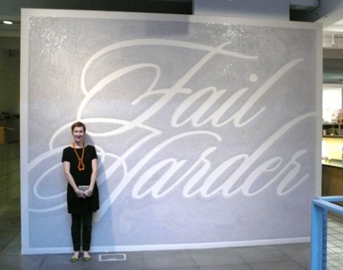
While visiting W+K Portland yesterday, I noticed this magnificent Fail Harder Mural, done by Wieden + Kennedy 12.
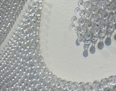
Over 100,000 thumbtacks were used over 351 hours to create this typographic mural that spells out Fail Harder, a message that underlines the importance of failure during the creative process. Absolutely fantastic. I would love to do something similar in my studio! Hat tip! (Make sure to watch the video below!)


wow. i actually was planning on doing something like this for a book cover i’m working on…now I’m wondering if I shouldn’t anymore.
but at least I know that it DOES have the potential to look great. really beautiful.
Oct 10th, 2009 / 9:22 pm
Similar story to Sean. I was planning on doing something like this (on a smaller scale) for a poster.
Pretty awesome though—I like when studios have something clever built into their workspace.
Oct 10th, 2009 / 11:47 pm
students and much time
Oct 11th, 2009 / 2:57 am
Fantastic, impressive and surprisingly!
Oct 11th, 2009 / 4:43 am
Nice! One thing: those are not thumbtacks, they are push pins. Milton Glaser, founder of Push Pin Studios these many years ago, would know the difference!
Oct 11th, 2009 / 9:43 am
By any chance, do you know some info on the music used?
Oct 11th, 2009 / 10:13 am
Nice work! Me like it very much :)
Oct 12th, 2009 / 10:43 am
Great!
Oct 12th, 2009 / 11:28 am
Wow! So crazy! Was brought here by someone facebooking about this! :)
Oct 15th, 2009 / 9:04 pm
let’s think.. . if you do fail at an agency you’ll probably will get the sack..
Oct 16th, 2009 / 2:02 am
great message, great way to send it to millions!
Oct 19th, 2009 / 6:58 am
what was the tool they used to put in the push pins? It looks like it probably saved their fingers!
Oct 25th, 2009 / 1:31 pm
Makes me feel better about the 92 song lyrics that sucked too badly to be listed on my blog (138 made the cut ).
Very impressive ! I felt bad for the guy starting out with his thumb – it looks like people smartened up after awhile
Jan 18th, 2010 / 8:43 pm
This is wonderfull! good job!
Dec 24th, 2010 / 11:41 am
Wow, this is amazing! 351 hours, the power of persistence and vision. This is some great work
Mar 28th, 2011 / 4:42 pm
This is a “fail” because it’s a success. It doesn’t support the message conceptually. If it was left unfinished, or utilized a medium that gradually fell apart or deconstructed the piece it would be a much more successful and beautiful failure.
Jul 28th, 2011 / 12:07 pm
The tool they are using appears to be an inexpensive screwdriver… the kind that has a magnetic shaft where you can change the bit between flat or Phillips. They just left the bit off. These can be found at dollar stores or at “big box” home improvement centers for a couple of bucks. Great idea, and nice installation.
Aug 16th, 2011 / 2:03 am
Love it! it speaks so much for ad folk.
Nov 8th, 2011 / 10:09 pm
Hi! Someone in my Myspace group shared this website with us so I came to give it
a look. I’m definitely loving the information.
I’m book-marking and will be tweeting this
to my followers! Superb blog and wonderful design and style.
Nov 25th, 2013 / 2:07 pm
I needed to thank you for this fantastic read!! I absolutely loved every bit of it.
I have got you saved as a favorite to check
out new stuff you post…
Dec 6th, 2013 / 12:23 am
These are in fact great ideas in about blogging. You
have touched some good factors here. Any way keep up wrinting.
Dec 10th, 2013 / 12:09 pm
I all the time emailed this webpage post page to
all my friends, because if like to read it then my contacts will too.
Dec 27th, 2013 / 12:05 am
Heya i’m for the primary time here. I came across
this board and I in finding It really helpful & it helped me out much.
I am hoping to provide one thing back and aid others like you helped
me.
Apr 8th, 2014 / 10:11 pm