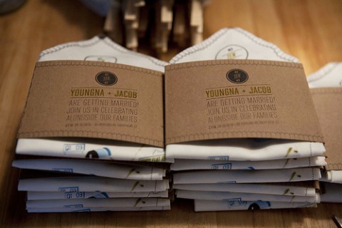
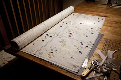
If I wasn’t married already, this is the invitation I’d want: Map on handkerschief featuring directions to the wedding venue. Location font is based on iconic “Greetings from …” postcards. Congrats on the fabulous idea and the upcoming wedding, Youngna.
Design + letterpressing by Kelli Anderson
Fabric printing by Spoonflower
Sewing, folding, ironing, envelope typing, stamping by Youngna
UPDATE: Kelli, the designer just sent me a link to her blog post where she explains the entire process in detail. What a talent.


Groom provided by Jacob.
Hooray!
Aug 31st, 2010 / 11:43 am
I wonder if its socially acceptable to actually use. Maybe someone could clarify.
Aug 31st, 2010 / 3:34 pm
Fantastic idea! Love love love.
Aug 31st, 2010 / 6:55 pm
WOW
Sep 1st, 2010 / 4:21 pm
@chickenflava – I reckon it would be ok to use this for polite and reserved tears of joy for the happy couple. Not for howling sobs and runny noses (even if they are howling sobs of joy!)
Sep 1st, 2010 / 9:21 pm
A creative and original idea adding an extra dimension to a wedding invitation…
Well done.
Sep 2nd, 2010 / 1:12 pm
Incredible idea. What a lovely way to invite guests. Very original indeed.
Sep 7th, 2010 / 4:10 am
@chickenflava – You could definitely use it as a pocket square for your suit!
Sep 13th, 2010 / 4:17 pm
WOW, Wish I would have seen this for my wedding too! Too cool!
Sep 18th, 2010 / 8:15 am
Too cute.. creatively well-done!
Oct 5th, 2010 / 11:52 pm
I love this! Such a pretty professional and this is great blog.
Oct 29th, 2012 / 5:20 am