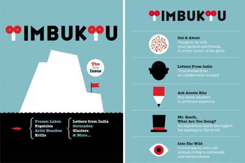
Timbuktu is the first iPad Magazine for Kids. It was art directed by the wonderful Olimpia Zagnoli. Download it from the App Store.

Timbuktu is the first iPad Magazine for Kids. It was art directed by the wonderful Olimpia Zagnoli. Download it from the App Store.
I must say the idea is cute, Zagnolis illustrations are amazing as ever, but is a complete failure by a kid standpoint.
It sounds like a magazine that a bunch of adults would love to think is meant for kids but they are completly wrong.
This is not for kids.
Typography and illustrations are made by adults e for adults. I beleive they never didna focusngroupnwith kids before publishing it.
Interactive wise is a disaster. Is completly dumb and unattractive. I had lots ofmdifficulties to undestrand the interactin, if there is any.
Overall, a bummer. Kids need more. Have you ever been in a science museum and see how kids enjoy all those incredible machines? Well go out ofnyour studio sometime to explore the real world.
Apr 6th, 2011 / 5:27 am
I’m sorry but I can not stop seeing something which is not very kid friendly in the T of their logo…. how did that get approved for use with kids?
Apr 6th, 2011 / 11:52 am
Thank you for your feedback @Guys.
Timbuktu is not meant to be a showcase of technicalities. It is meant to be a place where the interaction design is simple and clear, with full focus on content. We actually had three focus groups with children of different age-range before launching it and what we found out is that children like very much the simplicity of the design and interaction.
We share with you the love for science museums, that we’ve had the privilege of visiting since we were kids. But there are already many interesting apps designed on that logic. What is missing instead is a digital magazine specifically designed for children where they can find visually stunning content and simple interaction design. And where news is the core of the content. That is exactly what Timbuktu is. We simply decided to follow another path from the one you’re talking about.
Of course there are still many aspects that need to be further developed, but this is only the first issue and we will have plenty of time to improve them.
Apr 6th, 2011 / 11:53 am
Well i like the idea and design is intuitive which kids can used it easily. Of Course the content have to be design so kids can learn it easily.
I wish to see more improvements in next issue.
Apr 7th, 2011 / 12:53 am
Um, this is a really nice looking app. But I feel like this is designed for the kind of person that reads Monocle, Foreign Policy, Economist, Walrus, New York Times et al. Or maybe for web designers who love using font-face with Museo and grainy backgrounds.
The iconography doesn’t work for me at all. What’s with the Kafkaesque eyeball for Conversations w/ Animals?
Well designed magazines specifically for children include National Geography Kids, Owlkids, Time for Kids. Inspiration for a kids magazine should have come from the preteen section of a book store, not the News/Political/Cultural magazine rack.
I also have to agree with @Louis that the T’s in the name are very phalic and quite unfriendly and inappropriate for kids.
Apr 7th, 2011 / 9:50 am
The illustrations are amazing. However, the interface design completely missed its mark. Lacking of basic navigation system, even sliding becomes confusing, almost like a bunch of PDF putting together. That being said, I am thrilled of the idea of kids magazine going on IPad, looking forward to seeing the second issue.
Apr 7th, 2011 / 10:37 am
I have a 4 year old granddaughter. At age three she already unlocked the iPhone and iPad. She knows how other children handle applications, especially those aimed at children. Put your images on youtub unlocking the iPhone. Look at the address below. I believe it is a good opportunity to hire her to advertise this and other products. A big hug!
Visit blogdotabletbrasileiro.com
[email protected]
Sorry for bad English.
Apr 10th, 2011 / 10:35 am
Hi, I’m studying a masters in this type of interaction. I think you have done a great job. I suppose you get for what you look for in icons. I did not see any untoward meanings as I was not looking for them.
My children liked it
M
Sep 4th, 2012 / 9:09 am
Ps the navigation is fantastic as you have modified it appropriately for kids.
Well done
Sep 4th, 2012 / 9:11 am