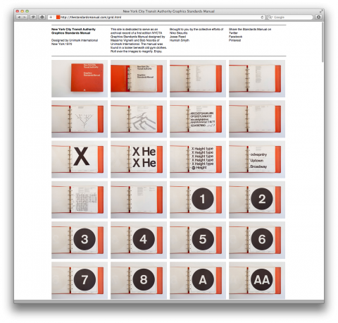
This site is an archival record of a first edition NYCTA Graphics Standards Manual designed by Massimo Vignelli and Bob Noorda of Unimark International. Fascinating fact: The manual was found in a locker beneath old gym clothes. But thanks to Niko Skourtis, Jesse Reed and Hamish Smyth we can now all enjoy it online.
(thanks Don)

Great to see how all the element of a brand come together as a whole.
Here’s another interesting manual, this time for the British Rail Corporate Identity by Design Research Unit. Everything from the painting of their trains, to typeface and logo, to uniforms and clock faces.
http://www.doublearrow.co.uk/manual.htm
Feb 18th, 2013 / 10:53 am
403 error. Nooooo!
Feb 18th, 2013 / 2:05 pm
Yup, the working link is:
http://www.thestandardsmanual.com/grid.html (with “www” in front).
Feb 18th, 2013 / 3:17 pm
Very cool!
Feb 19th, 2013 / 4:34 pm
This Standards Manual was a watermark design piece. So glad to see it accesible in some form. I think getting a physical copy of it has become an Indiana Jone’s like pursuit for any designer/love of designed print pieces! Thanks for making it easier to see!
Feb 20th, 2013 / 5:01 pm