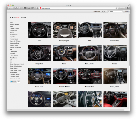
Car-UX.com is a fascinating project by user experience designer Min Seung Song: a growing collection of UX image details of contemporary automobiles. This field of UX seems to be undergoing dramatic changes. A few weeks ago I had the change to drive a Tesla and the interior felt like an oversized iPad on wheels. I can’t remember seeing one physical button. The car is basically an app.
(via Khoi)

But is it a good thing for user experience and safety? I personally don’t think so as you don’t have any physical affordance: it makes you have to look at the screen for any interaction (not a good thing while driving).
Apr 16th, 2014 / 11:31 am
Interesting idea, however quite a few of the labels on these interiors are incorrect.
Apr 17th, 2014 / 2:38 pm