In 2010 I co-created a to-do app, called TeuxDeux, which instantly garnered a loyal following. Fun Fact: Fast Company called us the most beautiful to-do app within hours of launching!
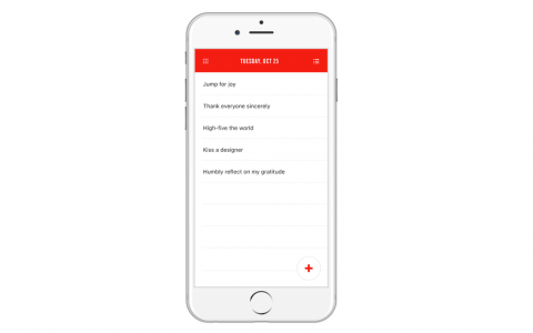
TeuxDeux is based on the idea of creating a simple, almost paper-like, list-based to-do app. While it almost feels like a paper list, the to-dos you didn’t check off magically roll over to the next day.
I keep TeuxDeux as my landing page on my browser, which means every time I open a browser window at work I am being reminded what I should be doing. The web app is solid and is making us proud! And, now, we can say the same about the iPhone app!
Team TeuxDeux has been working on the new version of our iPhone app for the better part of this year. We designed, built, and tested it. Then we redesigned and updated it what seems like an infinity number of times.
If you’ve requested improvements to the existing app, odds are you’re going to be quite pleased with this update. We listened carefully and brought in most of your favorites, including:
– Markdown
– Recurring to-dos
– Voice-to-text
– Seamless autosync
– Calendar date picker
– Drag to-dos to tomorrow
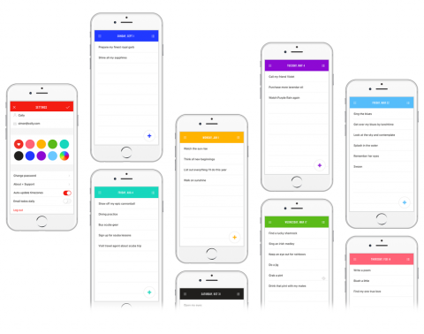
– Custom colors
– Powerful to-do editing
And a few goodies you might not have thought of:
– Custom color picker
– Start your week on any day
– Flying cat
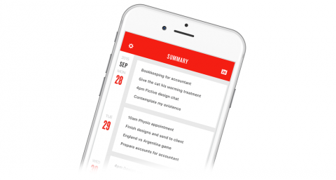
– Summary View
– Hide completed to-dos
– Thumb Nav
It’s important to us that TeuxDeux always stays simple and lovely. Not an easy balance to strike when adding new features, but we think you’ll instantly recognize the old TeuxDeux in the new, and you’ll love how much there is to discover.
Of course, the app is still free for our subscribers (sign up for a free 30-day trial). Upgrade on your phone or, if you’re new, find it in the App Store.
This app took a lot of time which we could not have afforded if not for you believers who have supported TeuxDeux over the years. Thanks for helping us get here. It wouldn’t mean anything without you.
Yay for staying organized and crossing things off!
(Big thank you to the team behind the rebuild and redesign: Josh, John, Cameron, Evan, Larry and Andreas!)


Glad you are using the (modest) annual fee to iterate on the app. After trying the new app, I think I liked the user interface of the old one better. But maybe I just need to get used to the new UI. We’ll see. I’ll be curious to see what the reviews look like. Not a big deal to me either way as I typically use the Web interface. Thanks again.
Oct 25th, 2016 / 7:36 pm
It’s great that you’re updating your iPhone app, but some of your loyal users are Androids and have been hoping for an app for forever.
Oct 26th, 2016 / 9:37 am
I agree with Kei, you really do need to get on the android bandwagon. Your missing out on over half the market. iPhones are way over priced and frankly passay.
Nov 4th, 2016 / 5:24 am