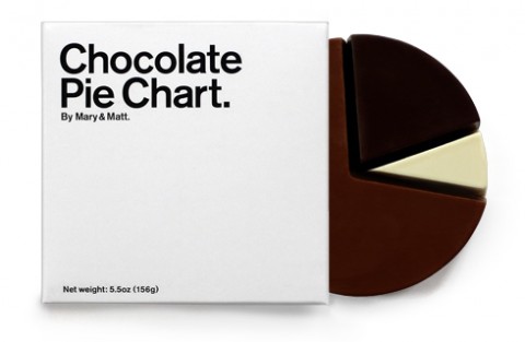
Has the current economic condition made it difficult to look at charts and figures? Did you used to feel a tingle, while adjusting asset allocation? Do you remember when the phrase “portfolio performance breakdown” made you want to breakdance? Now through an advancement in data visualization, Mary & Matt have created a chart that will bring those good vibes back. The Chocolate Pie Chart is a candy chart made of 70% milk, 20% dark and 10% white chocolate. It’s a completely new way to digest the numbers. So, if the economy has given you a case of chart heartburn, the Chocolate Pie Chart should provide relief. Unless you eat it in one sitting. Made me smile!
That looks so scrummy! Suddenly I’m interested in fractions ;)
Reminds me a little of this:
http://www.flickr.com/photos/tiinateaspoon/307647193/in/set-72157594152409365/
Nov 16th, 2008 / 11:27 pm
That looks so scrummy! Suddenly I’m interested in fractions ;)
Reminds me a little of this:
http://www.flickr.com/photos/tiinateaspoon/307647193/in/set-72157594152409365/
Nov 16th, 2008 / 11:27 pm
That looks so scrummy! Suddenly I’m interested in fractions ;)
Reminds me a little of this:
http://www.flickr.com/photos/tiinateaspoon/307647193/in/set-72157594152409365/
Nov 16th, 2008 / 11:27 pm
Hello there, I am a long time reader first time commenter ;)
Just wanted to share this with you, hope you like it as much as I do :)
http://www.swissknifeshop.com/Swiss_Chocolate_Knife_p/wh03586.htm
Nov 17th, 2008 / 6:50 am
Now this would make me pay attention to numbers! Of course, it would not last long in my house.
Nov 17th, 2008 / 12:11 pm
Is the gelatin used in the swiss miss marshmallows made from pork products?
Dec 10th, 2008 / 11:34 pm
That is pretty cute and I don’t even like chocolate.
Nov 3rd, 2009 / 11:03 am
I like chocolate,it can make me smile.and I just bought one yesterday.
Apr 2nd, 2011 / 9:48 pm
delicious!i love chocolate!thanks for sharing
May 1st, 2014 / 10:14 pm