Most children learn to read going letter-by-letter, learning which sounds go with which shapes until they can blend the sounds together to form words. This is why new readers proceed slowly and sometimes struggle with pronunciation and syllable stress.
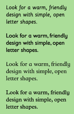
The efforts of new readers can be supported by making sure their texts use inviting, easy-to-read typefaces, set in the most readable way.
(via urbanpreschool)
“VAG Rounded” is good for kids as well. Baby GAP uses that typeface for their commercial ads.
Jun 17th, 2008 / 10:48 am