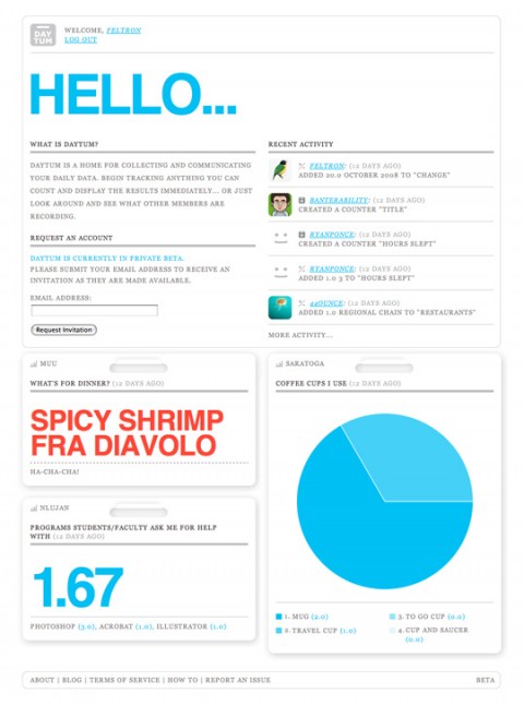
Graphic designer Nicholas Felton spends a great deal of time thinking about how to construct charts and graphs from his everyday routines. SVA’s new MFA Interaction Design Program talked to him about the effects his Annual Reports have on his everyday life, and some of his longer-term projections. Make sure to see him speak at the March 11 Dot Dot Dot Lecture.
(thank you liz)
The new issue of “Fast Company” has a nice infographic by Mr. Felton in its feature on the World’s 50 Most Innovative Companies.
Feb 18th, 2009 / 12:54 pm
This reminds me of the “way-cool” Dashboard at the Indianapolis Museum of Art:
http://dashboard.imamuseum.org/
Feb 18th, 2009 / 12:56 pm
Very interesting! His daytum website is lots of fun.
I’m at daytum.com/lukas
Feb 18th, 2009 / 4:30 pm
I’ve been using Daytum to track my environmental footprint as well as I can. Data for one person in an apartment has been difficult to find, it’s usually geared towards families.
Feb 19th, 2009 / 6:35 pm