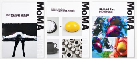
Along with the many signature artworks in its collection, The Museum of Modern Art (MoMA) possesses one of the most recognizable logotypes of any cultural institution in the world. In recent years, however, the application of this identity across the museum’s broader graphics program has been indistinct. Now MoMA has recast its identity, building on its familiar logotype to create a powerful and cohesive institutional voice. The new graphic identity has been designed by Paula Scher (Pentagram), and further developed and applied by wonderful Julia Hoffmann, MoMA’s Creative Director for Graphics and Advertising (and a Pentagram alumna).
(thank you kurt and don)
There’s something in this rebrand that annoyes me. Everthing is so tight all elements touching each others, makes me fell tension. Meaby is the goal of the design, but for me is kind of aggressive.
Thanks for the news!
Feb 18th, 2009 / 11:53 am
Isn’t it kind of a conflict of interest that Paula Sher, on some board at the museum, puts her inexperienced former assistant, Hoffman up for the job and then, lo and behold, Pentagram is hired to do the rebranding?
Feb 18th, 2009 / 1:52 pm
In following up on Carlos’s comment…
I would normally like this (I love how the bleeds work in placements such as the tiled posters seen on Pentagram’s site) but I think my workplace’s conservative styleguide (plus designing for a broad audience on the web) makes me a little… tense (to borrow the word) about the lack of margins as well.
thanks for the great post!
news.jacobheftmann.com
Feb 18th, 2009 / 4:01 pm
I’m not sure the rebrand is working for me either. On first look (and on its own), it is powerful. But I feel like it dominates too much compared to the actual content of the piece that the logotype is on. All I see is MoMA. Maybe that’s the intent, but it distracts from the content, at least to me.
Feb 18th, 2009 / 4:35 pm
I feel that the way a thumbnail looks on a computer screen can hardly be compared to the effect of running across one of these big subway-sized posters in real life. When you see these in person, the content is very arresting. That’s how it affects me, anyway.
Feb 19th, 2009 / 9:40 am
I agree with Morgan, but the aspect of the new branding that really bothers me is all of the horrible gradients, such as the ones on their 54th street banner. They show it on the pentagram blog:
http://pentagram.com/en/new/2009/02/new-work-the-museum-of-modern.php
Feb 19th, 2009 / 11:33 am
In following up on mw’s comment…
Yes, this is nepotism at its best.
Feb 19th, 2009 / 11:47 am