I am back at my studio after 3 days of sensory overload and networking marathon at SXSW. Deadlines are looming so I will keep this post brief. A few thoughts:
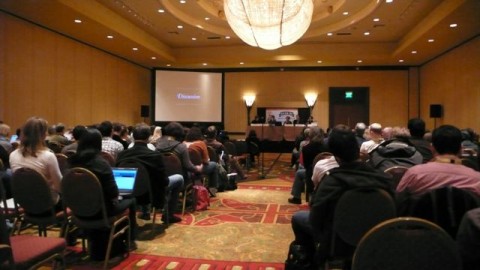
This was my first SXSW experience and I was surprised at the amount of panel discussions. I have voiced this many times before: Panel discussions don’t do it for me. It pains me to see brilliant speakers sitting up on a panel and none of them really being able to share their insights and knowledge. I always feel like that panel discussions only scratch the surface. On my second day I just simply stayed away from them and only attended single or two people presentations. And guess what, those were insightful, enlightening and inspiring.
I keep thinking that a conference like SXSW should be a little bit more playful. Put the panelists in the center of the room, hand them a microphone and have them stand and walk around. The dynamic of a panel would change and it would make it easier for the audience to participate. One thing I learned with organizing the CreativeMornings, which are always hosted at a different space, is that the ‘packaging’ of an event determines how the attendees and speakers interact. The oldschool ‘rows of chairs’ and panelists sitting on a podium far away at the end of the room is everything but facilitating exchange.
By putting speakers and the audience on the samel level you make them feel equal and it is easier to start a conversation.
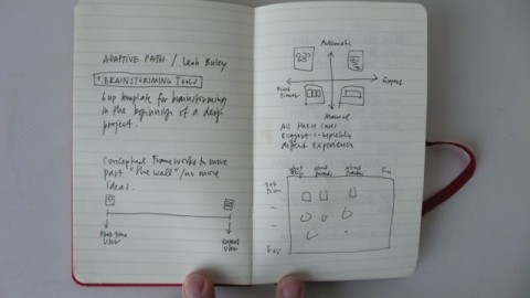
The one presentation that made the conference worth going alone was by Leah Buley of Adaptive Path. She spoke on the topic of “Being a UX Team of One” which she said will be available on Slideshare (but is currently not up yet, an older version of it is though). She gave a very insightful presentation on Brainstorming Tools they use, how she believes in Assembling and Ad Hoc Team is helpful and the Design Principles they believe in at Adaptive Path. It was refreshing to hear that at the beginning of a project, she always sits down and sketches (yes, by hand) first wireframe ideas and does not start off at the computer right away. This gets my two thumbs up! Hat tip to Leah Buley for her fantastic presentation!
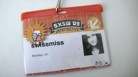
Why is it so hard for conference organizers to design a useful badge? It was literally impossible to read someone’s company name, let a lone where they were from. A badge simply doesn’t work if you don’t have the important information LARGE and in bold type. It’s not rocket science, is it? I literally had to walk up to people, bend down and stare at their tummy, cause that’s where the badge ends up. (I actually had them change my badge and only say swissmiss, take out my company name alltogether and it helped a little.)
Every time I get back from a conference I feel compelled to design the ‘perfect’ conference badge (or maybe it’s not even a badge per se). And then I get sucked in into my usual studio business and forget. If you are a conference organizer and want help with the badge/name information design, please get in touch. I feel strongly about this and have plenty of ideas how we can improve this and make it easier for attendees to connect and make valuable connections. After all, a huge part of why we go to conferences is to network.
I had the pleasure to meet Mike Davidson and we were discussing just this. He later pointed me to a post he wrote called Building a better conference badge.
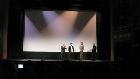
I got to see the world premiere of Objectified, the latest documentary by Gary Hustwit. I was sitting at the screening like a kid that just entered a toy store. And I fully agree with Allan’s review over at Core77: “Perhaps the big winner in the film is Dieter Rams, already a god in design circles and sure to fortify that shrine after this film’s release. He has some of the best lines (“Good design is as little design as possible”), but comes out triumphant on the sustainability front. Bill McDonough, watch your back.”
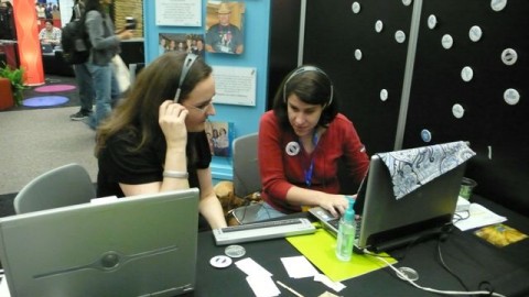
One of the most touching and memorable moments for me was when Desiree of Knowbility, who is blind, showed me how she surfs the web. She pulled up swissmiss and showed me her experience of surfing my site. I learned that I need to tag my images better, or tag them, period. Desiree also showed me how she posts to her blog called Universallydesigned.net. This is defintely something I want to look into more and potentially have a CreativeMornings talk about. Do you know of any similar services like Knowbility here in the NYC area?
Now, I will tune into the #sxsw twitter stream and see what’s going on from a far. Did you attend? What were your thoughts?
A great write-up. You already know that I agree wholeheartedly on Leah Buley’s presentation, and might know that I also agree wholeheartedly on the ineffectiveness of panels. But you make a great point on how SXSW could be a bit more creatively presented, too; I hadn’t thought that one through but you’re completely right.
Mar 17th, 2009 / 10:38 am
Tina, was nice to finally meet you. Would love to chat with you &/or John in NYC some time soon. And ++ on all your feedback — good insights!
Mar 17th, 2009 / 10:40 am
Glad you had fun. what was the outcome of the CMS Showdown?
Mar 17th, 2009 / 10:40 am
Off topic – Did you use a helvetica moleskine as your notepad? Mine is behind a glass case.
Mar 17th, 2009 / 11:00 am
Definitely great insights, Tina. I’d just like to point out that Carsonified’s conferenced have always done badges right for me. They’re clear, large, and lately economical.
This badge is from Future of Web Apps in London last year:
http://fruda.com/g/a946fea27311786486f51368e279704a.png
…and here is one from Miami, this February (this is actually a shot of the back of the badge, which had a fold-out conference schedule on it, which I think is not only great, but saves paper and resources as well):
http://fruda.com/g/4ffd4aa783ff2465ea23686b34299fbe.png
Mar 17th, 2009 / 11:32 am
Your idea about putting the speakers down on the floor in the middle of the conference room reminds me of the old democratizing hardcore setup of playing in the middle of the audience. http://www.youtube.com/watch?v=L46V7X7DILU You can see how well it works!
Mar 17th, 2009 / 11:34 am
I do agree about nametags for events like this. I am always frustrated at the idea of tasks like creating name tags being given to people without a sense of design….the name tag is what stirs conversations and engages participates to what to meet one another. I am going to host 60 invited guests to our work studio next month and will most definately keep factors like size and location in mind!
Ps. Swissmiss, is that your sketchbook that is shown above?
Mar 17th, 2009 / 11:46 am
The eternal struggle with nametag design involves dealing with a variety of name lengths. The solution, of course, is to use type large enough to see, but small enough to fit a majority of names. Names that are too long can be set with slightly smaller type. But this requires an automated badge printing system that will handle the size changes. Most conferences only invest in a simple template.
More on badge design.
Mar 17th, 2009 / 11:51 am
I’m with you on the badge design. For what we paid to be there, I expected something nicer, or even just neatly formatted. Very disappointing.
Mar 17th, 2009 / 2:18 pm
A brilliant write-up. I’m currently reading Desiree’s blog and I am amazed.
Mar 17th, 2009 / 9:23 pm
Hey there: Thanks so much for including me in your blog post!! Definitely let me know if you want any accessibility tips and tricks from us at Knowbility! Enjoyed reading your other observations about SxSW.
Mar 18th, 2009 / 6:23 am
I hear a lot of people share similar sentiments on panel discussions – but believe it or not, I actually find them more valuable and interesting than single-person talks.
A terrific panel discussion only happens when there is the right mix of people with different point-of-views and most importantly, a moderator who is able to bring out simply the best out of each and every panelist.
At a one-person speaker, I am wary of becoming too enchanted by a single dominating thought that they are selling. I actually enjoy the agreements/ disagreements and dynamism at panels.
However, I can see why it is so easy to go wrong with panels. Panels are like an orchestra – the panelists are the players and the moderator is the conductor. The wrong mix and I can totally see why people would stop enjoying panels :)
Mar 23rd, 2009 / 4:03 pm
@Jinal — it’s true that a panel can actually be great, however in my experience that any randomly selected one or two person talk at SXSW is invariably higher quality than any randomly selected panel.
This year, I attended a few panels, most with really smart, amazing people and all but one were duds. The only panel I attended that I felt was worth my time was “Designers & Developers” lead by Liz Danico. I think the moderator really makes the difference. She did a great job managing her (smart, amazing) panelists and the involving the audience.
Mar 23rd, 2009 / 5:13 pm