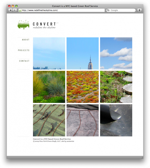
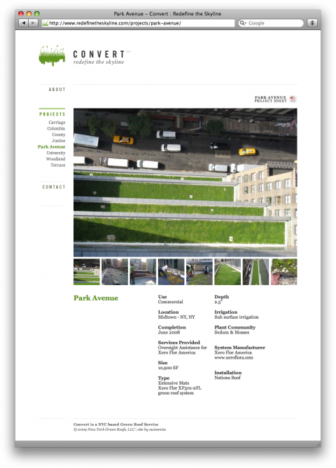
My fab developer John and I launched a new site last night for a NYC based Green Roof Service called Convert. I not only designed the site but also had the opportunity to help my client find an appropriate name for their business. When they came to me, they did business under the name of New York Green Roof, which was simply too generic and not memorable. After a long discovery process the client picked ‘Convert’ which not only perfectly expresses what they do (converting roofs) but also entails the word green (vert). I am happy how this little gem of a site turned out. Yay for launching new sites! Yay Internet!


it’s a very pleasant looking site – congratulations.
not to nitpick or anything but rather to gain a little insight… i’m assuming that redefinethekyline.com was chosen in part because convert.com was taken but don’t you think this puts them at a little bit of a disadvantage from both an seo standpoint as well as a ‘consumer-ease-of-use’ standpoint?
also – a mailto link? i always thought those were like giving spammers the keys to your house. no?
May 5th, 2009 / 10:16 am
congrats on a solid, clean looking site that really shows off the client’s work.
have you ever considered putting together a section on swiss-miss that documents your work?
May 5th, 2009 / 11:27 am
@MES. Yes, indeed, I have. We are actually working on it. (Watch out, you, wednesday when I come into the studio!)
May 5th, 2009 / 11:35 am
The site is beautiful. The name is perfect. Bravo.
What block is the carriage house on? And when are we going to see some green rooftops in DUMBO!?
May 5th, 2009 / 12:31 pm
I would love it if I could click on the images of the site in order to go to it. Then your click target area for heading there is SO much larger than just the text link.
May 5th, 2009 / 2:55 pm
Does your client not want to register convertyourroof.com, ie in a hurry!
I see you registered convertmyroof.com, presumably for this project. So perhaps you have already been down the track.
In my view it’s a shame your client did not go with branding rationale on the name, but stay generic with the domain, ie on the basis that they can’t have convert.com
Friendly feedback.
Nice work, as always.
May 5th, 2009 / 8:43 pm
This is cool.
May 6th, 2009 / 12:29 pm
Lovely work. I especially like the green rollover on the logo type treatment.
May 6th, 2009 / 5:09 pm
When I saw the screenshot I thought “Why didn’t they set “VERT” in green?” . Upon visiting I caught on…nice…so, ditto Lala’s comment. Wonderful, legible typography. I appreciate the straightforward, elegant presentation (no Flash, jQuery effects etc etc). BTW, CONVERTAROOF.COM is available.
May 9th, 2009 / 11:36 pm
Nice one ;)
Great photography in some.
ps would been neater if it’ll load in full screen
May 10th, 2009 / 8:53 am
While searching for an industrial real estate property agent,
inquire about their major source of income. The representative’s answer ought to be open and honest and should make it clear if the passions and rules of your business are in accordance with your own. Be sure you realize precisely which section of the firm’s financial transaction with you will end
up rewarding to the organization.
Dec 17th, 2012 / 3:47 pm
Hello! I could have sworn I’ve visited this web site
before but after going through many of the articles I
realized it’s new to me. Nonetheless, I’m definitely happy I stumbled
upon it and I’ll be book-marking it and checking back frequently!
Jun 12th, 2014 / 4:02 am