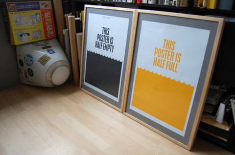
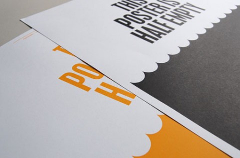
How can these limited edition posters by Because Studio not make you chuckle? The ink coverage on each poster amounts to exactly 50% of the surface area, adding another layer of meaning to the message. You can purchase them individually or as a set right here.
(via designworklife)


My room is optimistic since a couple of weeks…
:-D
Oct 20th, 2009 / 5:37 pm
ha! i almost sent this to you last night.
Oct 20th, 2009 / 6:51 pm
Cute design. That comparison always seemed silly to me though– if a glass started empty, then it’s half full, but If it started full, it’s half empty!
Oct 20th, 2009 / 8:06 pm
I love these! Ironic and witty, I’d love to get these for my room.
Oct 21st, 2009 / 12:44 pm