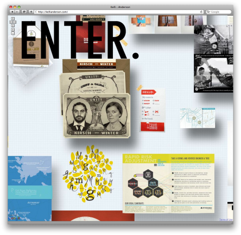
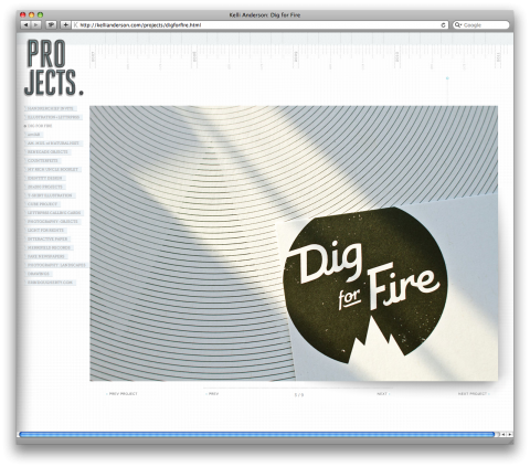
So, I admit it, I am over portfolio sites. I can’t remember when I was last completely excited over seeing one. Until just now. Kelli Anderson emailed me and thanked me for blogging the Handkerchief Wedding Invitation Design a few weeks back. She pointed me to a blog post explaining the entire process. I then clicked to her portfolio site and clicked and clicked and clicked. I am impressed and am sending a big giant hat tip over to Kelli.
ps: Check out the Google Map inspired navigation on the homepage. Quite amusing!


The enter page was first done here: http://www.microtyp.org/
It’s actually a couple years old but genius all the same.
Sep 30th, 2010 / 11:38 am
That’s my wife and me on those Save-The-Dates, which Kelli meticulously re-worked from an old campaign poster and some images from the Library of Congress.
Kelli’s a great designer, a close friend, and a pleasure to work with. I highly recommend her to anyone looking for a unique take on their project.
Sep 30th, 2010 / 3:06 pm
here http://urli.st/ZnH a little list of websites with similar navigation through g-maps (feel free to add you own)
Oct 1st, 2010 / 8:41 am
So what are you impressed with specifically? I think the left navigation type is to light and hard to read.
Oct 1st, 2010 / 5:10 pm