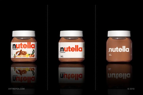
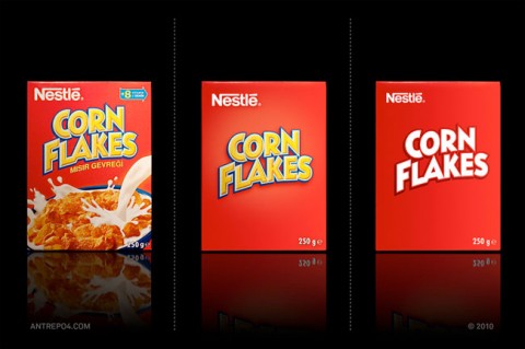
David Airey blogged about an interesting packaging project. Antrepo took a few examples of product packaging and stripped them back to the bare bones. It’s titled a minimalist effect in a maximalist market. Seeing more packaging like this would make me *so* happy! I caught myself buying energy bars or drinks just because their packaging was simple, unusual, not screaming in my face.
More examples on the Antrepo blog.


An interesting study and the different effects they can create just with these 2 examples. With the nutella, the simple packaging (to me) gives it a more high end feel. However, I get the exact opposite with the cornflakes and it looks even more like an off brand product. None the less I don’t think I have seen a corn flakes boxz that really looks like that anyways.
Dec 21st, 2010 / 11:28 am
I always like the grocer Publix repackaging efforts from a few years ago. Straightforward & to the point. And cheerful as well.
http://www.publixpackaging.com/
Dec 21st, 2010 / 12:03 pm
The world’s markets are overly saturated with colour. A minimalist approach can make a product’s packaging even more noticeable, or at least to me…
Dec 21st, 2010 / 12:17 pm
The nutella glas is stunning!
Dec 21st, 2010 / 12:24 pm
I am all for simplicity, considering that people take less than 1/3 sec to look at an item and be able to process whether they are interested in considering it for purchase or not, simplicity is absolutely vital. But imagine if our store shelves were filled with row upon row of very simple packaging like your nutella or cornflakes packaging where the package simply offers up a brand-name without any help from photography to communicate what might be inside or how it might be used, consumed or prepared. If there wasn’t any copy to explain how much product is contained or whether it is peanut -free or allergen free. Further, how would you distinguish one brand from another or one flavour from the next? Get the picture? or not. Packaging is not simply an exercise of aesthetic expression. A Package has a very specific function to perform beside containing the product. The package has to catch your attention amidst the visual clutter of hundreds of other packages, it must inform, engage and persuade you to chose it over its competitors. Once your pretty designs can accomplish all those things effectively then you can say you’ve succeeded in creating a strong design. Anything short of that is just… pretty packaging.
Dec 21st, 2010 / 4:51 pm
I interviewed Saul Bass for a design magazine many years ago when “generic” packaging in the as the box bottom right was in vogue.
Bass had nothing but contempt for it. As I recall, his worst criticism was that at bottom this sort of thing didn’t sell. To illustrate it he said something like, “When it comes to cat food people like to buy packages with cute cats on them no matter how corny we designers think that is.”
Dec 21st, 2010 / 8:18 pm
I like the cornflakes idea a lot, it has a cool comic book feel!
Dec 22nd, 2010 / 2:39 am
Do you not think that maybe some consideration should be given to the fact that the images on the packaging also helps those who may have low literacy levels, learning disabilities or quite simply don’t speak the language of the country that they’re in to easily identify the product?
It’s all well and good to declutter packaging to give a clear and strong visual message but, that being said, surely it shouldn’t alienate part of the target market for the wont of being able to identify what the product actually is.
Dec 22nd, 2010 / 4:47 am
I tried to comment on their blog, but no luck… I’ll post here:
Interesting experiment. Reminds of the generic beer can labeling of the 70s.
As a consumer, the thought of this type of minimalism in package design is frightening.
Imagine pushing your shopping cart down the aisle in a grocery store actually having to read! Aisle after aisle jam-packed with words on boxes, words on cans, words on jars, words on bottles, words on cartons. It would take forever to find anything!
For me, the images used in packaging serve a real purpose – product identification in a world with too many products.
Again, interesting experiment and somewhat cool if you’re a designer but realistically, not very viable if you’re a consumer.
– – – – – – – – – – – – – – – – – – – – – – – – – – – – – – – –
(Seems John Marovino and I agree…)
Dec 22nd, 2010 / 12:37 pm
i love this idea. i think it would really help bring attention back to the quality of the product within the container rather than the flashiness of the package. i’m to check out his blog for more!
Dec 22nd, 2010 / 4:04 pm
its like im in communist russia ! when i want my regulation cereal, i want my box art to be as bland as possible !
ugh,
simplicity has its place in design, its just not on most food items.
Jan 4th, 2011 / 10:30 am
i literally wrote a 2 page long essay and my browser crashed, go figure.
im not going to rewrite the whole thing, all i want to say is that, ironically, a properly executed minimal design would be more expensive than whats currently available.
Jan 4th, 2011 / 11:29 am
Minimalism has helped me in packing more stuff with simple and attractive design to look better. It is very helpful.
Aug 4th, 2015 / 8:12 am