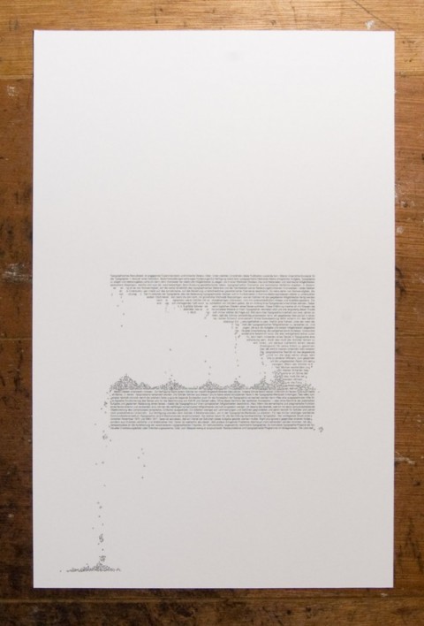
This typographic print is third in a series of three, each of which explores the effects of erosion and weathering on the printed word.
The text itself is taken from a 1971 essay on experimental typography by the German designer and typographer Wolfgang Weingart, and is set in the Univers typeface. Univers was designed from 1954-57 by Adrian Frutiger.
Stunning. #wishlisted

I am loving this…really wonderful print
Jan 18th, 2011 / 7:12 am
That’s lovely. I’m a real sucker for this kind of thing.
It reminds me of Sam Winston’s work on “A Dictionary Story”, which is also wonderful and worth checking out.
http://paperposts.posterous.com/a-dictionary-story-by-sam-winston
Jan 19th, 2011 / 8:31 am