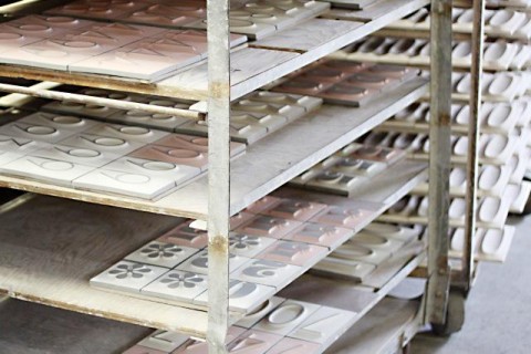
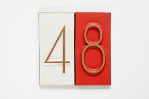
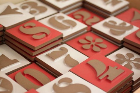
Heath Ceramics and House Industries teamed up and created Heath House Numbers, 3-dimensionals clay tiles. The tiles celebrate the legendary Neutra and Eames Number Fonts. Aren’t they beautiful? This makes me want to own a modern house where I can apply them outside, for the wold to see!


Hands down Eames is my absolute favorite typeface. My biggest type splurge to date. If I had a house, even one that wasn’t modern. I would get these. Actually, I don’t really need a house for them, do I? I got plenty of walls in my apartment.
Jun 2nd, 2011 / 9:56 am
these are so great! maybe something to think about for the front of our building…
Jun 2nd, 2011 / 12:19 pm
I’m sorry to be the ghost at the banquet, but these kind of typefaces, this sort of Modernism design generally leaves me cold. (There are exceptions.) For my taste it is sterile, and functional to the point of soullessness. It just makes me think of machines and bureaucrats and things with sharp edges. I know, I know, a lot of people are crazy about Swiss design. It’s so clean! It’s so pure! But for my taste it’s clean to the point of antiseptic, scrubbed clean of life. Pure to the point of looking like it was designed by a machine with no messy humans involved. Intellectual purity, but without a heartbeat. Just my opinion.
Jun 2nd, 2011 / 8:16 pm
This creates such a unique look…great design.
Jun 3rd, 2011 / 9:25 am