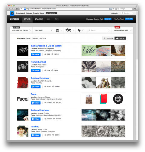
Huge congrats to the team over at Behance for their brand-spanking-new site. They’ve completely redesigned key features – gallery browsing, activity feeds, member profiles, curated galleries, and the follower experience.
Their new Explore lets you sort the world’s creative work by field, location and tools. (Here’s an example for the location ‘Brooklyn’) And their new Activity Feed provides a visual dashboard for tracking the creative work of people you care about. The redesigned portfolio pages and project views bring a new level of transparency and attribution as they clearly indicate where and when your work has been featured.
One of my personal favorite features is that you can search by materials used. Way cool! And then of course there are the curated sites, Typography Served is a site I often get lost in.
Read more about the changes here. And check out the new site.
Yay for Behance!
And I can see my work (Face.) in your screenshot :)
Mar 20th, 2012 / 1:11 pm
Looks like they have Pinterest-ised it!
Mar 22nd, 2012 / 7:35 am
Looks a good bit like 9gag.com but far enough to not be a knock-off.
Mar 22nd, 2012 / 2:03 pm