An Endless Table


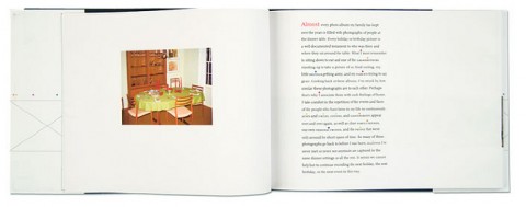
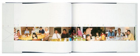
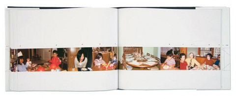
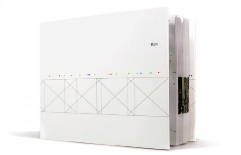
Don’t we all have a lifetime of dinner table photographs, each celebrating a holiday, birthday, or special event. Pictures that depict the same dinner table and usually the same cast of characters — family members, friends, neighbors. Combined, they create a seemingly never-ending scene. Colored dots represent the designer’s relationship to each person. I absolutely love this idea. Hat tip to Kim Bentley!

(thank you Kyle)

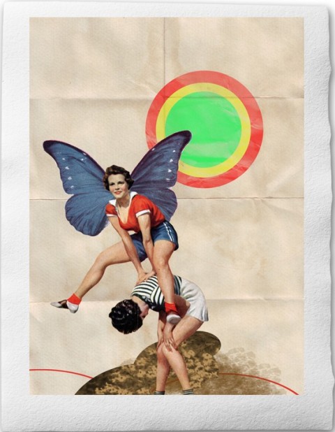
Jump

Can’t help but smile when looking at this collage titled JUMP.

(thank you Kathleen)

Jesse Draxler

Discovered this fascinating collage work by Jesse Draxler over at Ignant.

A Paper Record Player Wedding Invitation

NYC based designer Kelli Anderson created the most amazing wedding invitation in this universe: A Paper Record Player:

Paper Record Player from kellianderson on Vimeo.

We here at Studiomates were lucky enough to get a live demonstration of the card by Kelly last week. Yes, we were blown away.

Method & Craft

Are you a designer? Are you familiar with Method & Craft? If not, I would suggest you check out their site.

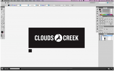
Method & Craft is run by a crazy talented bunch of designers (one of them is my studiomate) and features Articles, Interviews, Videos, and Notes. The Method & Craft articles focus on process and workflow of designers. Their interviews let designers discuss their approach & perspective in their own words. And their videos show the designer at work, sharing application-specific techniques. Needless to say, those are my favorites!

I just thoroughly enjoyed this video covering Vintage Effects in Illustrator:

(kind of via chris glass)

Buy art? Prognosticator

Whenever Kelli Anderson sends me an update on some of her latest projects, I stop and listen. Her talent is humbling and her updates always awe-inspiring.

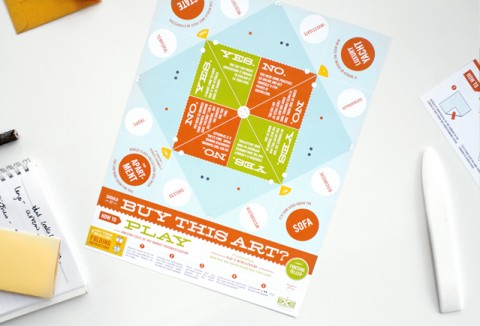
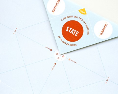
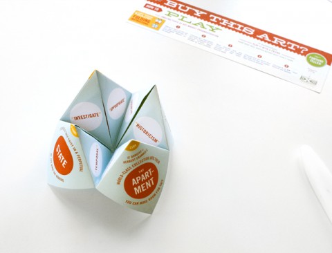
This Should I Buy This Art? Project made me laugh. It’s meant to be a helpful tool for everyone involved in the currently ongoing art fair season here in NYC. Kelli made this paper-gizmo for Jen Bekman‘s 20×200 to distribute in their “Art Fair Survival” tote bags. Jen had the initial inspiration for a fortune teller and the entire office brainstormed on a theme, ultimately arriving at this question: “Should I buy this art?” Kelli worked that basic idea into a handy-dandy art market prognosticator, which will aid the user in making very expensive decisions about art… responsibly, of course.

I need the same answering the question: “Should I Blog This?”

Erik Spiekermann on Gestalten.tv

The folks of gestalten.tv just pointed me to their most recent video with Erik Spiekermann. Listen to the German King of Typefaces talk about new visual languages, design processes, the analogies of music and typography.

Watch their complete line up of video interviews on gestalten.tv.

Typefaces of the World

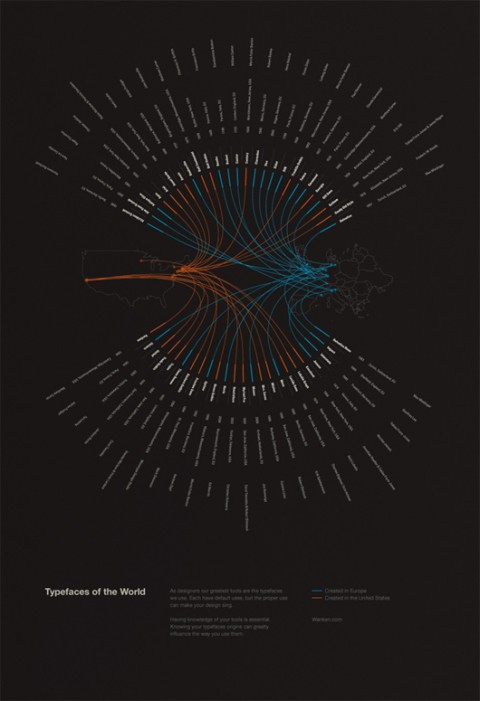
Typefaces of the World is a poster Shelby White created to show the typefaces that are most commonly used in a lot of today’s design. The poster includes information for each typefaces such as the year it was made, the location and the typographer. These 50 typefaces were chosen based on popularity and usefulness in present design. It was by mere coincidence that the typefaces were nearly split 50/50 between Europe and the United States. But it does show that the most prominent locations for typographers were in these areas.

What a beauty! I would love to hang one of these in my studio. Shelby says he is toying with the idea of adding a store to his site. Let’s hope he does soon! Typefaces of the World! Wishlisted!

Collaborative Fund

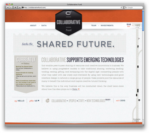
What visuals come to mind when you think of an investment fund? Clean, boring, blue (!) logos and websites? Yes. But you have to rethink that from now on. Check out this new investment fund called “Collaborative Fund” by Craig Shapiro. Not only am I am impressed by its mission but am floored by the awesome branding and website. (Check out the navigation!) Kelli Anderson is the mastermind behind it all. Check out her blog post about the design process.

CollaborativeFund.com

Pentagram (new website)

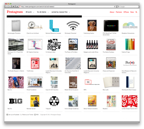
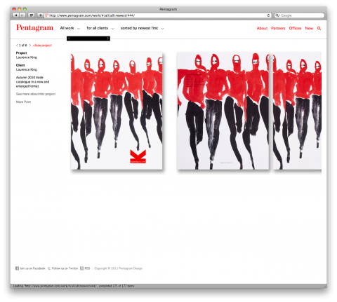
Congratulations to Pentagram for their new site.

(Yay, they are linking to Michael Bierut’s CreativeMorning talk!)

relativity

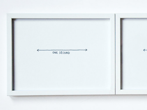
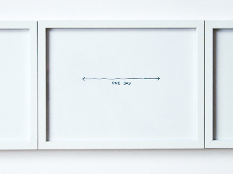
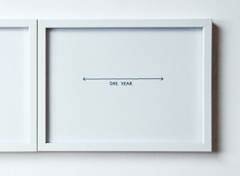
The first official exhibition of the london based gallery ‹between› featured 10 young designers and design studios around the world. They were all invited to think and respond to the meaning of the word ‹between›.

Swiss designer Marcus Kraft contributed a triptych which was an attempt to translate Albert Einstein’s theory of relativity into a piece of concept art: Sometimes, one second can change your whole life. On the other hand, a whole year can feel very boring, unimportant and dull. What if one year is as long as one day or even one second? — Maybe there’s no difference at all.

Milton Glaser on using design to make ideas new

From the TED archives: The legendary graphic designer Milton Glaser dives deep into a new painting inspired by Piero della Francesca. From here, he muses on what makes a convincing poster, by breaking down an idea and making it new:

Milton Glaser on teaching

Fundamentally I teach because it makes me feel good. It helped me certainly clarify my own objectives. There’s nothing more exciting than seeing someone’s life affected in a positive way by something you’ve said.

— Milton Glaser on why he teaches

Milton Glaser (by Hillman Curtis)

I still can hardly believe it but Milton Glaser will indeed be our January NewYork/CreativeMornings speaker. This documentary about Milton is by Hillman Curtis. Check out his entire Artist Series here.

2011 diary

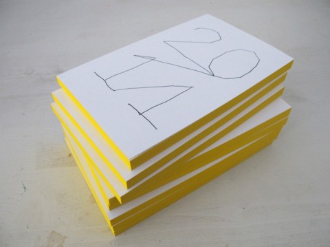
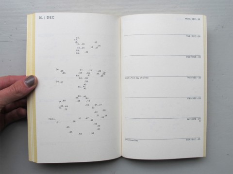
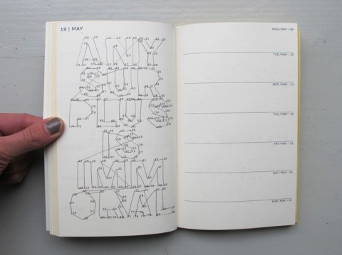
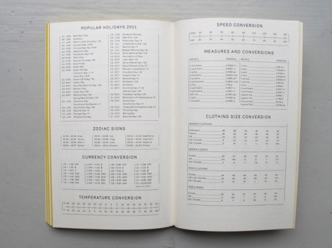
If you’re into paper timers, you should consider this playful 2011 diary by Swiss Julie Joliat with more than 50 connect-the-dots puzzles. But that’s not all, it also contains a lot of useful information, like maps, popular holidays, wine chart, monthly and weekly plannings. (It’s currently sold out but more should arrive early January!)

The Kindness of Strangers

During a lovely conversation with a young German designer, we both agreed that well established designers here in NYC are down to earth, humble and approachable. Something that is entirely not the case in Germany, she said. And I agree. I am regularly amazed at how lovely and humble so many of these super-established designers in our industry are. I never forget when I met Steff Geissbuehler for the first time. He sat down with me and we had a 20minute chat and bonded over our common Swiss roots.

Or take Michael Bierut who so generously agreed on giving a CreativeMornings talk in January of this year. Not only did he give a talk but a brand new talk on clients. (Anyone who knows how much time it takes to put a talk together must be equally humbled by this as I was!)

The list goes on, add Steven Heller, Debbie Millman, Paola Antonelli etc.

One of my readers pointed me to this wonderful article called The Kindness of Strangers by Jessica Helfand. I love the part where Jessica talks about Milton Glaser:

I have heard that Milton Glaser will never accept a social invitation if it means canceling a class, because his students come first. This makes him a rock star in my book, and makes me wonder if we should start teaching ethics in design school. If charity begins at home, how can we proclaim new and progressive agendas of social change without examining ourselves, our students, our profession?

Here’s to the rockstars in our industries that stay humble and approachable!

The Kindness of Strangers, by Jessica Helfand
The Great Gatsby

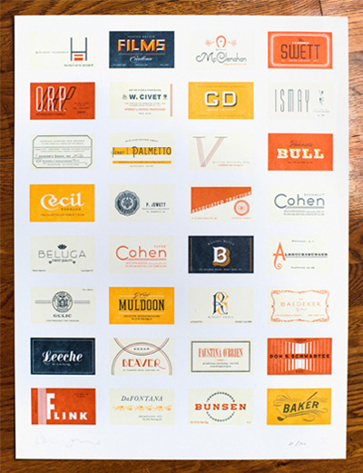
My friends over at The Heads of State just released this amazing 4-color letterpress print titled “The Great Gatsby“. Inspired by F. Scott Fitzgerald’s The Great Gatsby, this poster is comprised of the business cards and personal stationery of the movers and shakers that attended Gatsby’s parties in the summer of 1922. Masterfully printed by Studio on Fire in Minneapolis, this 4 color print comes hand signed and sealed on 140 lb. French Poptone Sweet Tooth.

A beauty!

Edits by Edit

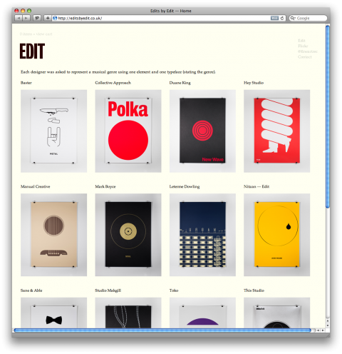
Some of the posters over at EditsyEdit put a smile on my face. Each designer was asked to represent a musical genre using one element and one typeface (stating the genre). My favorite: Twist by Hey Studio.

Olimpia Zagnoli | Small Talk

On November 10th, 2010, Olimpia Zagnoli was invited to give a lecture at AIGA/NY about her work and the sources of her inspiration. The below video is short version of what she talked about, for people who couldn’t make it to the NYC event.

This is fantastic, Olimpia! Thank you so much! I missed your talk that night!

PS: I am kinda bummed that I wasn’t born with a bump on my head!

The Heads of State

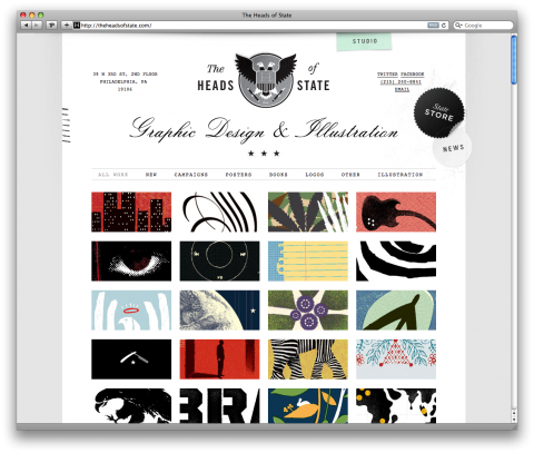
My friends over at The Heads of State (Jason is a former studiomates member) just launched their brandnew site and shop. Seeing their work is quite humbling, to say the least.

Just a few cards

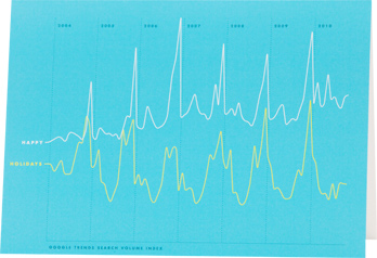
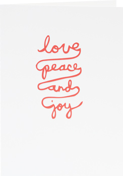
What a fun surprise! Paul Octavious is visiting our studio today! He is a fantastic photographer, runs a design studio in Chicago called Broken Pencil, is the force behind GeniusVomit (?) and also just came out with a site that sells cards called JustAFewCards.com. My favorites are by James Nick Felton and Kyle Steed. See below:


Get your holiday cards over at: JustAFewCards.com

Damien Correll

Why did it take me so long to check out Damien Correll’s portfolio? What a talent! Hat tip!

Fancy Custom Dock Icons

Two readers asked me about Jessica Hische’s fancy custom doc icons that they spotted in an earlier post today. She created them herself, you can download them here and watch the video below explaining how to change your dock icons.

How to Change your Dock Icons from Jessica Hische on Vimeo.

Jessica is one talented lady. We miss her here in studiomates land.

Please note: When sh says “left click” in the video she really mean “right click”.)

Olimpia Zagnoli


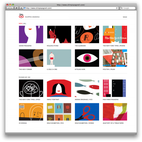
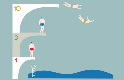
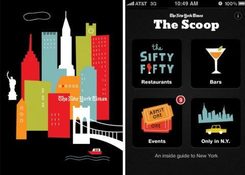
I admire Olimpia Zagnoli’s work. She is a 26 year old illustrator, based in Milan, Italy. She has an adorable logo, an amazing sense of color and, of course, drives a yellow Fiat. Best of all for us NYC peeps: We will get a chance to meet her at an upcoming AIGA/NY Small Talk event here in the big apple.