I am dreaming of an entire wall in my studio set up with this pegboard shelving system. Made by the Hornsby Berowra Men’s Shed, discovered over on Apartment Diet.
Zen Bedroom
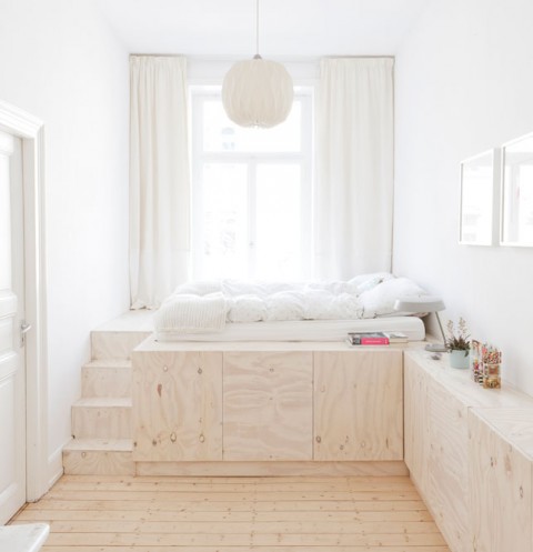
Beautiful minimal bedroom with built in storage designed by Studio Oink. Definitely will circle back to this image when we are tackling the project of building loft beds in our kids rooms.
Dymaxion House (1946)
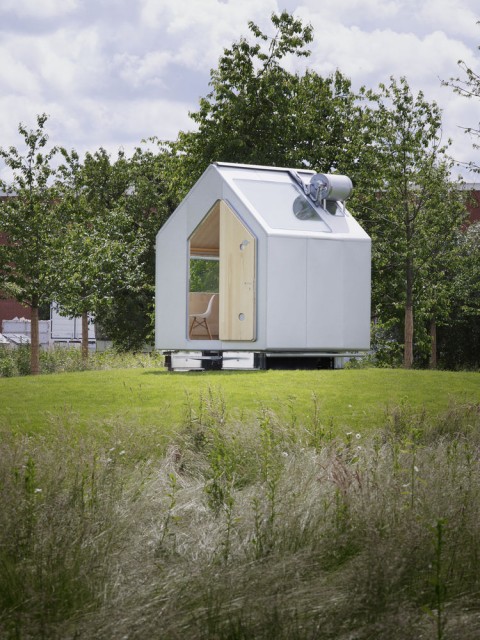
Buckminster Fuller’s Dymaxion House is all kinds of fascinating, especially the conveyer belt linen closet!
Hotello
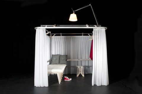
Hotello is a portable space, containing all the necessary elements for a minimal room: a desk, a lamp, a stool, a shelf, a locker. Hotello consists of a metal structure that supports double curtains (translucent and sound absorbant) as well as all the furniture needed to work and rest. Designed by Roberto De Luca and Antonio Scarponi.
Oddly charming.
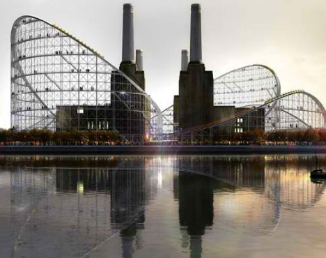
Powerstation gone Rollercoaster?
Love this proposal by Atelier Zündel Cristea to turn an abandoned London power station into a playground and museum.
Famous Architects Dressed as their Buildings
Famous Architects Dressed as their Buildings in 1931. I heart this.
The Modern Family: Part One
What a stunning house to raise kids in. It’s located in Carmel, California, designed by Lake|Flato Architects.
(via Dwell)
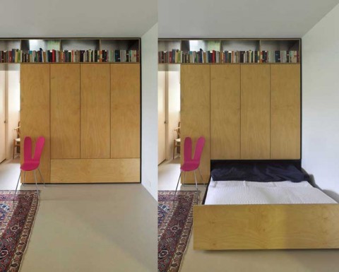
Hidden Bed
This is the Murphy Bed of my Dreams. Completely Hidden.
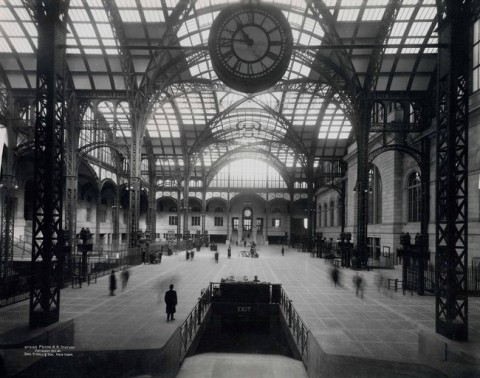
Value of Architecture
The original Pennsylvania Station was razed in 1963. (Collection of the New-York Historical Society, negative number 59044)
A passionate NYTimes article addressing the calamity that is Penn Station:
“To pass through Grand Central Terminal, one of New York’s exalted public spaces, is an ennobling experience, a gift. To commute via the bowels of Penn Station, just a few blocks away, is a humiliation.
What is the value of architecture? It can be measured, culturally, humanely and historically, in the gulf between these two places.”
Restore a Gateway to Dignity, by Michael Kimmelman
(via @kbAndersen)
Spaces, Etc.
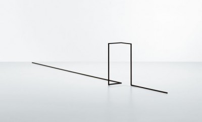
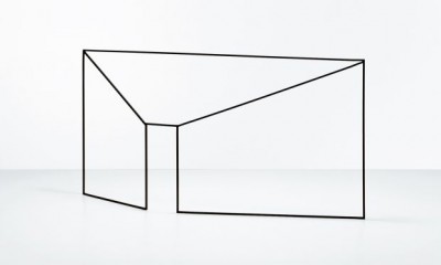
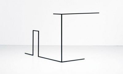

These sculptural objects by New York based designer Ron Gilad are minimal three-dimensional outlines of various familiar shapes. As minimal as they are, they form spaces, rooms, shapes. It’s fascinating how our mind finishes what his artwork has started.
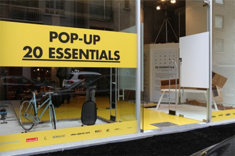
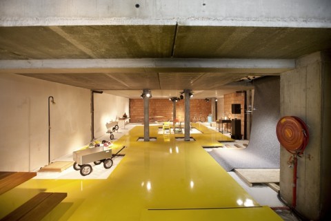
20 Essentials
20essentials is a Belgium based pop-up concept with a selection of carefully picked products by a ‘little more’ or a ‘special twist’. The products are different in their concept, shape, material and functionalities and are an attempt to meet 20 of our most basic, daily needs, such as sitting, sleeping, transport, …
20 Essentials is located in Knokke, Belgium. Wish I could stop by. Lovely idea.
(Thank you Pieterjan)
Rainbow Panorama
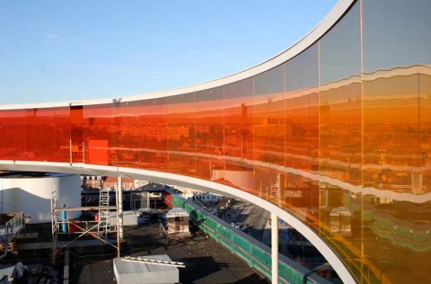
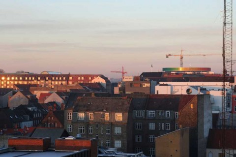
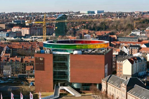
Olafur Eliasson’s Rainbow Panorama Installation makes me want to book a flight to Denmark asap. RAINBOWTASTIC, as my color-loving studiomate Jessi would say!
(via chrisglass)
Rainbow Bank
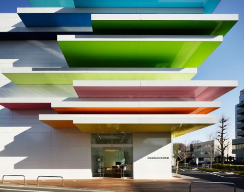
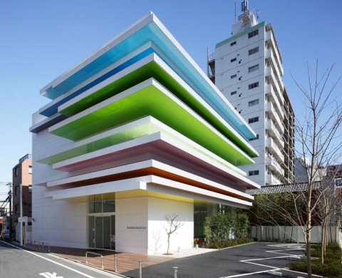
This ‘rainbow bank’, as my reader Kirsten calls it, makes my heart beat a little bit fater. It was designed by Emmanuelle Moureaux. It’s called ‘Sugamo Shinkin Bank’, a credit union located in Shimura, Japan. Te design, an offset volume of rainbow-like layers, is the third branch designed by Moureaux, with the first two located in Tokiwadai and Niiza. Read the original designboom post.
Stunning Bookshelf (shot by Selby)
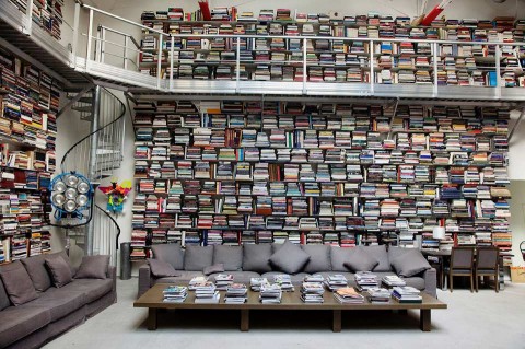
Karl Lagerfeld’s bookshelf system is crazy impressive (and big!) It’s an older shot by Selby, who just came out with Edible Selby.
(via Raul)
Winy Maas on the Balancing Barn
In this short film made by Dezeen and Oliver Manzi of WopFilms, architect Winy Maas of Rotterdam firm MVRDV talks about Balancing Barn, a house in Sussex Suffolk, England, completed late last year.
At some point in my life, I want to live in a house like the Balancing Barn and own a real Calder Mobile.
Suspended Staircase
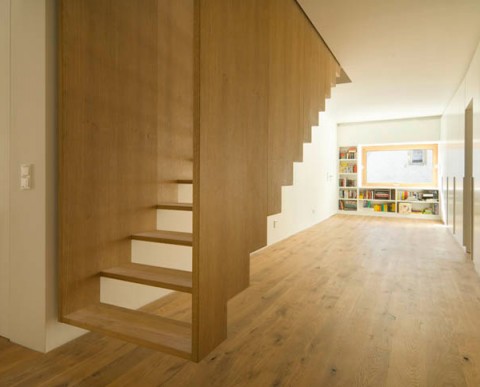
photo credit: Rainer Detzlaff
How stunning looking is this suspended staircase? It is part of a home designed by SoHo Architektur.
(via trendir)
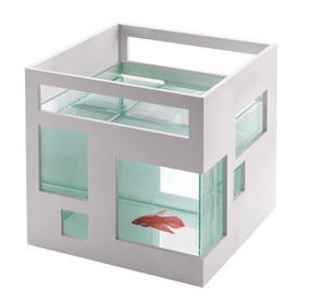
Modular Fish Hotel
Now here’s what I call a modern take on the good old fishbowl: Modular Fish Hotel.
nr1977 by MihaDesign
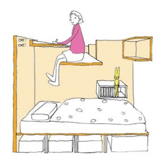
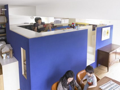
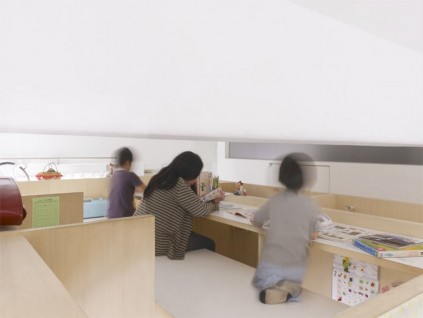
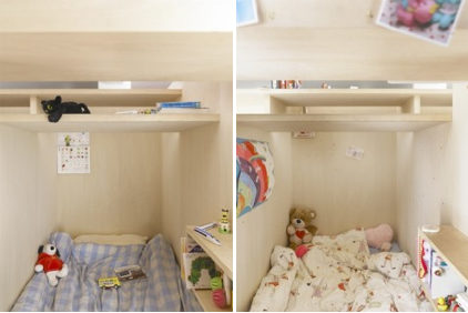
It does not happen often that a design has me speechless, but this desk-bed-loft construction just did. Naoto Mitsumoto and Naoko Hamana of MihaDesign were asked to renovate an old 770 sq apartment that was constructed in 1957. The designers were asked to propose a solution for the owners – a husband and wife with 4 kids – who desperately needed to come up with a creative use of the limited space. Who would think of putting boxes into this small apartment that not only serves as cozy bed-nucks but also offer a desk space above the beds. The kids can quietly read or study while comfortably dangling their feet above their beds. This is brilliant! Unbelievably brilliant! Read more.
(via spoon and tamago / via bb)
An Apartment for Space-Age Lovers
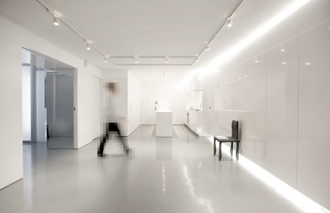
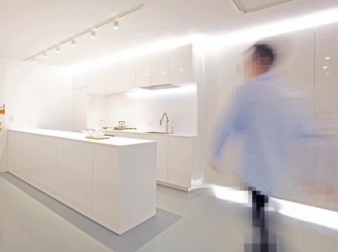
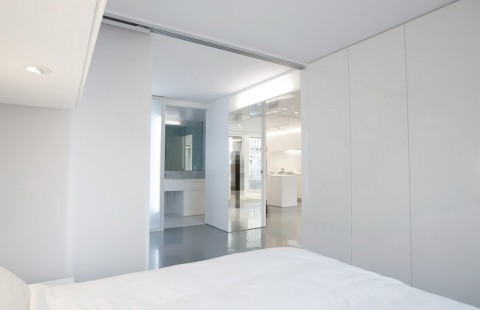
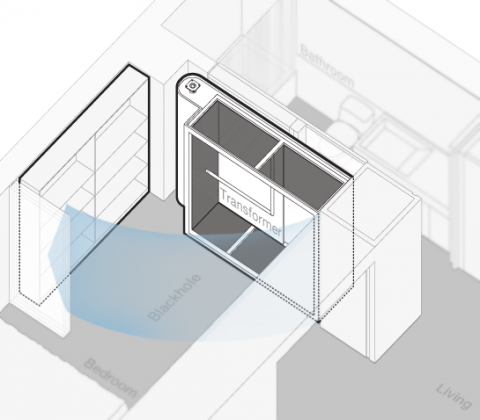
If I lived on my own this is how I would want to live. Completely clutter-free. No visual noise whatsoever. The owners of this sleek NYC apartment wanted a place where every boot and book, every single little thing could be hidden away; they wanted something that would make the most out of their 715 square feet.
I especially love (!) the concept of the friendly Black Hole, a flexible zone which can be annexed to the living room or bedroom, or optionally kept closed as a large walk-through closet space depending on the needs. It’s big enough to gobble up anything they need to hide.
Hat tip off to Dash Marshall, the architect/designer.
(I know, I know some of you might say that this is too sterile! Live and let Live!)
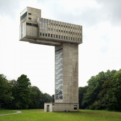
Filip Dujardin – Fictions
Filip Dujardin takes photographs of nondescript, often post-modern buildings and remixes them using Photoshop to create strange hybrids. Stunning!
dispatchwork
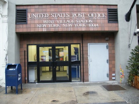
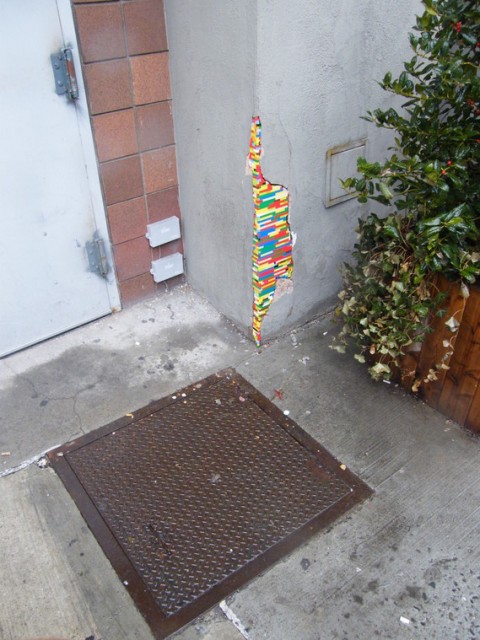
Does the exterior of your house need repair? Ever thought of using LEGO to patch up holes and cracks? That’s exactly what the agents of dispatchwork do. Jan Vormann is the force behind this refreshingly fun public service. Whenever a space needs repair, Jan or one of his volunteers all over the world, jump into action and fix it with LEGO pieces. Made me laugh!
Somebody should send an agent to 10 Jay street in Brooklyn. There’s plenty of patching to do!
(thank you Charlotte)
City Hall Subway Stop
Here’s a blog post that makes want to jump up and run to take the 6 train:
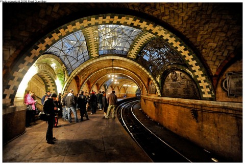
“New York’s famous City Hall subway station, one of the most gorgeous gems in the world of mass transit, has been closed for decades but now it can be viewed again by in-the-know riders of the 6 train.
Although it’s not open to the general public, there’s a way in-the-know New York subway riders can still see this famous and beautiful architectural glimpse at the city’s past. The 6 train used to make all passengers leave the train at the Brooklyn Bridge stop, but no longer.
If you have a little extra time, you can stay on the train and view the City Hall Station as the train makes its turnaround.”
I can’t wait. Can NOT wait to do this.
(via jalopnik and @HelenWalters)

