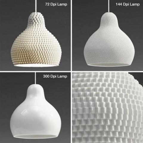
Now here’s a refreshing idea: Applying the screen resolution metaphor to lighting design. This dpi Series made me smile. Very cool idea by Guillaume Delvigne.
Italian-Designed Space Saving Furniture
Ron Barth, President of Resource Furniture, demonstrates and explains their amazing line of Italian-designed space-savers.
(thank you joelzimmer)
“a” stool
Chris Jackson of Hastell.com designed this “a” stool. It’s a Helvetica LT bold lower case ‘a’ stool. Pretty cool, no?
Reading Table
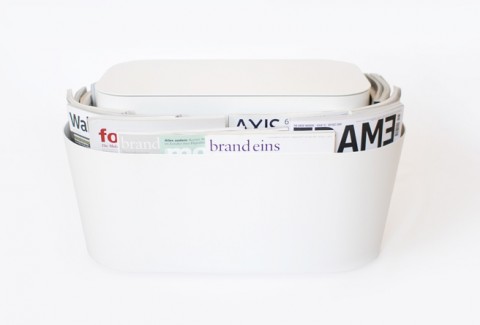
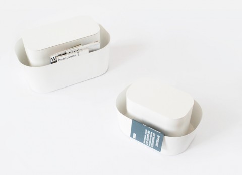
Uli Budde’s Reading Table is a mix of side table and magazine rack – a logical combinatino of functions and interior products resolved in a simple and unobtrusive way. Gasp-for-air-fantastic!
Seen over on Stilsucht.
UliBudde.com
Letter Stool
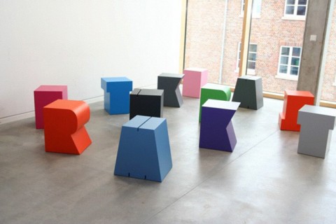
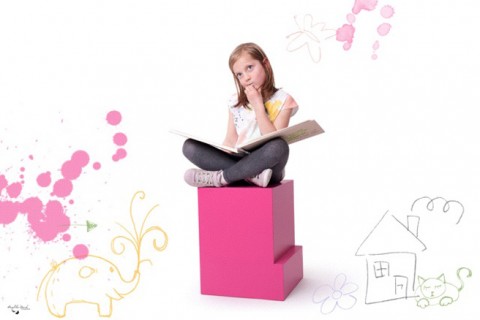
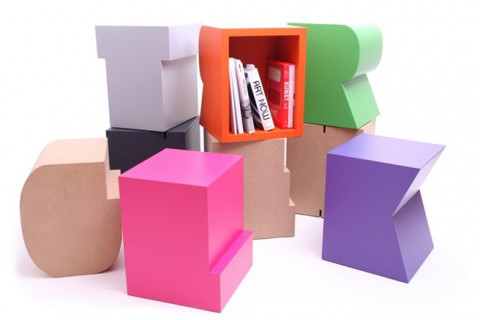
These stools in shapes of abstract letters make me rejoice. How fantastic for a pre-school or modern childrens room? They are a brainchild of German Sascha Grewe and go by the label “artcanbreakyourheart.de”. They are available in 147(!!!) different colors. And how funny is their slogan: Kitsch can make you ritsch but art can break your heart.
Seen on Stilsucht.
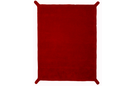
Handle It Rug
How cool is this Handle It Rug? Designed by Miguel Vieira Baptista.
(thank you for pointing me to mjoelk, jenn!)
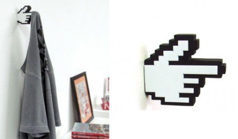
8-Bit hanger
This 8-Bit hanger made me chuckle. Perfect for an interactive studio, no? I am tempted to get one right next to my desk, so I can hang my headphones when not in use!
(thanks sorella)
Timber Table
Timber is a beauty of a table that doesn’t need any tools for assembly. (See video below). Designed by Julian Kyhl.
Timber Out of the Box from julian kyhl on Vimeo.
14% by Laura Strasser
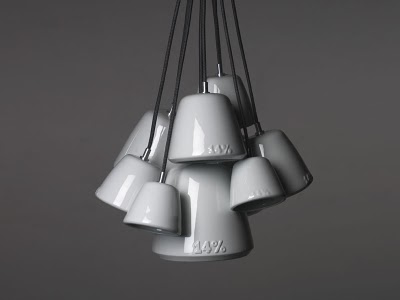
Gesa Hansen, the charming designer behind this beauty of a desk visited swismiss studio yesterday. During her bubbly, delightful visit, Gesa told me about her friend Laura Strasser and the 14% hanging lamp. Each porcelain lampshade is a cast of the previous, larger shade and is itself the model for the next, smaller one.
Yep, tagged with #wishlist.
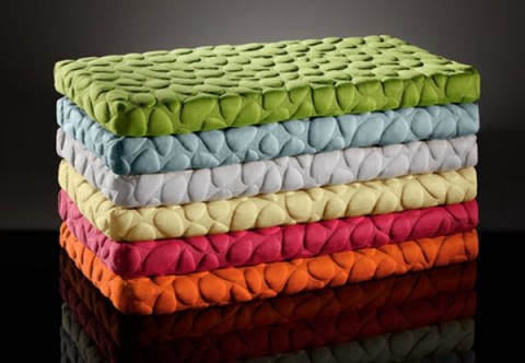
Nook
The Pebble Mattress by Nook is supposed to be the world’s most considered infant mattress. From a unique air layer that fosters oxygen flow inside the mattress, to the superior softness of all-natural eucalyptus fibers, to the unique pebbled surface that promotes air circulation, every detail is examined for maximum breathability, non-toxicity and smart design in the crib.
All I know is that it looks pretty darn cool. Made me Nook.
(via coolmompicks)
Colleen & Eric
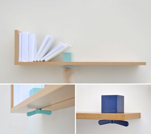
This bookshelf called Hold On Tight by Colleen & Eric took my breath away. It comes with an integrated bookend (a cube with an oversized wing-nut that you can loosen and slide on a track to make room for more books). It’s minimal and brilliant. Make that cube white or red and I am in heaven.
CounterEvolution
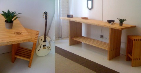
Walking down the hallway to my studio this morning I noticed a new studio neighbor. Their door was slightly ajar and I saw this amazing table and stool (pictured above). I walked in and introduced myself to Jim Malone, the owner and designer of Counterevolution. Jim designs furniture out of reclaimed and restored bowling alley wood. (!!!) I am all for furniture with a story and give CounterEvolution a swissmiss-thumbs up!
Welcome to 10 Jay in DUMBO, Jim!
Loop Stand Hall Wardrobe
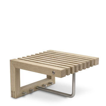
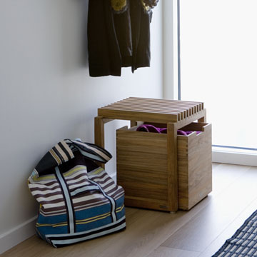
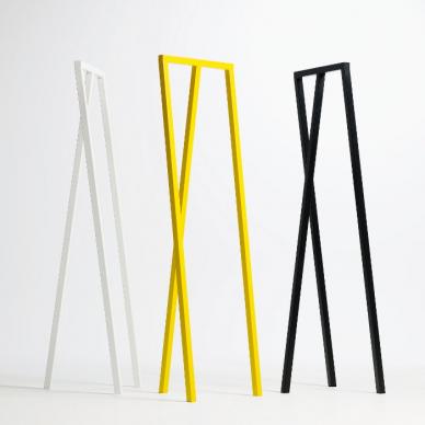
Amazingly minimal. A true beauty of a wardrobe: Loop Stand Hall Wardrobe.
Tukluk
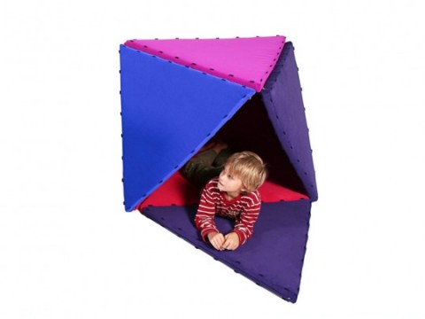
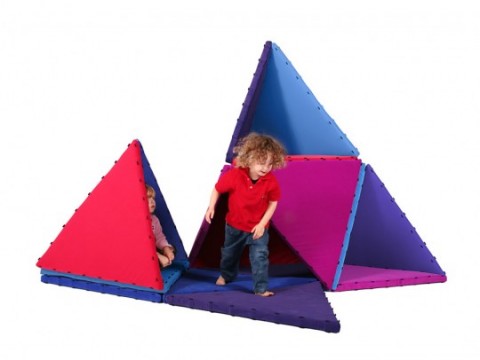
TUKLUK is a kid’s play object based on the shape of a triangle. Integrated magnets hold the elements together. Designed by Benedikt Kirsch+ Katharina Schildgen. Makes me want to be a kiddo.
The Mad Men of Mid-Century Modern Design
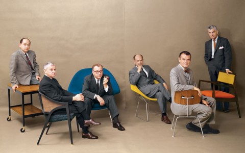
George Nelson, Edward Wormley, Eero Saarinen, Harry Bertoia, Charles Eames and Jens Risom Playboy Magazine, July 1961.
For fans of Mid-Century modern design, this classic image above from Playboy, July 1961 is like the Holy Grail. Design masters & fellow peers in their prime, beautifully captured in a time that was aesthetically crisp, uncluttered and innovative.
The Mad Men of Mid-Century Modern Design
(via @zeldman)
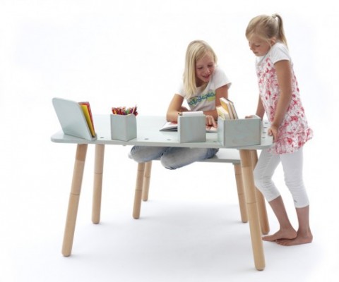
Growing Table
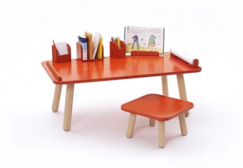
Now if this Growing Table isn’t an important looking kid’s desk, I don’t know what is. It has future CEO written all over it. The smart thing about it, you can extend the legs so the desk growths with your kiddo. Brilliant! Somebody has been using their noggin!
Oliver Yaphe
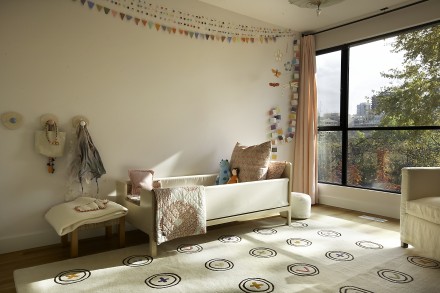
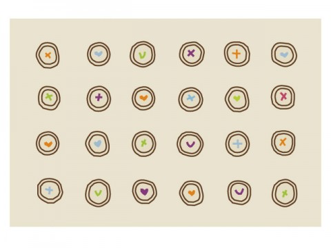
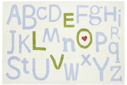
I agree with Jennifer, these children’s room rug designs by Oliver Yaphe are wonderful.
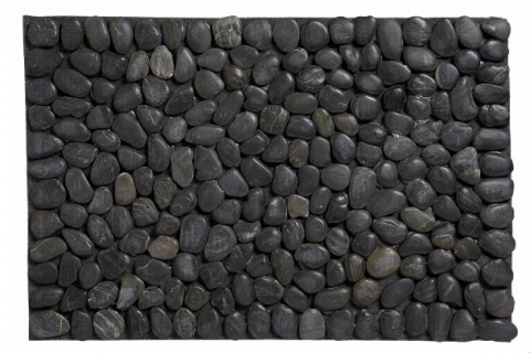
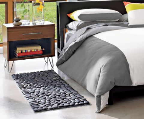
Pebble Mat
This Pebble Mat made me look. Not sure how I would feel about having one in my apartment though. Must feel odd to step on it, no?
Trompe L’Oeil Floor Mat
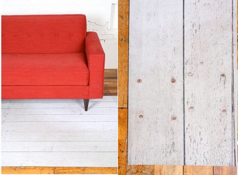
Totally floored A clever alternative to the common rug, Urban Outfitter’s low profile Trompe L’Oeil Floor Mat features a photorealistic reproduction of a distressed, white washed wood floor, printed on a tough micro-woven poly, backed with plush foam rubber. Very cool!
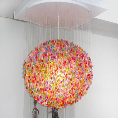
Gummi Bears Chandelier
Ever wondered how to make a four year old’s head explode: Install a Gummi Bear Chandelier in her room.
Electric Piano Dining Table
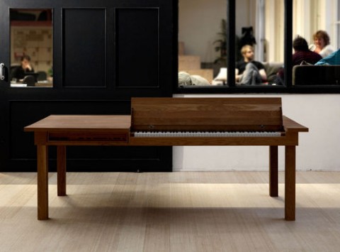
G would love one of these Electric Piano Dining Tables.
