Chris Jackson of Hastell.com designed this “a” stool. It’s a Helvetica LT bold lower case ‘a’ stool. Pretty cool, no?
Letter Stool
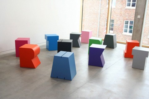
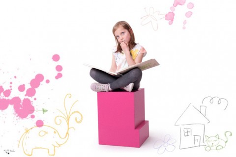
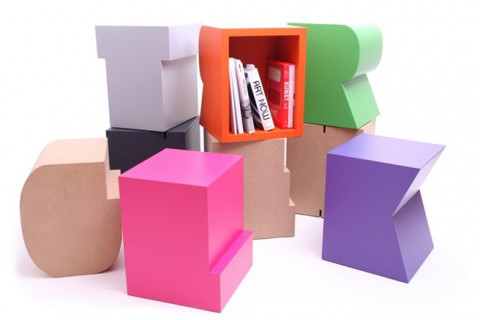
These stools in shapes of abstract letters make me rejoice. How fantastic for a pre-school or modern childrens room? They are a brainchild of German Sascha Grewe and go by the label “artcanbreakyourheart.de”. They are available in 147(!!!) different colors. And how funny is their slogan: Kitsch can make you ritsch but art can break your heart.
Seen on Stilsucht.
Jason Santa Maria’s favorite Typefaces
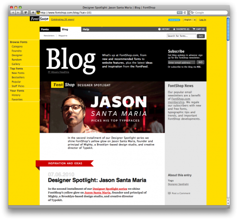
Next door studiomate Jason Santa Maria was interviewed by FontShop about his favorite typefaces. Thumbs up to Titling Gothic.
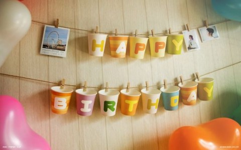
ABC Paper Cups
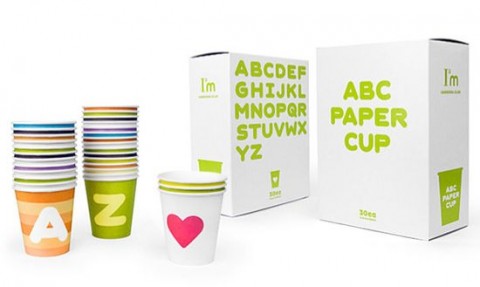
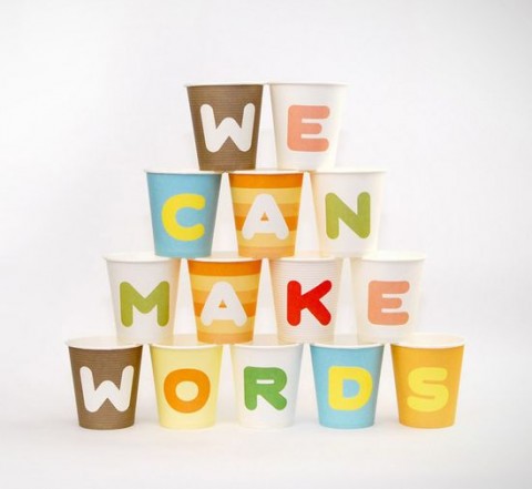
ABC Paper Cups puts an end to the boring design of disposable paper cups. (I know, I know, we shouldn’t go with disposable cups but use reusable plastic cups instead!)
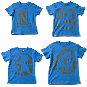
1 2 3 4
Nothing says “I’m the Birthday Boy” cooler than this retro style number tee with nice funky typography. Go Appaman!
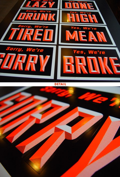
YES, WE’RE / SORRY, WE’RE
Inspired by their previous experiment with paper signs, the guys of Aesthetic Apparatus decided to take the plunge and print actual plastic window signs. According to their site they are shiny and smell like a brand-new Barbie doll ass. Available for sale singularly or as a set of four.
Yep, made me smile!
GIVE
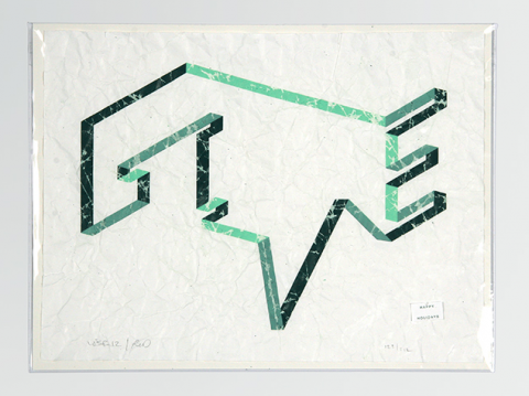
How incredibly stunning is this GIVE graphic by Topos Graphics?
Inspired by the act of giving rather than by giving a gift, Topos Graphics gifted an idea for their 2007 mailer—GIVE. The lettering to them was both a form of giving the gift that keeps on giving and wrapping their intention—the ribbon having no clear beginning and no defined end. And to point at their intention (rather than the gift) we took away the preciousness of the print by adding a marked history to the paper. By crumpling and re-flattening the print it was as if the gift had already been given and the wrapping paper already effectively been tossed into the recycling pile. With that in mind, it was the thought that counted—and still counts.
Their edition numbered 212. Every package included a signed and numbered print within acid-free plastic, each labeled with a Happy Holidays sticker that they had custom-printed to be used within a pricing gun.
Hyperactivitypography
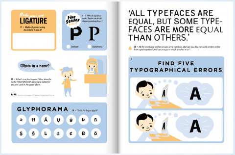
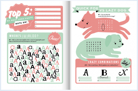
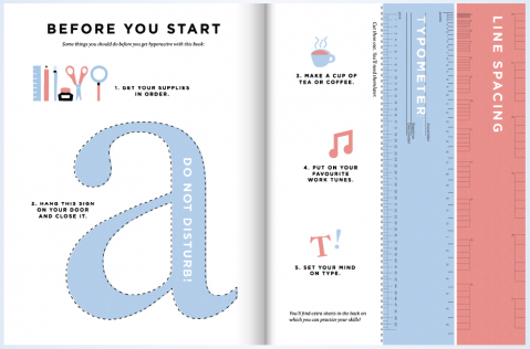
Hyperactivitypography from A to Z is an activity book for typographers
illustrated in a nostalgic vintage style to give it a sweet and childlike look.
The book is packed with activities, ranging from silly to hard core nerdiness.
It’s great to test your skills on and to learn new things while having fun.
Who said typography had to be stiff and boring?
You can flip through the book or buy it on www.hyperactivitypography.com!
(via thinkingaloud)
TDC | Beautifully Banal
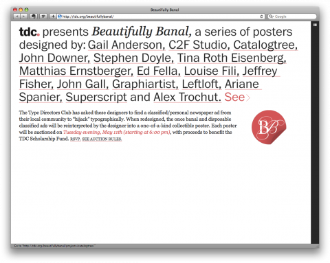
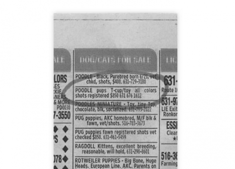
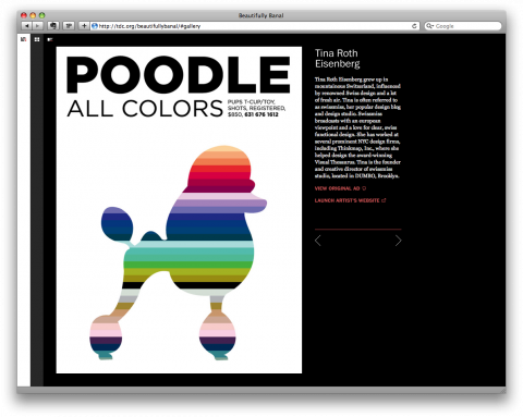
I had the honor to be part of this very cool project by The Type Directors Club called Beautifully Banal.
TDC and Cardon Copy asked 16 designers to find a classified/personal newspaper ad from our local community to “hijack” typographically. When redesigned, the once banal and disposable classified ads are reinterpreted by the designer into a one-of-a-kind collectible poster. Each poster will be auctioned on Tuesday evening, May 11th (starting at 6:00 pm), with proceeds to benefit the TDC Scholarship Fund.
I also happen to give a talk that night, right before the auction. To register please email the TDC (email on the bottom of this page) or call 1-212-633-8943.
UPDATE: One of my readers, Erik Wessel, pointed out that my classified seems to be from a puppy mill. I had no idea and am sorry to be giving this breeder additional attention with my poster. If you do get a puppy (or a poodle for that matter) please make sure to go through breeders that treat their animals with respect and dignity.
I am *not* endorsing the sale of puppies like this or this breeder, and I simply chose this ad because the idea of “poodles, all colors” was attractive to me as a designer.
Live Your Dream Bib
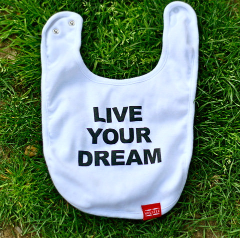
If this bib doesn’t make you smile, I don’t know what does. (Com’on Tilo (swissmister), don’t let anything stop you, you’re only 3months but hey, Live your dream!)
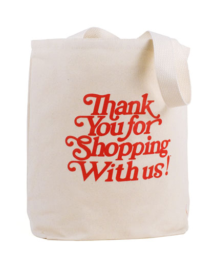
Thank you…
This durable tote is modeled after the plastic bag you’ve seen everywhere, with one important difference: it’s reusable. Made in the USA of natural organic Grade A canvas, it measures 16.5” x 16.5” and has a roomy 6” gusset to hold plenty of groceries. The design is screen printed and faithful to the original, right down to the last “s” (it’s upside down)
Typepong
It’s a retro resurgence with a modern twist. Pong is back. But not just any old Pong. Oh no. It’s TypePong! Pong. With type. This time, it’s on the iPhone!
TYPEPONG IPHONE APP #HFT003 IDENT from HypeForType on Vimeo.
(thank you Jake)
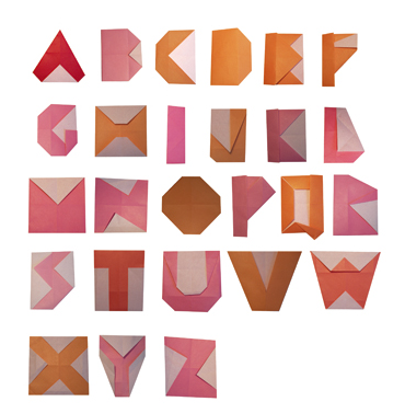
Origami Typeface?
Origami Typeface (title by me) by Gesa Hansen. Made me look.
Brauer Neue
(image philippe desarzens)
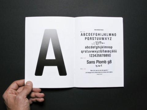
At last week’s CreativeMornings I had the pleasure to meet Martina Salisbury of TwoSeven who handed me one of her business cards. I noticed the amazing font on the card and was told it is Brauer Neue. It is similar to Trade Gothic Condensed just a little softer with the rounded corners. Instant new favorite.
Brauer was originally designed by Pierre Miedinger for the Zurich based brewery Braueri Huerlimann as part of the company’s corporate design in 1974. The typeface was extensively used on anything from beer bottles and beer mats to pub signs and promotional material, from letterheads to the company’s signage system, until the brewery was bought by Carlsberg in the early 1990s.
Elektrosmog extended the basic characters of Miedinger’s original ink drawings to a full character set, adding all special glyphs and symbols to make up a complete typeface – including a bonus font offering the brewery’s cherished brand logos.
I can’t remember when I was last so excited about a typeface. (And I can’t remember when I was last as annoyed by browsing a site looking for a font like I just did on lineto.com. While I do appreciate the playfullnes with that pop-up navigation system it is simply not intiutive intuitive and I don’t feel I got to get a real glance at the typeface, hence keeping me from buying it.)
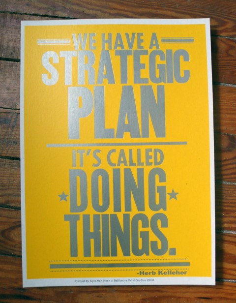
We have a strategic plan…
Kyle Van Horn got inspired to print the below poster after he saw the quote on my blog. I love creative chain reactions like this! Yay Hooray!
Ampersand ID Chart
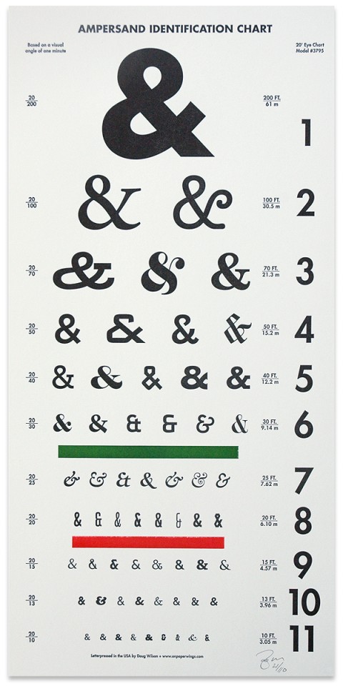
Ampersand Identification Chart is a lovely new limited edition letterpress print from Douglas Wilson. Based on the Snellen eye chart, this three colour print has been designed to keep your typographic eye keen on the details of everyone’s favorite conjunction. Each print comes with an identification key that details the names and weights of all 61 ampersands. Ampersand Identification Chart has been printed by Douglas in a signed and numbered limited edition of 110, and is available for £35 at keepcalmgallery.com
UPDATE: Doug just let me know that US customers can also buy a copy on his site directly.
On Combining Fonts
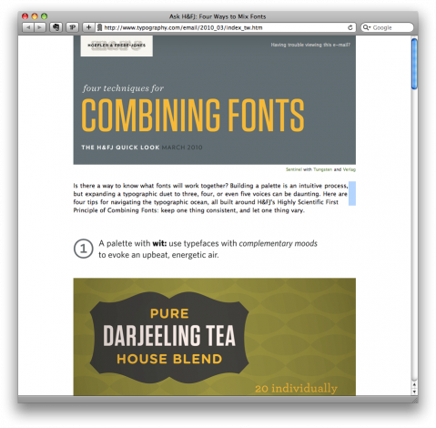
Is there a way to know what fonts will work together? Building a palette is an intuitive process, but expanding a typographic duet to three, four, or even five voices can be daunting. Here are four tips for navigating the typographic ocean, all built around H&FJ’s Highly Scientific First Principle of Combining Fonts: keep one thing consistent, and let one thing vary.
Design Letters
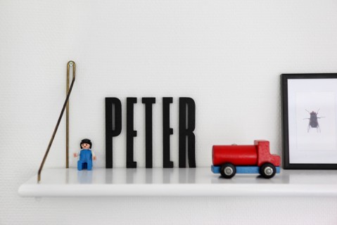
Condensed letters for your kids room? YES! Makes me happy.
Triboro Design | Leftovers
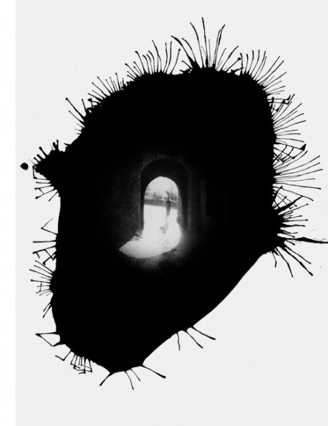
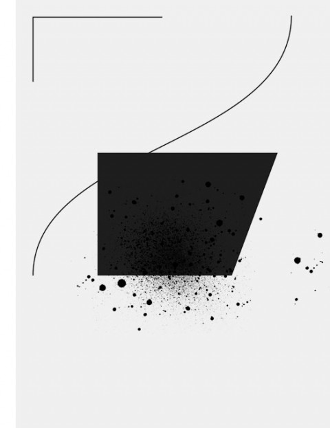
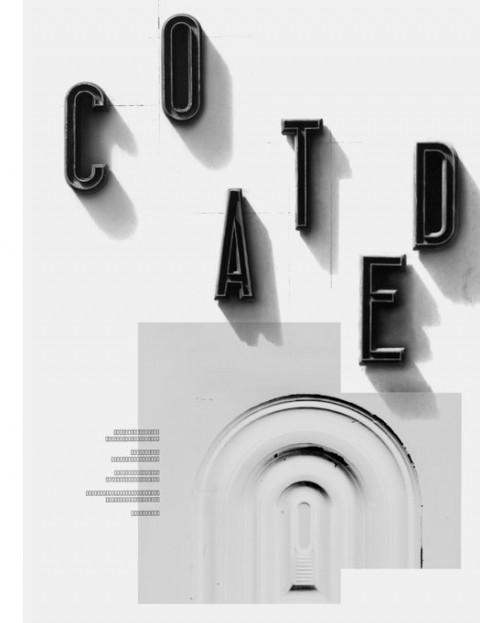
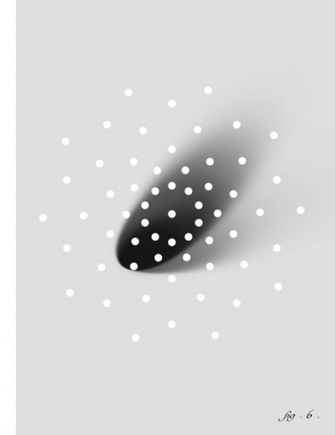
Triboro Leftovers is a compilation of unpublished type treatments, photos, sketches, illustrations and logo explorations that we have created over the years. Rather than allow these to remain lost on our harddrives we decided to set them free. We mashed together elements from hundreds of different projects—and in the process—deliberately stripped the elements oftheir original context and meaning. The results are visual remixes which stand on their own.

