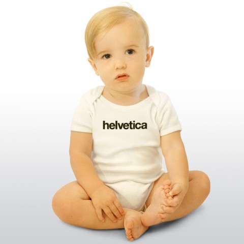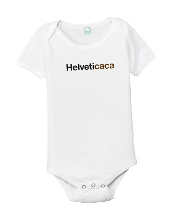
The Helvetica-Onesie-Madness is getting better and better: Helveticaca. Thanks for the laugh, Royal Stuart.
Helveticaca
Helvetica Baby?
Thank you @MullerBrockman for pointing out this Helvetica Onesie. Made me chuckle.
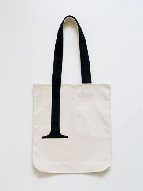
And how about this Beta Tee?
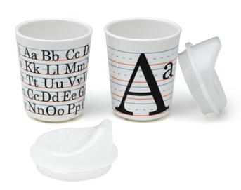
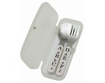
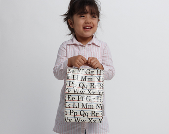
Vintage Alphabet
Adorable vintage inspiried Sippy Cup Set with Alphabet. Silverware Set and Lunch Sack. Cute, no?
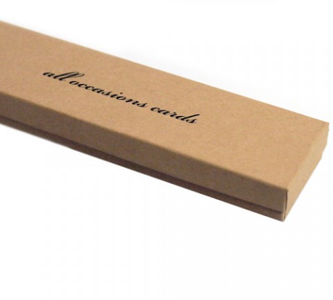
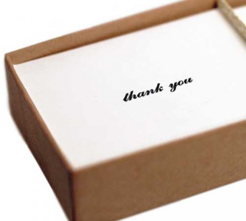
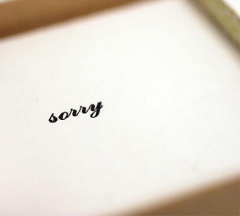
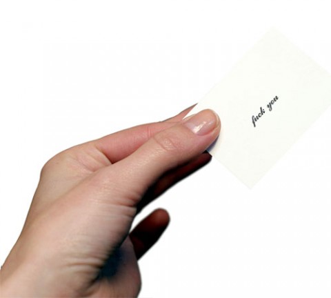
all occasion cards
Most situations really only require one of the following phrases: “thank you”, “sorry” or “f*** you” Well now you won’t even need to speak. All one need do is administer the appropriate hand letter-pressed card, and it’s stated in style, way cooler than what your mouth could do. Thirty-three of each card in a foil stamped box that reads ALL OCCASIONS CARDS.
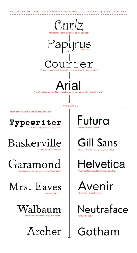
Evolution of Type Taste
Thank you for procrastinating, Jessica, and sharing this Evolution of Type Taste Chart from Grade School to present with us here in the studio! I am glad to see I was not the only one going through a Courier and Typewriter phase. (Please note this is Jessica’s personal evolution of Type Taste.)
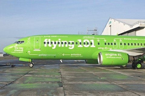
Kulula Airplane Rebranding
South Africa’s Kulula airlines recently received the rebranding treatment from creative agency Atmosphere when they applied this 101 guide to the various parts of the airplane. Made me smile. Found over at PSFK.
Helvetica Cookie Cutters
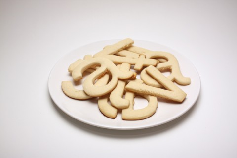
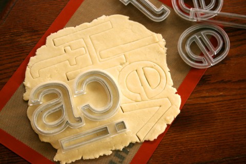 Helvetica Cookie Cutters by Beverly Hsu. Yes, these need to get produced. Seriously.
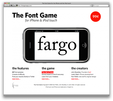
The Font Game
A game based on Typography? Yes, please! Think you know your Arial from your Helvetica, your sans from your sans serifs? Then step up to the plate. With three levels of game play from the ease-yourself-in, ‘Somewhat Difficult’ through to the incredibly challenging ‘Exceedingly Difficult’, there’s lots of fun to be had for novices and typographic experts alike. Check out the Beautifully designed Font Game by John Boardley, Justin Stahl and Kari Kari Pätilä.
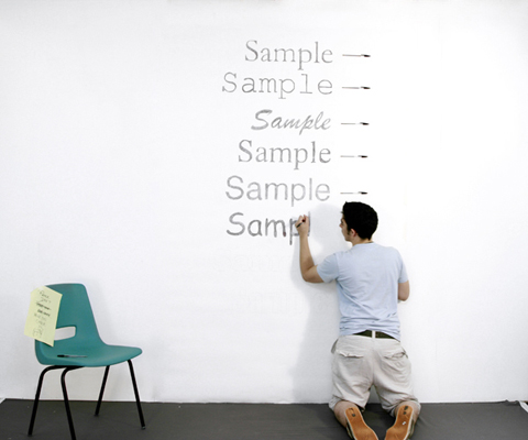
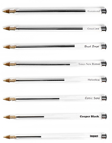
Measuring Type
Matt Robinson in collaboration with Tom Wrigglesworth compared a selection of the most commonly used typefaces for how economical they are with the amount of ink which they use at the same point size. Large scale renditions of the typefaces were drawn out with ballpoint pens, allowing the remaining ink levels to display the ink efficiency of each typeface. Measuring Type.
(via core77)
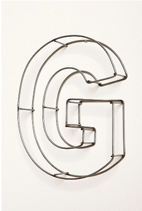
Wire Frame Letters
Wire Frame 10″ Letters. Wheeeee!
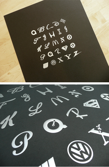
ABC of Branding
Using no ink whatsoever, these 18″x24″ posters are foil stamped and embossed to create an alphabet composed of letters from many of the more famous (and some infamous) logos of all time. Printed in two different colorways, you have the choice of silver foil on black paper or gold foil on cream, both stocks are 100 lb. French Pop-Tone and include the artist’s signature on back.
(via substudio)
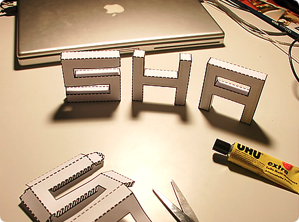
3D Font Print-Out
Note of the Tobias Sommer, Author of Punched Out: This font is a set of cut-out layouts with which you can build 3D pixel style letters. They should all work. Just cut along the solid lines, fold along the dotted lines, put some glue on the shaded flaps, stick them together and there you go…
If you wanna use this for a commercial project, please contact me. I’ll most probably let you use it for free, but I’d like to know what it is for. I also appreciate it if you send me a link/image of non-commercial projects featuring this font.
(via mmolai)
2010 Letterpress Wall Calendar
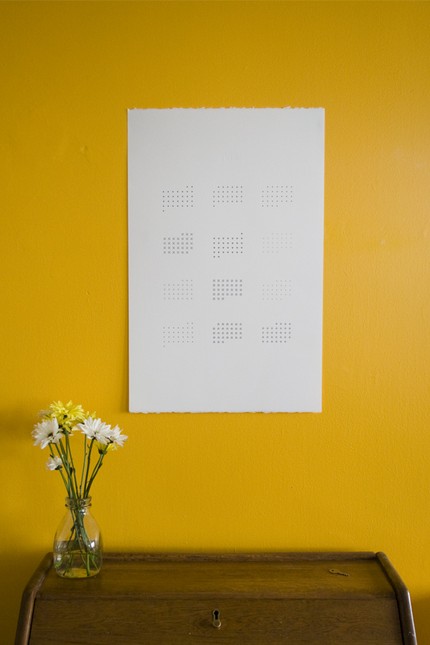
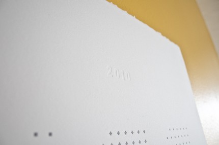
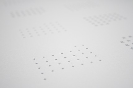
Beverly Hsu created this beauty of a minimal and slightly abstract 2010 letterpress wall calendar. The days of the month are represented by twleve different decorative types that she discovered from various typecases in the letterpress lab. Each decorative piece represents a day, each set of decorative elements represents a month, and all together, the twelve months of 2010. Lovely.
(thank you so much for the surprise, beverly)
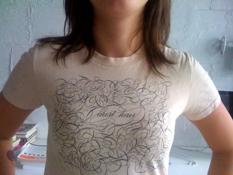
Typographic Chest Hair
My studio mate Jessica Hische just walked in with the *best* t-shirt ever, sporting typographic chest hair. Available at Veer. Made me smile.
Underground Signs
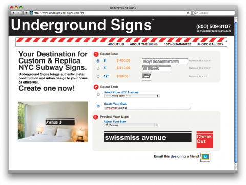
Always loved the New York Subway Signs and wanted to own one? Now you can get it customized to your liking! Underground Signs will create a custom NYC Subway sign for you. Hello there, awesome type-driven holiday gift? Also a really cool decorating idea for any kid’s room. (Oh, this would look great in our studio! swissmiss avenue?)
(via stilsucht)
Typography by Ronnie Bruce
Matias Corea shared this video with us at today’s CreativeMorning:
Poem by Taylor Mali.
Maple Ampersand Print
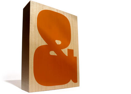
Love this maple ampersand print over at House Industries! Also, check out the maple santa – made me chuckle.
Speaking of House Industries: If you happen to be in New York TODAY, swing by the House Industries Pop-up shop at the Type Directors Club to touch and feel both old and new Housewares in person. Click here for more info.
Autografik
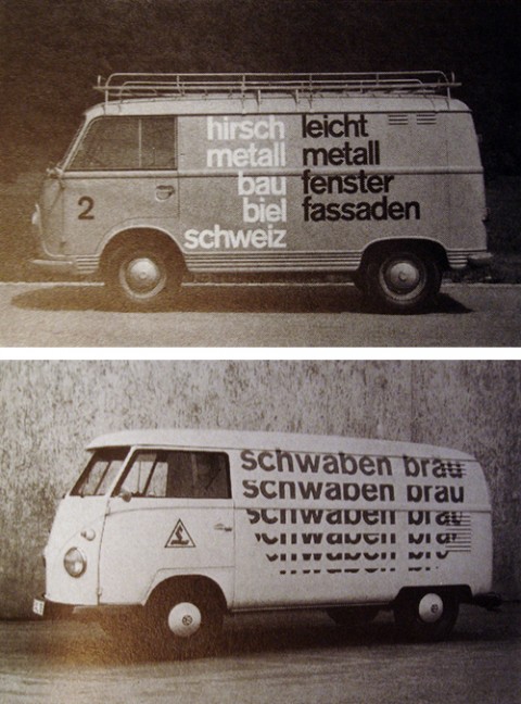
Flickr user insect54 has set up Autografik, a pool dedicated to graphic design applied to motor vehicles. With a focus on modernist corporate identities of the 60’s and 70’s. I love you internet!
(via hellobauldoff)
My first PrintSociety purchase
I am thrilled about my first PrintSociety purchase: The amazing Ampersand Print by Conor & David. Make sure to watch the making of video. Did you know: The ampersand was first seen in the 1st century AD and this short text in Irish and English charts its history and role in the English language.
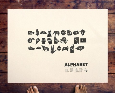
Alphabet
Can anyone tell me who this is from? Saw it over on PrintSociety. Designed by Beauchamping, view his etsy store here.
(By the way, PrintSociety’s Size Chart made me laugh)
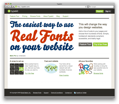
Typekit now available to the public
Typekit just became available to the public. What does it do? It is allows you to use real fonts on the web. It’s a subscription-based service for linking to high-quality Open Type fonts from some of the worlds best type foundries. We are entering a new era of Type Possibilities on the web. Gasping for air!
The introductory pricing will remain for a while, so sign up now to get the best deal.
