Yup. I <3 Typography.
(thank you @blogvotw)
This is not only a useful but also a pretty towel. Seen over at Bailey Doesn’t Bark.
(via @whimsyandspice)
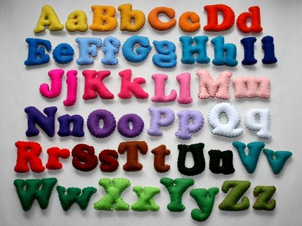
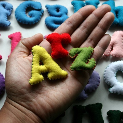
Two swissmiss thumbs up for these stuffed felt letters.
How incredibly cool are these 3D house numbers made out of solid concrete? Fabulous!
Here’s the perfect gift for the Helvetica Obsessed in your circle of friends.
Oh, this Block Gothic Typeface makes my heart jump. It is available in three weights from Fontshop.
(via designworklife)
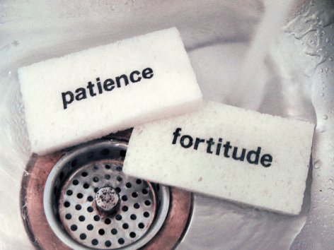
Who does not need patience and fortitude to do their dishes.
(thank you jon)
Don’t we all think that at some point in our lives? My head is full…
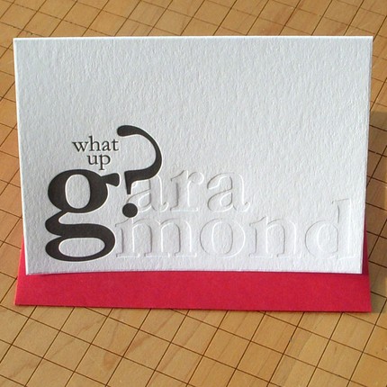
This letterpress card is sooo made for my husband, G: What up G? Check out the entire typography set.
(thank you nicola)
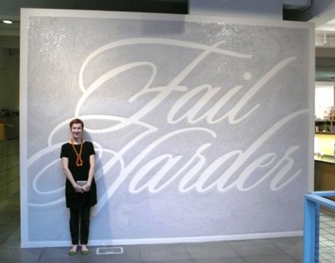
While visiting W+K Portland yesterday, I noticed this magnificent Fail Harder Mural, done by Wieden + Kennedy 12.
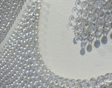
Over 100,000 thumbtacks were used over 351 hours to create this typographic mural that spells out Fail Harder, a message that underlines the importance of failure during the creative process. Absolutely fantastic. I would love to do something similar in my studio! Hat tip! (Make sure to watch the video below!)
David Friedman took 20 Helvetica logos, redid them in Arial (blasphemy!), and made a quiz out of it to help people hone their ability to differentiate them in a hands-on way.
“The way I relate the difference between typeface and font to my students is by comparing them to songs and MP3s, respectively (or songs and CDs, if you prefer a physical metaphor).”
– Nick Sherman
(via ISO50)
UPDATE 1: Just got an interesting tweet from my studio-mate @shiflett pointing me to a post by @jontangerine in which he distinguishes typefaces from fonts.
UPDATE 2: Jonathan Hoefler just sent over this link. A growing list of defintions and explanations. Nice!
The Daily Drop Cap is an ongoing project by my lovely studio mate Jessic Hische. Each day (or at least each WORK day), a new hand-crafted decorative initial cap will be posted for your enjoyment and for the beautification of blog posts everywhere. To use a Daily Drop Cap on your site or blog, follow the instructions in each post and read about the usage limitations. Enjoy!
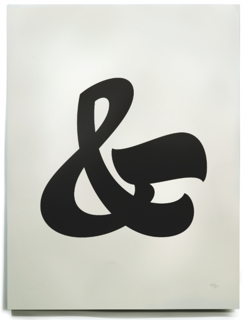
One of these lovely HouseIndustries Ampersand Prints would look perfect in my studio, right where I sit. Must order. (Hand Printed by David Dodde)
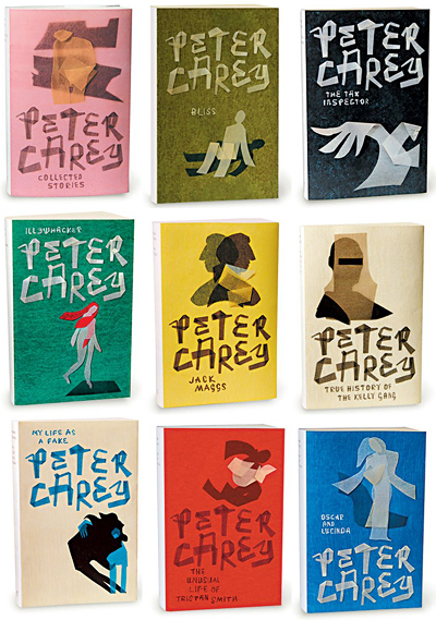
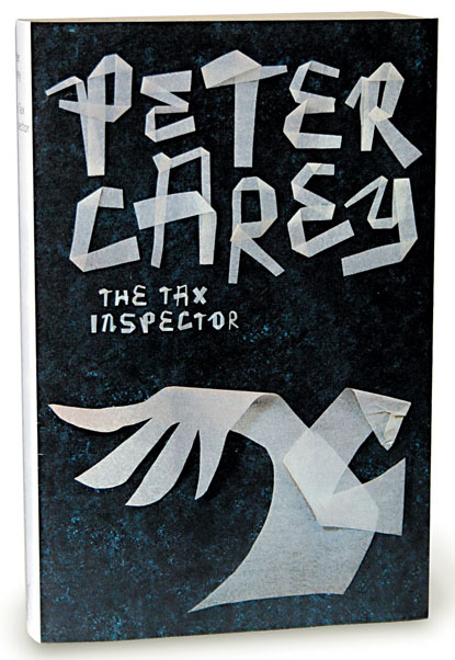
I fully agree with Bauldoff, this tissue paper book cover series by Jenny Grigg is wonderful.
In 10 Common Typography Mistakes Brian Hoff lists 10 common mistakes used in type design/layout that can make a large impact in the effectiveness and appearance of your designs, in addition to saving you time and money when dealing with printers.
Typophile Film Festival 5 Opening Titles from Brent Barson on Vimeo.
(thank you reuben)
Designers, it’s time to Play the Cheese or Font Game.
The above Typofiles page is from the now shuttered Blueprint Magazine. In every issue they did a themed spread in a classifieds section style. Scanned Flickr Set by Nubbytwiglet.
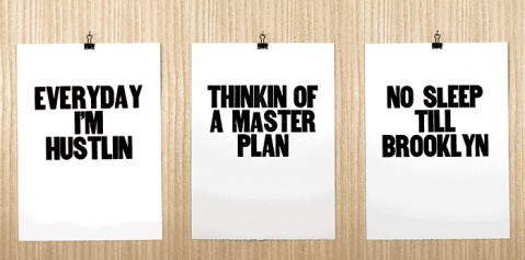
After spending a little too much time in front of the computer my friend Arianna thought she’d get back to basics and get her hands dirty. She makes these posters because cutting giant stacks of paper, setting wood type and scrubbing ink off her hands feels good.