Video by Sean Fischer. Part of xType Culture Show.
(thank you jennifer)
Video by Sean Fischer. Part of xType Culture Show.
(thank you jennifer)
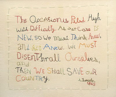
The occasion is piled high with difficulty. As our case is new, so we must think anew, and act anew. We must disenthrall ourselves, and then we shall save our country.
Taken from In Love With A. Lincoln, by Maira Kalman.
(via bauldoff)
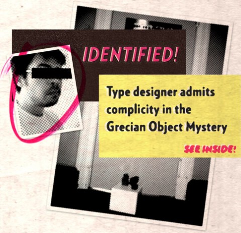
Eighteen months ago, H&FJ reported on a mysterious typographic gift that materialized outside their H&FJ offices. Today, they delighted to report that the culprit (artist) has come forward! Rob Keller — who may well be a typeface designer graduated from the University of Reading, but will always be known to me as The Grecian Bandit — apparently included us them his rounds when distributing ceramic letter sculptures throughout the city, as part of a project called Left Out Letters. Check out the collection of photos on his blog.
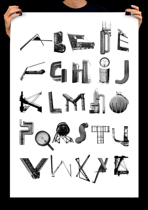
Fantastic Alphabetical Industrial Typography by Kalle Hagman.
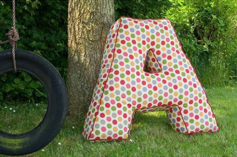
Here’s my latest contribution to Coookie’s Nesting Blog: Big Giant A Pillow. I want one of these so bad!
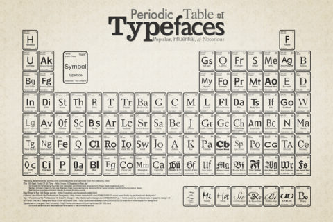
The Periodic Table of Typefaces is obviously in the style of all the thousands of over-sized Periodic Table of Elements posters hanging in schools and homes around the world. This particular table lists 100 of the most popular, influential and notorious typefaces today.
(thank you jake)
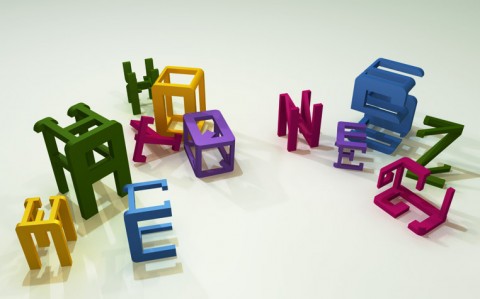
Action Types is a fantastic student project. Marcus Schaefer was trying to create a typographic toy to show children different types of fonts. The 3 dimensional letters consist of three very different fonts – Actiontype Bold, Actiontype Light and Actiontype Serif (slab serif). Action Types do not only provide these 3 fonts. Using them as base models, several random fonts can be constructed by interpolation. This is radical!
(thank you lisa)
Adobe Font Development Kit for OpenType package let’s you share the tools used by Adobe font developers for wrapping up PostScript fonts as OpenType/CFF font files, and adding OpenType layout features. These tools are used for in-house development of new Adobe OpenType fonts. Use them at your own risk, and with no guarantee of support!
(thank you matthew)
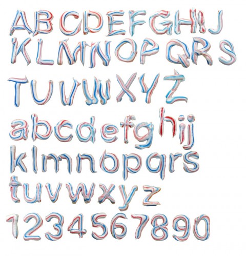
Handmade Toothpaste Type (Heldentica) fighting Gravity. Scroll down and see the animations. Made me smile. (Download Heldentica.ttf)
UPDATE: Make sure to read Joe Bauldoff’s comment below. Hilarious!
(thank you anke)
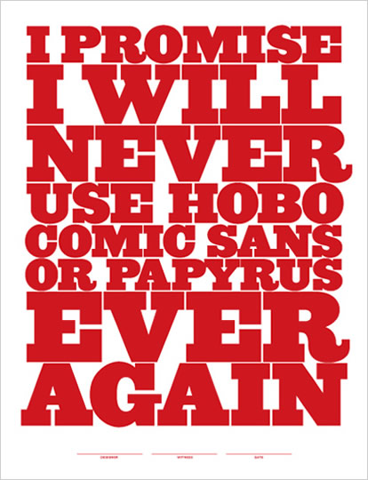
Does someone in your studio use one of these typefaces? Does it make your typographically sensitive skin crawl? You can help. Order this poster and make your hack designing colleague take this pledge and sign it.
Jeff Matz Designer/Principal of Lure Design created this last week for a screen printing presentation at “Pull + Ink” Art Center of South Florida, South Beach for AIGA Miami. They were such a big hit – they decided to put them up for sale!
Made me smile.
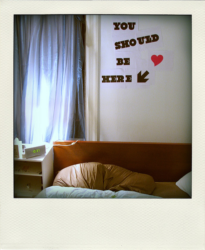
A picture note by Carl Collins for his girlfriend CEE. This is as wonderful as it gets.
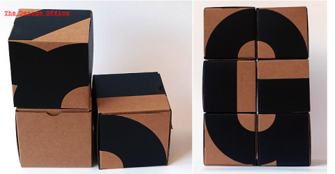
These oversized kraft boxes reintroduce the alphabet not as 26 distinct letters, but as the result of combining geometric parts. The 4-inch cubes may be viewed and stacked from any direction, creating unexpected shapes and letterforms. Letterboxes by The Design Office
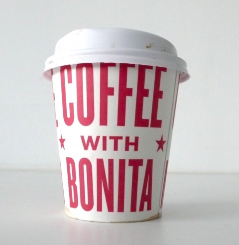
Suzanne just walked into our studio with this wonderful paper cup in her hands. It had me jump off my chair and snap photos. Oh, Bonita Diner, could you please open up a branch here in D.U.M.B.O so that I can walk around with these awesome typographic paper cups as well? (Or I’d be happy to design a similarly beautiful cup for any of the delis or cafes in the area!)
UPDATE: Cup was designed by Derick Holt.
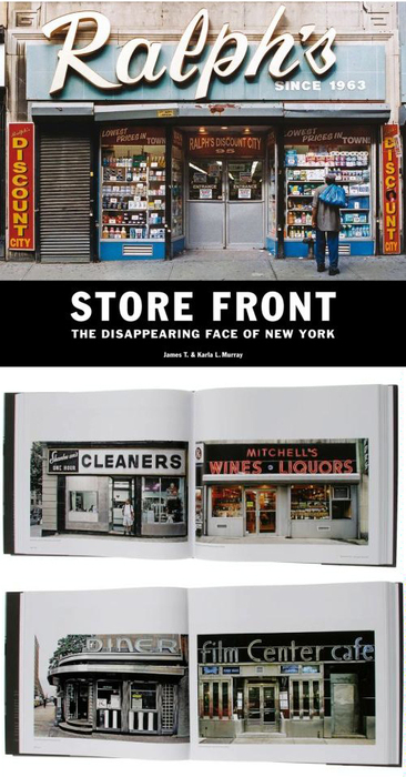
A wonderful find today over at In Transit (no more): I agree with Julia: Finally someone captured these beautiful storefronts with insanely gorgeous typography before they are gone. Store Front: The Disappearing Face of New York.
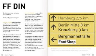
Here’s a lovely find for my german speaking readers: FF DIN – die Geschichte einer zeitgenössischen Schrift (PDF)
(via fontblog / patrickmarcsommer)
“This is Agostina” is a video to promote the font Agostina which was designed by Michael Cina.
This is Agostina from YouWorkForThem on Vimeo.
(via todayandtomorrow)