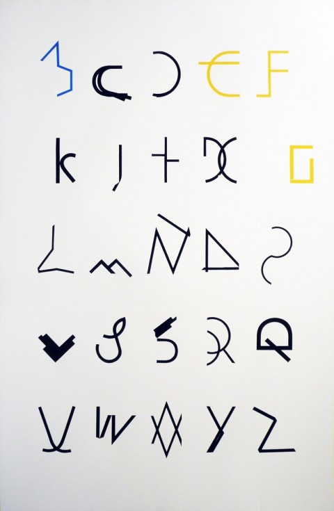
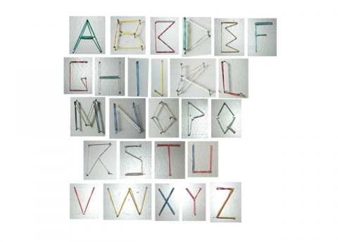
Julie Cloutier and Claire Nereim have physically shifted the forms of the alphabet, creating a B from an A, a C from a B and so on until they reached Z and lost one letter. They write: This shift in form and meaning is intended to both reveal and celebrate the formal deception inherent in the act of reading and to create new meanings by exposing the resemblances and fissures inside our hierarchical alphabet. SHIFT, available in 26″ x 40″, screenprinted on paper, edition of 45.
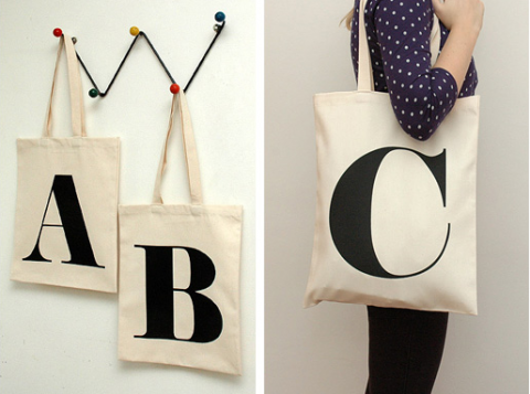
alphabet bags
Alphabet Bags was created in 2008 by business partners and couple Hayley Thwaites & Lucas Lepola, two twenty-somethings living in London. You might be familiar with their first project, the KeepCalmGallery, which I often link to. Their latest project, Alphabet Bags, which launched yesterday gets my two thumbs up for its sheer simplicity. The bags have been made using 100% heavy-weight cotton and have been stitched and screen printed in the UK. What’s your favorite letter?
Type Addicted
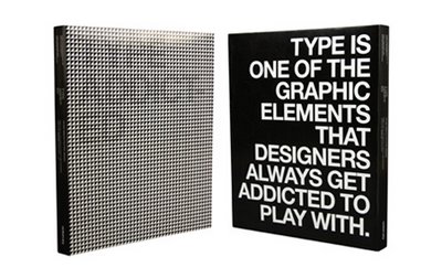
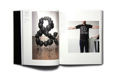
Carl just pointed me to Type Addicted. Instant favorite!
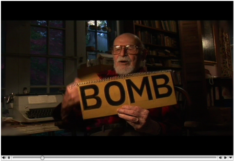
Ed Rondthaler | Trailer
Houseind spent a day filming Ed Rondthaler, the founder of Photo-Lettering, Inc., former president of the American Literacy Council and author of The Dictionary of Simplified American Spelling. They are in the process of editing down all of the film they shot. Click here for the “trailer” he put together so far.
Alphabet Truck
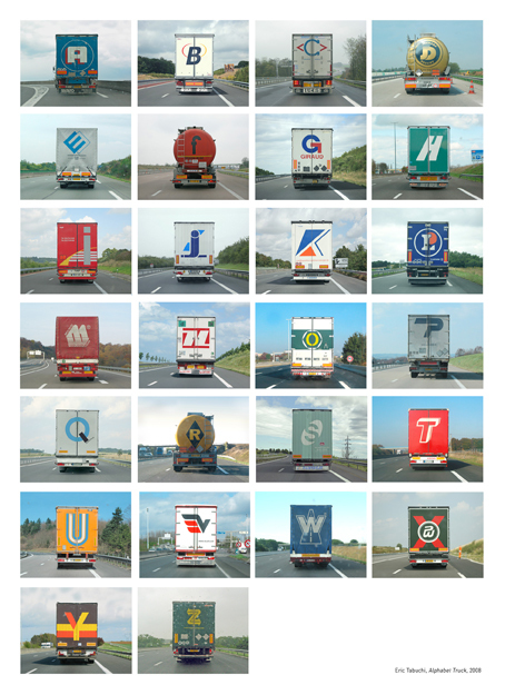
Kids and parents often resort to playing the Alphabet Game to avoid complete boredom during long automobile trips. Photographer Eric Tabuchi has taken the idea a couple steps further in his cool, limited edition artist’s book, Alphabet Truck.
(thank you Hilary, thank you Jim)
porn font. made me laugh.
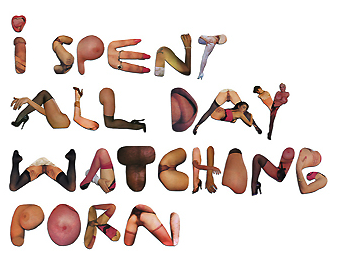
I spent all day watching porn, by Pedro Campiche.
shredding is all about…
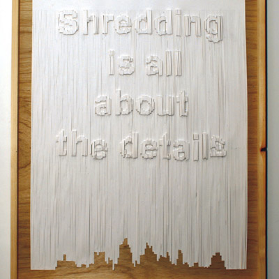
An experimental typographic piece exploring ways of creating three-dimensional letterforms from two-dimensional materials. The work is made from a large sheet of paper which was manually shredded. Each strip was then folded outwards on a pre designed map to create the sentence ‘Shredding is all about the details’. By David Aspinall
(thank you amy)
FF Netto
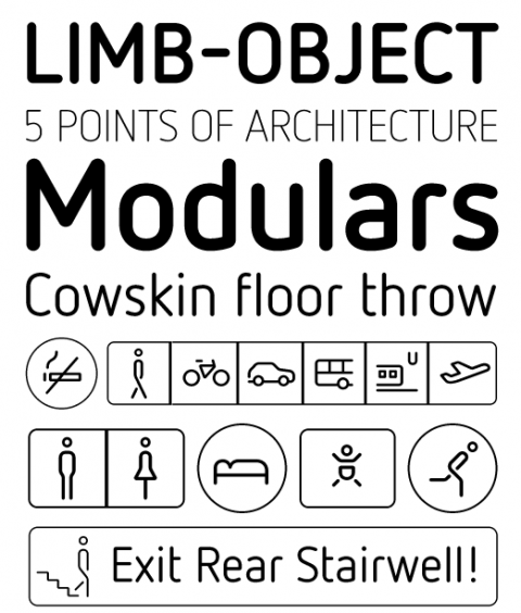
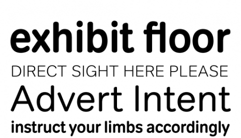
With FF Netto, Daniel Utz has stripped letters of any historical detail, leaving them with the barest, clearest forms possible. This makes FF Netto ideal for wayfinding, where quick recognition is essential. A series of simple and useful icons and arrows add to its utility for information design, and intelligent borders let you group the pictograms using just a few keystrokes.
tondo
Tondo is a professionally produced round face. Always soft, never blobby. Consider it a gentler VAG with more sophistication and text setting possibilities.
Kings Caslon
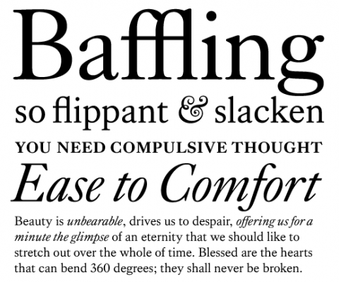
King’s Caslon. Pretty.
Enamel Alphabet
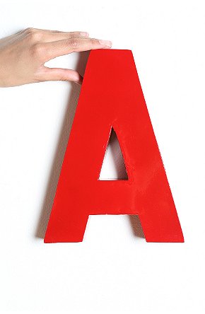
The writing is literally on the wall with these oversized metal Wall Letters.
message of the day
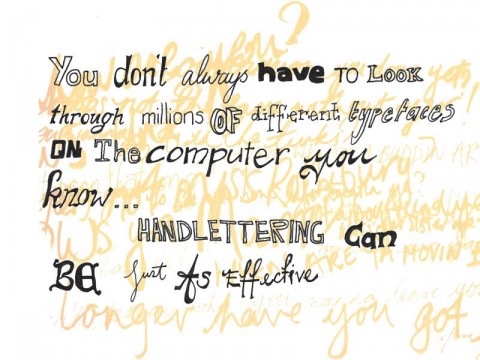
Handlettering message by Alex Cameron
parking garage typography goodness
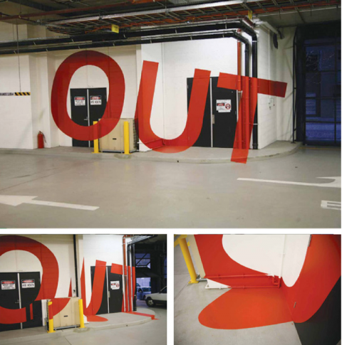
Check out this amazing way-finding-system for the Eureka Tower Carpark in Melbourne. The distored letters on the wall can be read perfectly when standing at the right position. This project won several international design awards and is the brainchild of Axel Peemoeller. Brilliant!
(thank you adam)
Coasters for the typophiliac
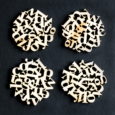
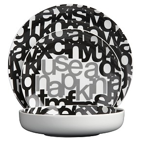
Coasters for the typophiliac. Download the eps if you want to try this design in acrylic, or want to put your own finish on your coasters. EPS includes 4 unique type coasters about 3.5 inches in diameter on P1.
(thank you KJ)
Elastypography
Elastypography by Sarah Kahn.
