Numbers. Yes, just numbers. Oh, so pretty! My favorite? REVENUE!
(another fab find by chris)
This has made my day. Thank you Carl!
Create/Reject asked 50 leading designers about their current favorite typefaces. What a lovely book idea. Too bad it’s sold out! Would have loved to get my hands on one of these! Lovely to know that the coverprice all went to UNICEF!
What typeface would you have picked?
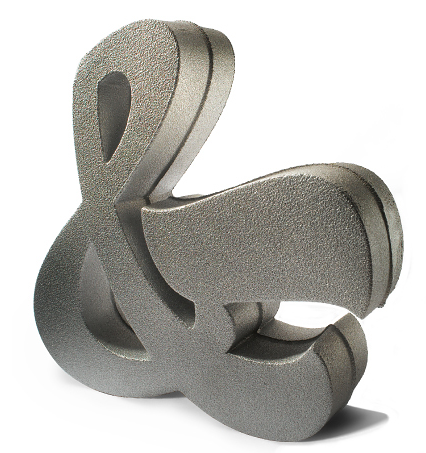
Finally, a perfect wedding gift for the type-obsessed couple: Cast Aluminum Ampersand: $175
The powerful social and economic change brought about when girls have the opportunity to participate in their society. More Info Here.
(via minordetails)
Can anyone of you point me to a ‘movie theatre marquee’ looking font? Thank you so much!
(image originally uploaded by mle.punk)
Love this font by Fanette Mellier. (the navigation of the portfolio site is slightly painful though)
(via whatmademelook)
“A More Perfect Union” spells out the preamble to the United States Constitution with forty friends in a high school gym in New York City. I would have wanted to be the comma girl. Poetic!
(HD) A More Perfect Union from Andrew Sloat on Vimeo.
(thank you craig)
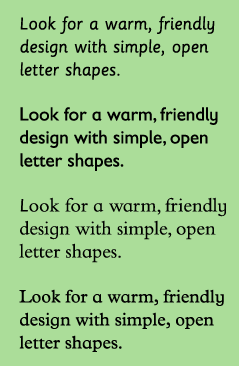
Most children learn to read going letter-by-letter, learning which sounds go with which shapes until they can blend the sounds together to form words. This is why new readers proceed slowly and sometimes struggle with pronunciation and syllable stress.
The efforts of new readers can be supported by making sure their texts use inviting, easy-to-read typefaces, set in the most readable way.
(via urbanpreschool)
For Seasons is a poetic, typographic experiment about memories. This just totally made my day! Download “For All Seasons“!
(via olive is green)
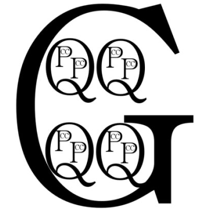
Memory Tricks: Remembering How Many Cups in a Gallon. It’s like “the woman who swallowed a fly” for cups and quarts!
(thank you faith!)
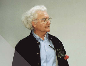
Tomorrow (May 24, 2008) is Adrian Frutiger’s 80th birthday. Send him a birthday message here. Frutiger is one of the most influential type designers of the 20th century; his Univers and Frutiger typefaces are still ranking amongst the most commonly used fonts today. His types include Meridien, Egyptienne, Serifa, OCR-B, Centennial and Avenir.
(image via magtypo.cz)
(thank you jeff!)
Fonts are like cologne: A bad choice speaks louder than a good one.
– Justin Feinstein
Love this! Critter font by Craig Frazier. The O is so sad. Boooo hoo.
TypeSQL – typeface connection visualization tool by So, Won-young
alphabet by luc gut
Tastefully arranged number signs from a type specimen book issued by the Schelter & Giesecke foundry of Leipzig.
Katarine starts with the simple structure of a face like DIN or Trade Gothic, but ends up being much warmer, thanks to its soft finish. A full range of figures, small caps, ligatures, arrows, and even banners of various styles are all included.