The Rather Difficult Font Game
(thank you nishad)

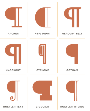
Like most punctuation, the paragraph mark (or pilcrow) has an exotic history. It’s tempting to recognize the symbol as a “P for paragraph,” though the resemblance is incidental: in its original form, the mark was an open C crossed by a vertical line or two, a scribal abbreviation for capitulum, the Latin word for “chapter.”
Read Jonathan’s full post: Pilcrow & Capitulum
FontFont have announced that they are to release Helvetica Serif, following the discovery of drawing of that typeface by Max Miedinger. The sketches which were discovered by Miedinger’s granddaughter have been redrawn to create the digital version shown above. The font has been released today, April 1st. And yes, it’s a joke.
Ministry of Type likes the Ampersand. So does swissmiss.
“…these hand painted alphabet blocks have two square sides and four narrow, rectangular sides.” Post Typography, 2004.
(via minor details)
(via red / todayandtomorrow)
Every year Stephen asks a few graphic and type designers to select their favorite font releases from the past year. Here’s 2007.
(thank you carlos)
Letter Ice is a design patent pending product line that’s made from a patented, high-gloss FDA tested silicone, that’s oven-safe to 572ºF (and -58º F) and is cool to the touch within minutes after baking. Letter Ice is currently seeking Retail Stores and/or Independent Sales Representative’s both in United States and abroad.
So, now what font is it?
(thank you arezu)
(thank you billy)
I miss hearing/speaking french. (sigh) Maybe I should find myself a french speaking intern?
(via swisslegacy)
Sweet but not saccharine, earnest but not grave, Archer is designed to hit just the right notes of forthrightness, credibility, and charm. Archer, the colorful slab serif by Hoefler & Frere-Jones
Chocolate Scrabble, seen on designsponge and ilovetypography.
I am always mesmerized by hand-drawn typefaced. This one is called Layerz by Peèle.
Grant created a custom font with his daughter’s handwriting over at fontifier. Love it.
I was pretty much speechless when I opened a package I received from House Industries last night. Inside I discovered the stunningly beautiful Alexander Girard Alphabet Blocks. They have been created by House Industries in a collaboration with the estate of reknowned mid-century designer Alexander Girard. The 28 wood blocks feature alphabets based on the forthcoming Alexander Girard font collection and a cleverly-adapted House Industries factory logo puzzle.
Alexander Girard (1907-1993) was a design virtuoso whose work ranged from the incredibly comprehensive and unforgettable Braniff Airways identity to high-profile restaurant designs such as New York’s La Fonda del Sol. A longtime textile designer for Herman Miller, Girard’s work created a powerful artistic statement that is still having a profound effect on interior and exterior architectural environments today.
We are now proudly displaying these blocks in our living room. They are simply too beautiful to be tucked away on one of Ella’s bookshelves. This is definitely my favorite new gift for the designy parent, uhm, I meant the KID of a designy parent.
Thank you Andy!
(thank you Dana)