Typeface : “ULTIMATE WORK : PROGRAMING (OS X)
(via wrongdistance)
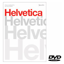
The perfect gift for any type lover: Helvetica. The DVD includes the full 80-minute feature film, plus over 90 minutes of additional interviews with Massimo Vignelli, Matthew Carter, Erik Spiekermann, Hermann Zapf, and more. NTSC, 16×9 anamorphic widescreen presentation, full-color booklet, English and German language subtitles. Buy it here!
Test a range of special characters, using default fonts installed on various platforms and show the special characters at a few sizes, to get a rough idea of how they would look when scaled with this ‘testing special character’s page‘ by Mike Harding.
Please note that the font you select will only be displayed properly if that font is installed on the machine you are testing. The test sheets aren’t meant to be plain lists that just show you graphically what is available for each font, but is also intended to help you get an idea if a particular font is actually installed on the system you are working on. If the font does not exist, then everything defaults to Arial.
Kit Hinrichs has designed Pentagram’s 2008 Classic Typographic Calendar using twelve typefaces designed by typographer Matthew Carter. “I wanted to bring a new awareness of typographic design through this calendar,” said Hinrichs. “Typefaces are pervasive in our daily lives in everything we read and see around us and yet most people are oblivious of them or the circumstances in which they were created. We can gain a new perspective on our world by studying the origin of typefaces. I hope the calendar will encourage a new sensitivity to the importance of typeface usage and the work of Matthew Carter.”
The calendar is available in two sizes, a supersize 33-by-22 inch version suitable for wall hanging and a smaller 18-by-12 inch version appropriate for desk use. Both versions are available in the US and UK at kenknight.com. The price of the supersize calendar is $36 and the smaller desk and wall calendar is $22. (Prices do not include shipping.)
(thank you michael b.)
These Helvetica posters by David Carson (who openly admits he hates Helvetica) are just painful. Boo. Boo. Boo.
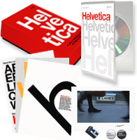
YAY! I’ve received my much anticipated Helvetica DVD last night. I ordered the limited-edition package in a custom box that includes the retail DVD, three letterpressed mini-posters, a color C-print of a still from the film (one of ten different stills) signed by director Gary Hustwit, two love/hate Helvetica buttons, and a letter of actual Helvetica metal type! Psyched!
Boasting more than 1,200 characters, Alejandro Paul’s Feel Script evokes the lilt of a bossa nova combo and the come-hither allure of a silver screen starlet. Endow your copy with its generous alternates, exquisite ligatures, and dreamy swashes.
The perfect gift for the typography and chocolate lover: Typolade. You can order your custom text. (Site is in german only.)
(via playboi.de)
Wonderful collection of human crafted fonts and typography.
(via brandflakesforbreakfast / via core77)
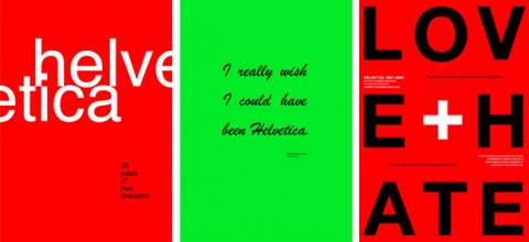
To celebrate the 50th anniversary of the Helvetica™ typeface, Linotype™ invited designers worldwide to take part in the Helvetica NOW poster contest.
More than 1,000 posters were submitted to the contest and are on the ballot for the first round voting. With your help, the 200 posters with the most votes will advance to the second round. Then you can select your favorites again to declare a winner. The winning entries will be announced in the January 2008 LinoLetter. If only they would show them bigger. Too bad. Browse through all the posters, but be prepared for some poor and inappropriate designs.
What was this guy thinking? Or this one? And, hello? These guys and this poster made me laugh.
(via swiss legacy)
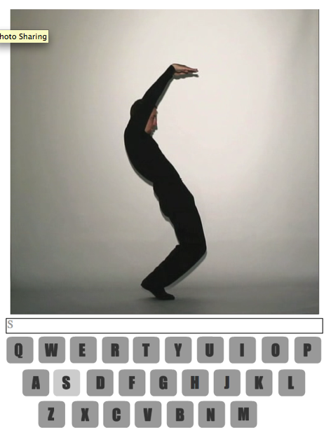
Hours of Typography-Dance-Fun to be had with DanceWriter!
(via my friend michael who now works for hillmancurtis)
In this digital age of computer-generated graphics and typography, it’s refreshing to find typographers who still believe in working by hand. No longer relegated to designer’s sketchbooks, hand-drawn type has emerged from the underground as a dynamic vehicle for visual communication—from magazine, book, and album covers to movie credits and football advertisements. As the practice and appreciation of hand-drawn type grows, it’s time to celebrate the work of those typographers whose every letterform is a work of art.
Hand Job, by Michael Perry
(thank you Margherita)
I finally had a chance to see Helvetica, the movie. I absolutely loved it. My favorite part was when Lars Mueller walked Gary and his team through the streets of London (?) pointing at helvetica sightings. I agree with his statement that “Helvetica is the perfume of the city!”
Erik Spiekermann was priceless. His comments made me laugh out loud.
Hat tip to Gary Hustwit and his team. He was at the screening and answered questions. What a warm, funny, down to earth guy. Refreshing to see that he managed to stay so humble, considering the amazing and well-deserved success of his documentary!
It’s so bad, it’s good.
According to typographica.org at least 1,800 new commercial typefaces were released in 2006 alone. This count does not include freebies, custom and proprietary commissions, or even individual weights. Check typographica’s list of favorite fonts of 2006.
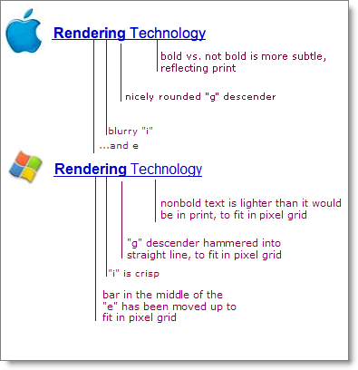
Apple and Microsoft have always disagreed in how to display fonts on computer displays. Today, both companies are using sub-pixel rendering to coax sharper-looking fonts out of typical low resolution screens. Where they differ is in philosophy.
Apple generally believes that the goal of the algorithm should be to preserve the design of the typeface as much as possible, even at the cost of a little bit of blurriness.
Microsoft generally believes that the shape of each letter should be hammered into pixel boundaries to prevent blur and improve readability, even at the cost of not being true to the typeface.
….
read full article, by Joel Spolsky, a software developer in New York City
(thank you larry)
See and hear what Neville Brody thinks of the Helvetica font! Great insights from a type master.
(via netdiver)