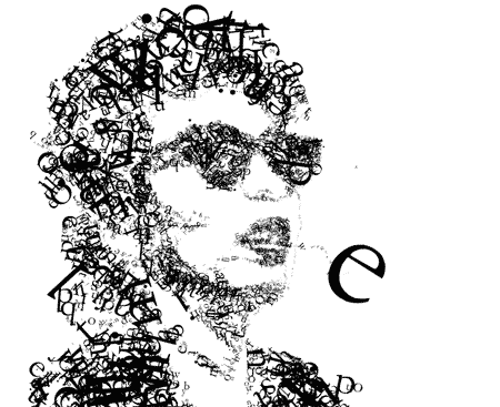
This typographic illustration made me look. Love it! Check out the site.
(via truetypelies)
Which company uses which font in their logo. A useful list.
(via brandspankingnew)
The city has no shortage of sign lettering, and one expert, Paul Shaw, has amassed 5,000 photographs of lettering in New York. He thinks he has only scratched the surface.
A Man Who Minds His P’s and Q’s, a NewYorkTimes Article by Christopher Gray
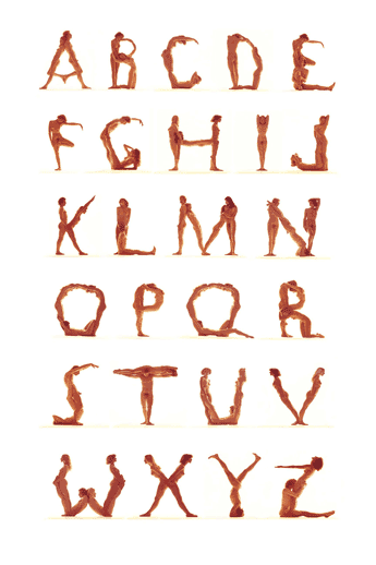
Love Letters by Rowland Scherman, 1975
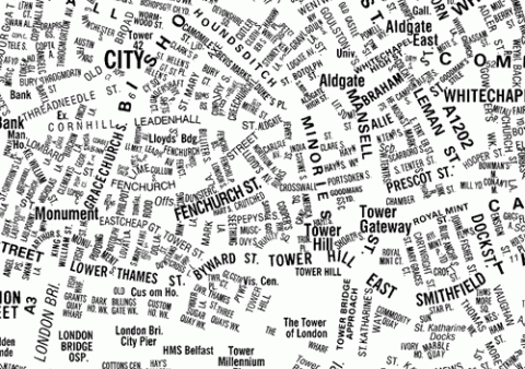
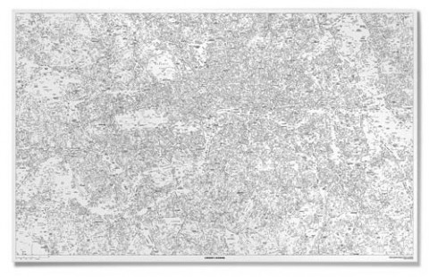
Londong based NB: Studio created a type driven map of London. I’ts a beauty! Oh my, this would love fantastic on our walls! Me want! Me want! You can order it here.
(via suspect device)
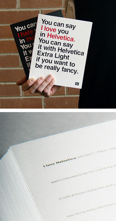
Choose sides in the design world’s love/hate relationship with Helvetica, or have it both ways. This two-sided notebook features a loving quote in Helvetica Std on one cover, then flips to reveal a darker intent. Ruled throughout with additional quotes in unobtrusive 3 pt. type. Favor one side or work from both, toward the middle. A center divider keeps the peace. 192 pages, 6 3/4″ x 8 1/2″.
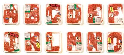
Robert Bolesta has created an alphabet out of formed chunks of ground beef in styro trays.
(via designobserver + boingboing)
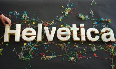
1000 pt. Helvetica cake, created by matt michaluk, alistair webb and adam tickle for Helvetica’s 50th birthday. Very cool!
Ella, want a Helvetica cake for your first birthday? (I can see G rolling his eyes in disbelief!)
(via BBlinks)
There are many reasons why Helvetica is so widespread. The most obvious being that a few weights have been bundled with the Mac OS for years. It is arguably the most respectable of the “default” fonts. But it’s also used because it’s a safe, neutral choice.
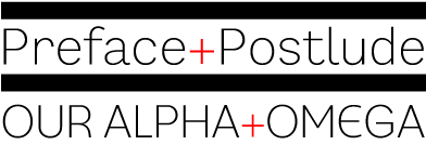
I comletely agree with Kate over at forme-foryou.com: Usually free fonts make me gag, but fontshop.com gives away a free font every month and this month’s font, Preface, aint too shabby. I haven’t had time to test it out, but so far I love the lowercase l’s. I’m a sucker for light sans serifs, such as Meta Light (oh look at that letter g!) and Helvetica Neue 25 Ultra Light, my staples at work. *drool*
The 100 best fonts of all time.
(Thank you Red!)
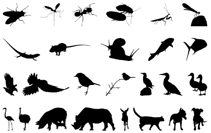
KAPITZA SHOP, a new online shop specialising in picture fonts and illustrations, presents its’ new release Creatures, an animal outline font. Creatures consists of 40 cute and creepy animal outline illustrations.
I love the ducks!!!
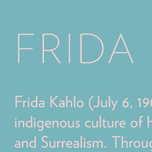 Hoefler & Frere-Jones released Verlag, an expansion of the fonts they created years ago for the Guggenheim. It’s available in 30 styles, including a very tasteful Compressed set and some thoughtful figures and punctuation.
(via typographi)
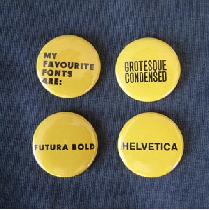
Fonts Badge Set ( Sans Edition), by Angry-Associates.com
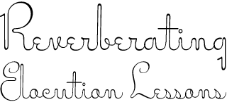
Miss Stephams Font, available at veer.com
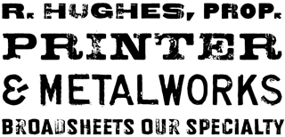
Designer Rian Hughes presents four new worn and weathered display faces over at Veer.com. See them all.
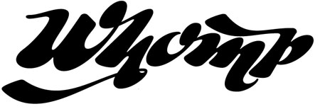
Whomp takes its inspiration from the work of an American master in sign painting and alphabet manipulation: Alf Becker. In 1932, Becker began designing a series of alphabets to be published in Signs of the Times magazine at the rate of one alphabet per month. Nine years later, 100 of those alphabets were compiled in one book that became an enormous success among sign painters. In the late 1990s and early 2000s, many Alf Becker alphabets were digitized with blurbs that falsely credit them as “an Alf Becker typeface”. Alf Becker was not really a typeface kind of guy. He was more of a calligrapher and sign painter. His alphabets were either incomplete or full of variations on different letters, and didn’t become typefaces until the digital era.
Whomp™ – A Veer Exclusive

Ludwig Gatzke’s compiled nearly 400 Web 2.0 logos. WOW!
Click here for a breakdown of the fonts used in some of the fontshop’s favorite brands.
(via design*notes)
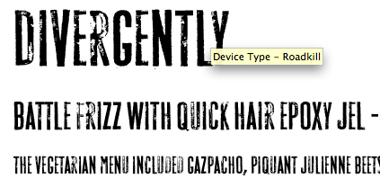
Me likey: Roadkill Font by Veer.