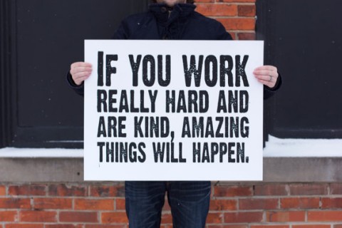
This hand-pulled screenprint by Kyle & Courtney Harmon *must* go up at Studiomates. Conan O’Brien is a wise man.
More / Less
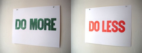
Sometimes you feel like you should be doing more. Other times you feel like the right thing to do is less. This letterpress print, by Jason Polan, helps once you decide which one to strive for.
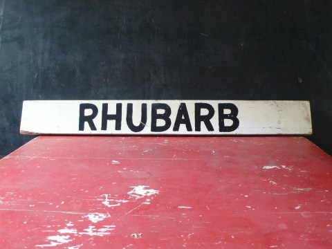
Rhubarb
I see beauty (and humor) in this Vintage Wood Road Side Produce Sign. Rhubarb!
FontShop Plugin
FontShop CS Plugin Beta from FontShop on Vimeo.
The new FontShop plugin lets you use all fonts they distribute for mock-ups. It allows the designers to experiment with font variations, and to show different typographic options to their clients before actually purchasing anything.
A Typographic Dating Game
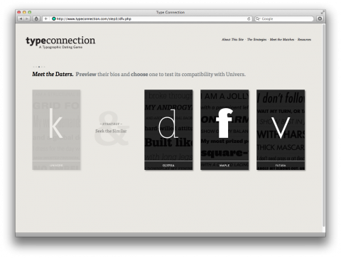
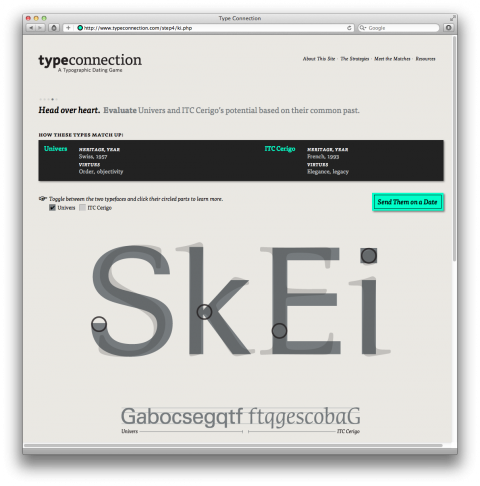
Aura Seltzer pointed me her newly launched typographic dating game called TypeConnection that helps you how to pair typefaces.
Sentimental Journey
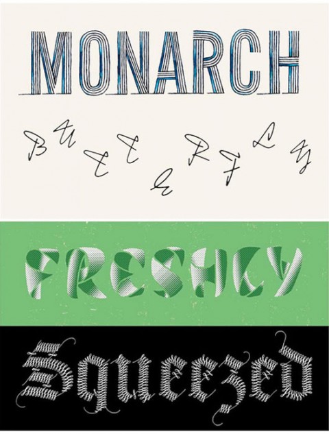
Sentimental Journey is a typographic postcard project by poet Kate Camp, graphic artist Sarah Maxey and typeface designer Kris Sowersby. It’s a limited edition of 500. Printed by Freestyle Total Print in Wellington, New Zealand, 2011, on 300gsm Munken Pure.
Asteriks vs Commas
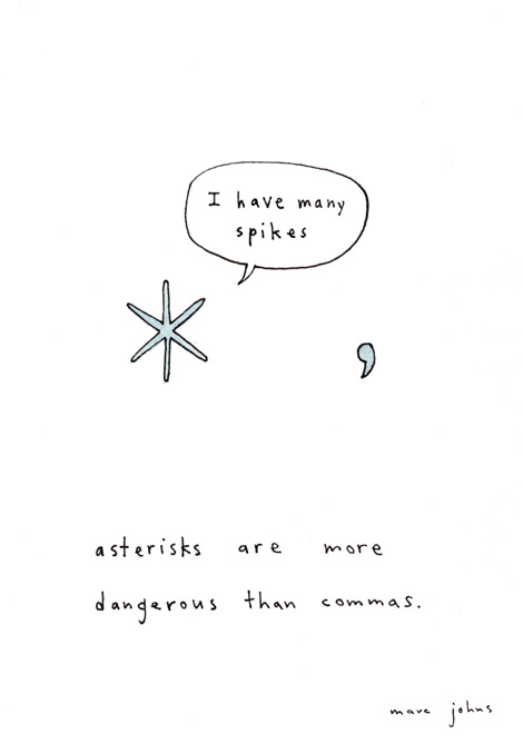
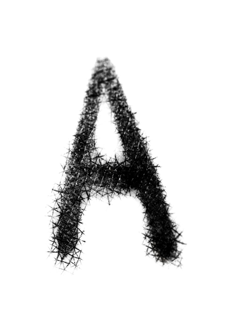
Something I always suspected, now confirmed by Marc Johns: Asterisks are more dangerous than commas.
Custom Family Pillow
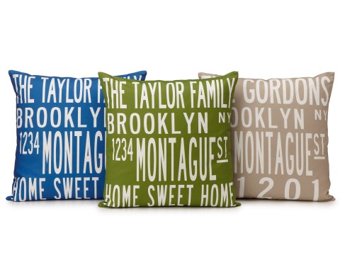
In case you keep forgetting where you live, you might want to get a Custom Family Pillow with your address on it. Great gift for someone that just recently moved.
Vernacular Typography
For the past 10 years, Molly Moodward has been photographing environmental typography and organized her images by place and category on VernacularTypography.com. As of now, the website has over 5,000 images of urban typography from 10 different countries, including Argentina, The Bahamas, Chile, Cuba, England, France, Italy, Japan, Spain, and the US.
Molly just started a Vernacular Typography Kickstarter Campaign to help build up her digital archive. It’s a beautiful projects which helps preserve, and promote the vanishing examples of lettering in the everyday environment.
Totally backing this campaign. Join me?
Mark Your Calendars for Linotype: The Film
Linotype: The Film is a feature-length documentary centered around the Linotype type casting machine. Called the “Eighth Wonder of the World” by Thomas Edison, it revolutionized printing and society.The film tells the surprisingly emotional story of the people connected to the Linotype and how it impacted the world.
The movie’s world premiere is February 3rd at the SVA Theatre in New York City with Steven Heller moderating the Q&A afterwards. Tickets are on sale now over on their screenings page.
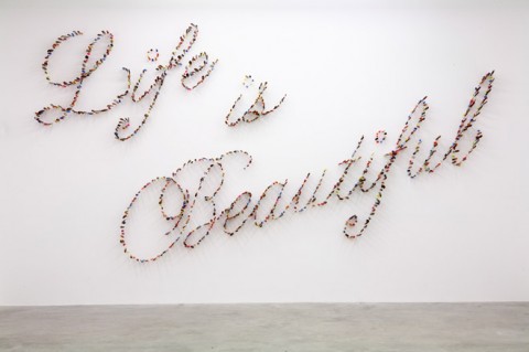
Life is Beautiful
Life is Beautiful is written with hundreds of knives stabbing the walls at the Pinault Foundation’s Palazzo Grassi, by Farhad Moshiri.
Big Letters
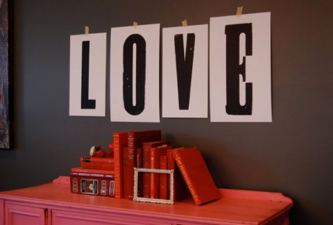
Wood type makes my heart beat faster! Check out these giant letter prints by Christie & Caleb, owners and operators of a small traditional letterpress company, located in the sunny South.
They recently were able to access three sets of rare and huge, antique wood type. These particular sets of type cam from a now defunct old print shop in Arkansas, where they were used to print giant Circus billboards in the 1940’s and 50’s!
The Big Letter Prints are printed on 140# cover, which is sturdy enough to lean on a shelf or mantle, or you can personalize your own words or phrases! Kids room, anyone?
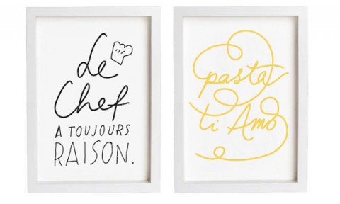
Pasta Ti Amo
If I had walls for artwork in my kitchen, I would order these typographic prints right now.
Le chef a toujours raison = The chef is always right
Pasta, Ti Amo! = Pasta, I love you
Here’s To The Crazy Ones
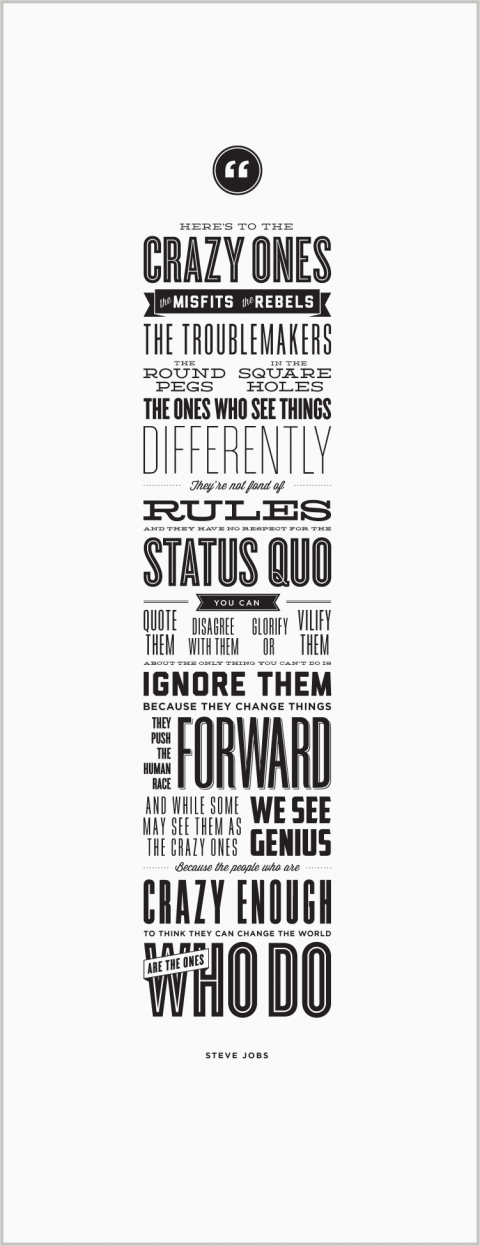
Purchase this fantastic letterpress poster and 100% of the profits are donated to Acumen Fund‘s mission to end worldwide poverty. #ordered.
(via HolidayMatinee)
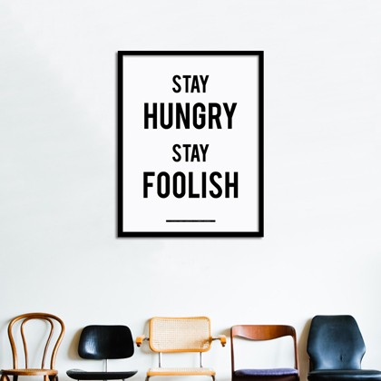
Stay Hungry Stay Foolish Poster
This Stay Hungry Stay Foolish Poster is a tribute to visionary people. Thanks Stewart Brand and Steve Jobs
(via The Next Web)
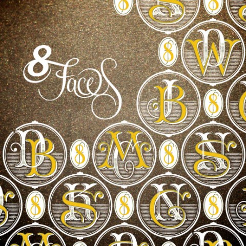
8 Faces #4
Issue #4 of 8 Faces is out! Yay! It’s quite an impressive line up in this issue:
With a cover by Jessica Hische, printed on metallic stock with white ink and foil-blocking, issue #4 features interviews with John Boardley, Craig Mod, Kris Sowersby, Doug Wilson, Nadine Chahine, David Březina, and Silas Dilworth and Neil Summerour of TypeTrust.
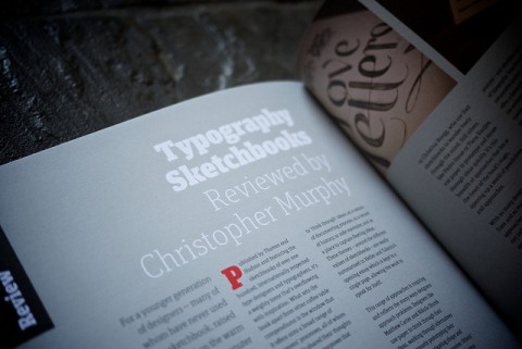
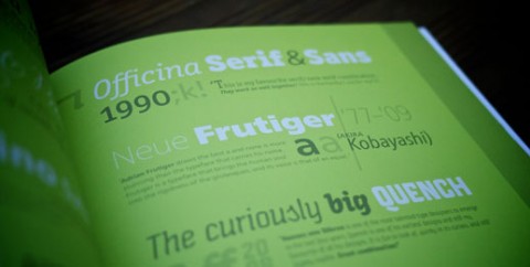
8 Faces Issue #4 features an introduction by Jon Tan, a review of Typography Sketchbooks, and web typography tips from Typekit’s Tim Brown. Every copy ships with an exclusive new catalogue courtesy of Typotheque. Ships mid-December.
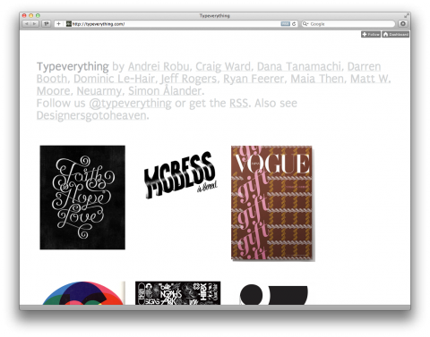
TypeEverything
I just spent a good 20minutes on typeeverything.com. Long live Typography.
Average Font
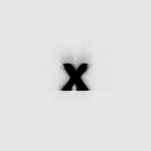
Average Font by Mortiz Resl shows what a font would look like if it consisted of all typefaces installed on his system. Every character from a to z is drawn using every single font with a low opacity. In total there are over 900 typefaces in his library. And, he didn’t exclude the ‘ugly’ ones.
The Average Font is typographic poetry.
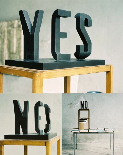
YES NO
I am a big fan of all things Markus Raetz. The fact that he now made a Typographic Illusion Scultpure makes me swoon.
