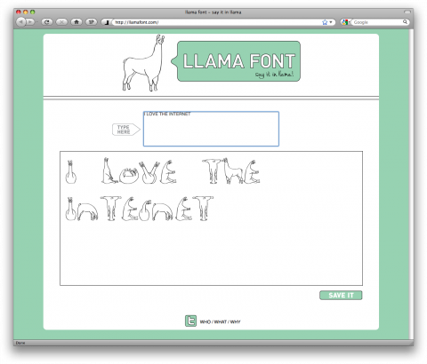
Avery Oldfield created Llamafont.com, a site that allows you to type a message in a font made of llamas and share it with your friends. Why? Because llamas make everything better. Totally absurd and made my day!
Online Kerning
Go to this url, click between two letters and use the A and S keys to kern. Fun.
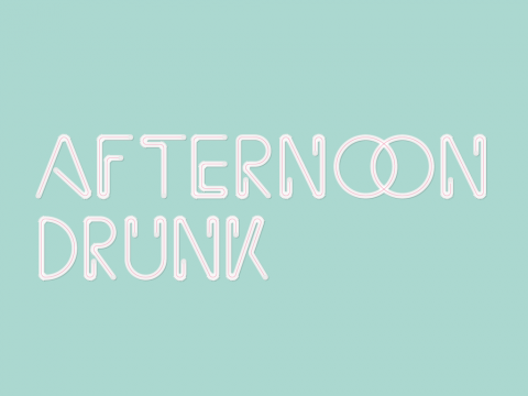
Afternoon Drunk
The idea behind the Phraseology Project is quite simple and wonderful: You submit a letter, word or phrase and they’ll make it look beautiful with type. Please be sure your word or phrase is under 20 characters. (My 5year old would love that typeface)
(Thank you Patrick O’Dell)
Helveticons
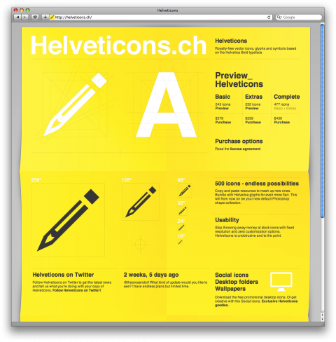
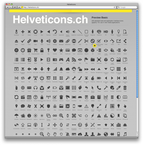
Helveticons are Royalty-free vector icons, glyphs and symbols based on the Helvetica Bold typeface.
(thank you marco)
Photolettering.com
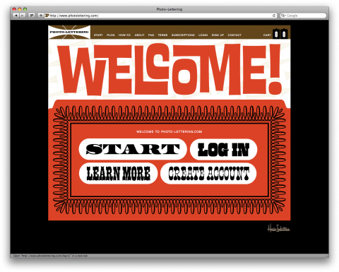
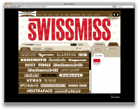
House Industries just announced photolettering.com which allows users to purchase single settings for $7 each, or for about $2 each, through several subscription programs starting at $15 per month. The final product is a downloadable vector-based .pdf file that can be placed as art and edited in any drawing program. At the time of launch, photolettering.com will include 40 alphabet styles that have been optimized specifically for the online interface but the collection will be continuously refreshed with a constant flow of innovative new offerings.
(Thank you Andy!)
Design is…
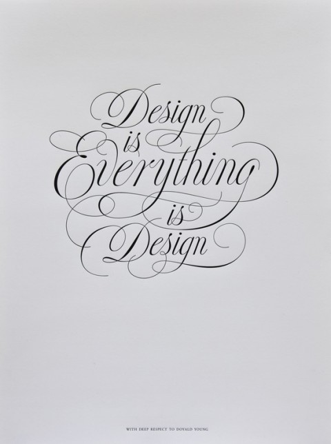
Josh Higgins started a project with Doyald Young in November of 2010 that got never finished. It was to be a gift from himself and Doyald to one of their mutual friends. Before the poster was finished, sadly, Doyald passed away. The day after his passing, Josh contacted Jessica Hische and she graciously and beautifully brought the project to life. The poster took a whole new direction from a gift for a friend to a way to raise money for a type scholarship in Doyald’s name.
(I just ordered one but am a little confused at the $50 shipping fee.) Ah! It was a typo! Whew!
(via designworklife)
Rich Quote Mark
Simple Rich Quote Mark print over at I need nice things.
My dirty laundry
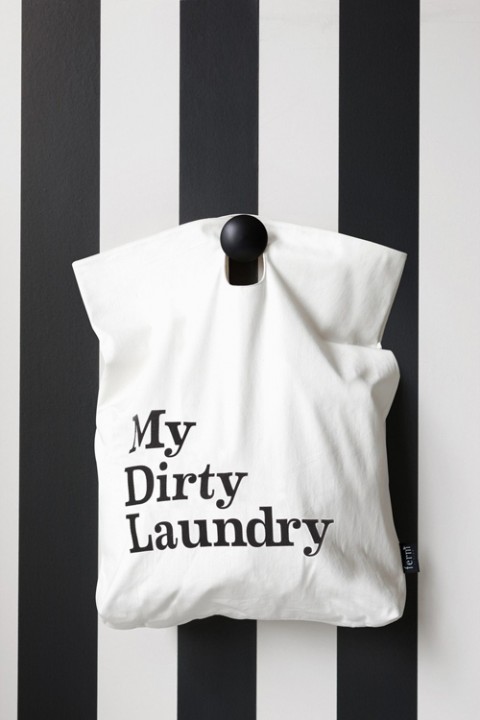
Both modern and practical, especially if you live in an apartment building or lack floor space – keep the laundry bag on hook and when it’s laundry time, grab and go.
NYC Type
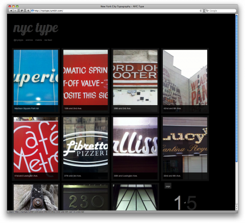
NYCtype is a lovely side project by Luke Connolly. I am sure every typography enthusiast will aprove!
“Cure for the Common Font”
As I didn’t make it to SXSW this year I am excited to see that presentations are made available online. One of the panels I would have loved to attend was the “Cure for the Common Font” — A Web Designer’s Introduction to Typeface Selection” with Frank Chimero, Tiffany Wardle, Stephen Coles and studiomate Jason Santa Maria. It just went up as an audio piece with slides over on Typographica.org.
“Cure for the Common Font” — A Web Designer’s Introduction to Typeface Selection
Letter March
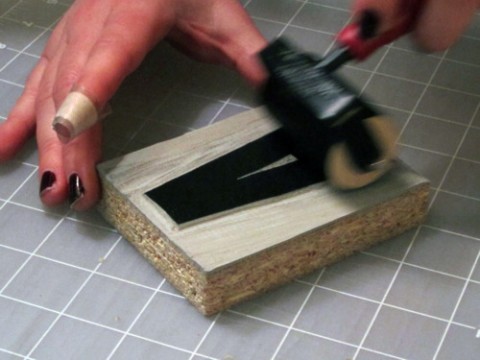
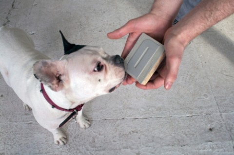
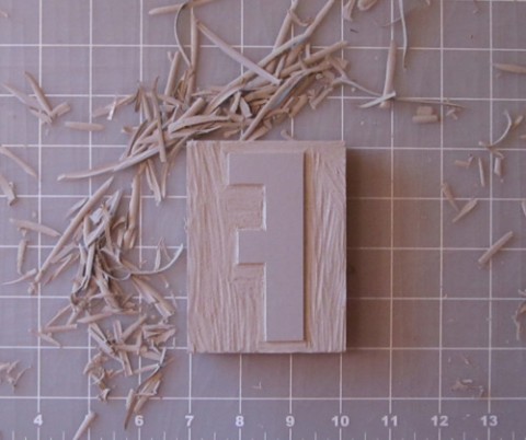
My studiomate Aymie is carving a linocut letter a day for the month of march. Chosen typeface: Champion Gothic by Hoefler & Frere-Jones. Lightweight was chosen based on a deep rooted affection with its ampersand. I can’t wait to see the posters she’ll be cooking up with these!
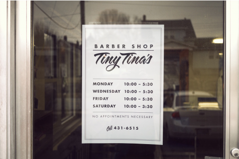
Chris Glass and his Barber
This Barber Shop Sign post is a prime example of just how awesome (and talented) my friend Chris Glass is.
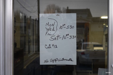
Chris needed a haircut and his barber needed a new sign in the window. So, he designed one. Check it out on his site for rollover before/after effect.
Fellow designers, let’s follow Chris’ lead and make the world a more beautiful – typographically speaking – space! What sign are you taking on?
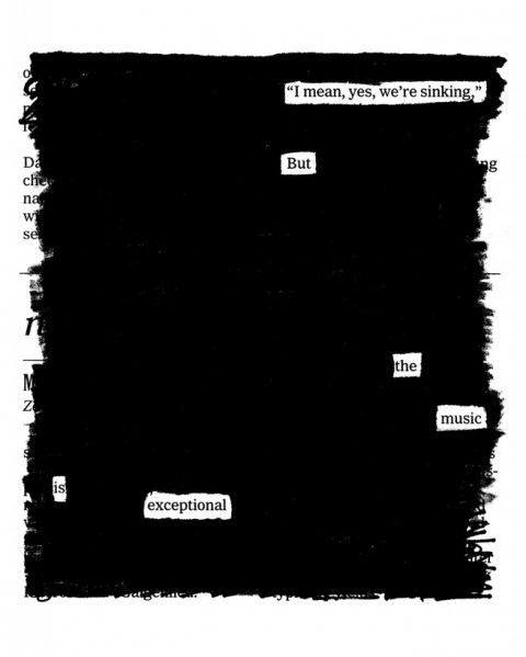
Overheard on the Titanic
Today’s 20×200 print made me smile and hit the purchase button: Overheard on the Titanic by Austin Kleon.
Nice To See You
(photo by Jon Tan)
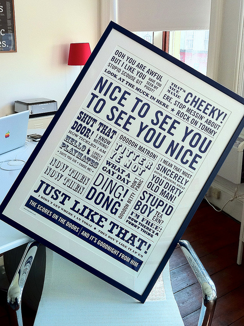
This ‘Nice to see you’ Poster is a one-color screen print inspired by well-known quotes from comedians of the last 30 years. Guaranteed to bring a smile to any Brit’s face.
It’s a limited edition of 500, screen printed by Ink Posters. A collaboration between Joff Casciani, Ollie Wood and Haydn Evans.
(via Jon Tan)
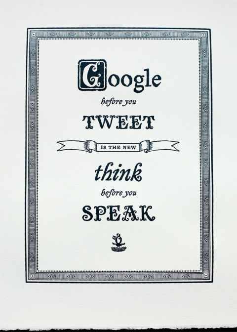
Google before you Tweet
A shame this letterpress print by Joe Newton is sold out.
it’s not the end.
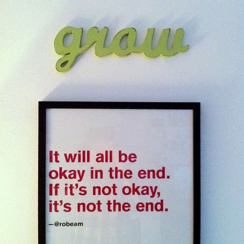
The above quote caught my eye and made me smile. The poster hangs at the Mild Bunch HQ and features their studiomate’s @robeam’s tweet, immortalised as a poster by Erskine Design for New Adventures. Too bad it’s not for sale anywhere. Or is it?
Update: A commenter below states that this is a quote by Fernando Sabino.
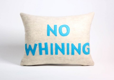
No Whining
I need this No Whining Pillow for my daughter.
Tilo Red = 1
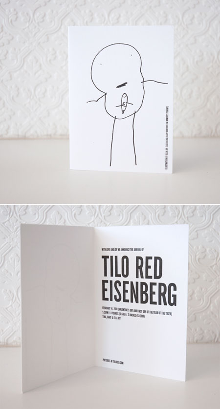
As if Valentine’s day wasn’t enough to be giddy, we are also celebrating swissmisster’s 1st birthday over here at casa swissmiss! I feel like it was just yesterday when I wrote this post. And yes this means it took me an entire year to finally post about Tilo’s birth announcement cards which were printed by the wonderful Kyle Van Horn. The drawing in the front of the card is by Tilo’s sister Ella. It was her first stab at stick figures. I was 7months pregnant at the time. So she drew me with Tilo in my tummy. Adorable? YES!
Snow Type
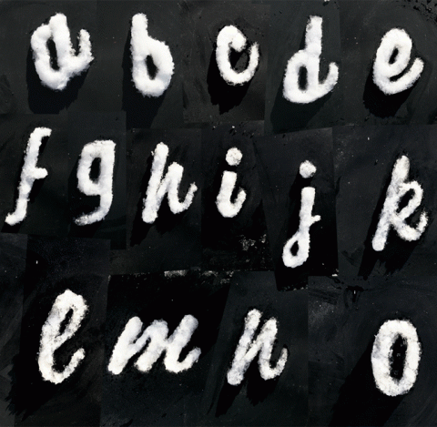
What does a Norwegian Typography lover do when there is too much snow? They go outside and make type from snow. Of course!
Letterpress Wallpaper
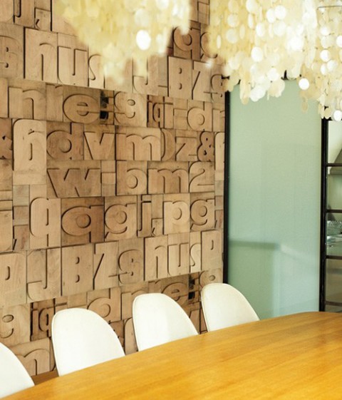
Typology wallpaper from Wall & Decò. Made me look. Made me want to order.
Erik Spiekermann on Gestalten.tv
The folks of gestalten.tv just pointed me to their most recent video with Erik Spiekermann. Listen to the German King of Typefaces talk about new visual languages, design processes, the analogies of music and typography.
Watch their complete line up of video interviews on gestalten.tv.
Make Do and Mend
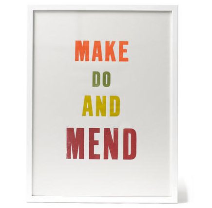
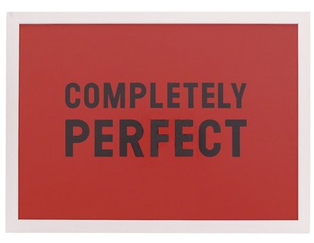
I love clear messages like this one by Gail Bryson: Make Do and Mend. Or take this “Completely perfect” one. Ha!
