Once Tilo has his own room (in a few month’s hopefully, if everything works out as planned) then I’d like to hang one of these bedtime posters on his wall. What an adorable, typography driven, kids room print. Great gift too!
(via pinterest)
Once Tilo has his own room (in a few month’s hopefully, if everything works out as planned) then I’d like to hang one of these bedtime posters on his wall. What an adorable, typography driven, kids room print. Great gift too!
(via pinterest)
I am in love with Jessica Hische’s Letterpressed Letter Posters. I especially love the Y, the O and the R. Check them all out over at JessicaHische.com. A perfect gift for new parents, or any type-lover that is.
I don’t know about you but I *love* the vintage feel and look of enamel signs. So, the idea of creating my own custom sign makes my heart beat faster. Ramsign is a small Danish company that specializes in making and selling classic enamel signs based upon original designs and techniques. I am tempted to get one done for our studio door with 612a on it.
Does anyone know of US based companies doing the same?

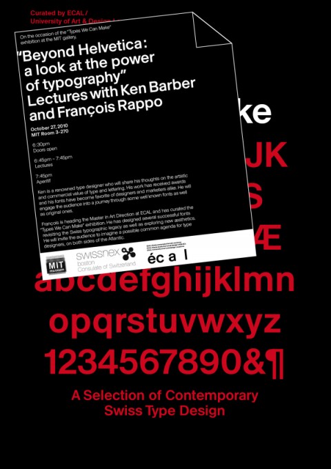
Here’s an event I’d go to in a heartbeat if I’d live in Boston: “Beyond Helvetica: a look at the power of typography” – Lecture with Ken Barber and François Rappo at MIT.
On October 27, 2010 from 6.30-9pm at MIT Room 3-270

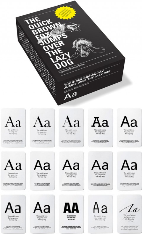
The Typeface Memory Game is the perfect gift for the Typography obsessed. It includes 25 variations of the letter ‘A’, each in a different letter type.
Typographic information about the letter is included on the card, and a separate folder provides a general history of the typography. Among the letter types included in the game are Akzidenz Grotesk, Baskerville, Centaur, Garamond, Helvetica Rockwell, Times New Roman, Univers and many more.
(thank you Joanna)
The Web Font Awards is the first ceremony to celebrate the newfound typographic freedom that Web designers are experiencing across the globe. The competition will recognize the designers and websites that are putting this emerging technology to greatest use. Aimed at promoting Web font awareness and adoption, the Web Font Awards is open to eligible users of any Web font service or technology that uses an @font-face declaration.
(via behoff)
The latest issue of FREITAG’s The Daily Reference made me smile. More info here.
Lucky Berliners! They have a Museum for Rescued Letters.
The Museum of Letters in Berlin is better known to the locals as Buchstabenmuseum. The gallery houses a huge collection of salvaged letters that were once part of large store and factory name signs. With the current rise in popularity of typography and a desire to preserve the past before it is too late, the Museum of Letters has been attracting crowds since its opening four years ago.
Can we please start one of these in NYC? I have the first artifact sitting right here on my desk. Look!
Linotype: The Film Trailer from Linotype: The Film on Vimeo.
Oh, what a tease Doug Wilson just sent a long: Linotype: The Film is a documentary about Ottmar Mergenthaler’s amazing Linotype typesetting machine and the people who own and love these machines today. Can’t wait to see the movie when it’s out.
A site devoted to teach laywers the ins and outs of Typography? Yes! Why? Because good typography makes your written documents more professional and more persuasive. Typographyforlawyers.com
(thank you Josh)
You can’t escape drying the dishes, but hey, you can make it more fun with The Kitchen Sink Drama Tea Towel Collection. The above towel features The Escape by Katherine Mansfield.
(They need better product shots. Such a great product idea, but the images are not helping.)
This 2011 Calendar Scarf is a beauty. It’s almost poetic how you are supposed to pull on the yarn as time goes by. If I didn’t have kids, I’d totally put one of these on my walls. In fact, this is the first time I think I endorsed a wall calendar. I usually can’t stand them.

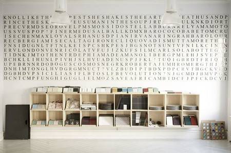
This picture made my Typography loving heart jump: Tiles with letters on them, by Made A Mano.
(via styl.in)
Just had a peek at my favorite etsy shops and found this beauty of a large helvetica ‘e’. How fantastic would this look in Ella’s room? (le sigh) Oh, and big giant ampersand anyone?
Fraktur writing for the Legacy of Letters italian tour, organize by Paul Shaw, NYC.
(via bmdesign)
A beautifully designed and helpful booklet on Typography: Meet your Type by Fontshop
(via subtraction)
Marion Bataille is coming out with a new book. YAY! (I am sure you are all famililar with the ABC3D book, right?) Acording to my reader Romain it should be available later this fall in France. Can’t wait!
(thank you Romain)
Please meet my friend’s son. His name is Cooper. He is 3 and I am his biggest fan. Cooper has been into typography ever since I can remember. The below video just put the biggest smile on my face.
Oh, and by the way, his parents are as cool as he is. Please meet Matthew and Lori. And yes, they are quite type savvy!
Greg of Able pointed to one of their most recent projects, a Coffee Packaging design: “One of our goals was to package the sentiments of “a village” into a customer experience. The bag was printed in white + two colors with a matte finish and gloss trapping over the logo. Because the budget didn’t allow for more than one type of bag, a different label with a customized icon is used to identify each type of coffee.”
Lovely. Made me smile and I’d definitely gravitate towards this packaging would I peruse a coffee shelf in a supermarket.
More photos over at thedieline.com.
Write by hand on your computer! Go to www.pilothandwriting.com, turn your handwriting into a digital font and send handwritten e-mails to your friends.
(via cameronmoll)