This Stripe Storage Chest by A2 is perfect for that room that needs a little color.
(via fromscandinaviawithlove)
This Stripe Storage Chest by A2 is perfect for that room that needs a little color.
(via fromscandinaviawithlove)
A big thank you to SemiBig Creative Industries for sponsoring this week’s RSS Feed.
PopSlice is an online portfolio tool that was created and crafted by a couple of designers from Oakland, California (home of the best weather and food trucks in the lower forty-eight). Think of PopSlice as a clean, well-lit gallery that’s ready to hang your work. It’s that simple. (Actually, they sweat every pixel to make it that simple).
Start with one of the clean and minimal designs as the foundation – then personalize it to the hilt. Easily switch between different layouts and fonts. Quickly add images and video. Choose from three different gallery types.
And they’re serious about reliability and security. They’re on the Rackspace Cloud – the same peace of mind cloud-hosting that I use.
PopSlice is offering a semi-sweet deal to SwissMiss readers for the rest of September: mention that you saw them here and get 50% off your first month of PopSlice. (Code: SWISSMISS2010)
PopSlice. They’re going to pretty your pixels all up.
Your visually tasty portfolio. Live on the web in minutes.
FollowUpThen is made for people that email people like me. (Yes, I admit it.) It’s a free and easy email reminder service. On your next email just include [email protected] and they will follow up after the time interval you specify. No Account Required.
(via corey)
Tweet Nest is a browsable, searchable and easily customizable archive and backup for your tweets. Almost sounds too good to be true. I’ll give it a go. I have been hoping for such a service for moooonths now.
(thank you Matthew)

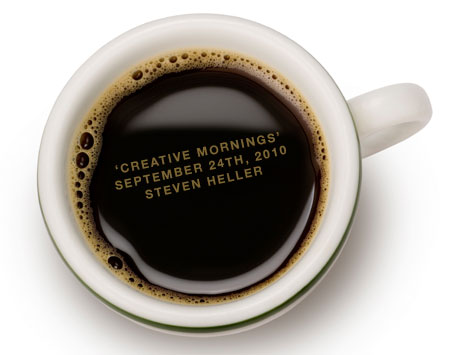
I am happy to announce next week’s NewYork/CreativeMornings with design maven Steven Heller.
WHEN/WHERE
NewYork/CreativeMornings, September 24th 2010, 8.30am – 10am. This month’s event will once again be hosted by the generous folks over at the amazing Galapagos Art Space in DUMBO. If you are not familiar with the space, get ready for a real treat.
ABOUT THE SPEAKER
Steven Heller is a former art director, current educator, continual writer and sometimes pontificator. He is the co-chair of the MFA Designer as Author and co-founder of the MFA Design, MFA Social Documentary and MPS Branding programs at the School of Visual Arts. He writes the Visuals column for the New York Times Book Review, the Graphic Content blog for T-Style online for the Times. He also writes for Design Observer, is the editor and writer for AIGA VOICE online and The Daily Heller for PRINT magazines Imprint website. He is a contributing editor for EYE, Baseline and PRINT magazines. The author, co-author or editor of 130.5 books, his most recent include POP: How Graphic Design Shapes Popular Culture, Born Modern, and revised editions of Graphic Style : From Victorian to Digital (with Seymour Chwast) and Becoming a Graphic Designer: A Guide to Careers in Design (with Teresa Fernandes). His podcasts on design issues and history can be found at here.
HOW TO SIGN UP
R.S.V.P will open at 11.55am monday september 20, 2010 over at creativemornings.eventbrite.com!
Please let us know if you r.s.v.p’d but can no longer make it. Our events fill up quickly and we usually keep a waiting list. Thank you! And at the morning of the event, make sure to put on your chatty networking hats!
Breakfast will be sponsored by our main sponsor MailChimp and this month’s co-sponsor FieldNotes.
MailChimp is a fantastic service that makes it easy to send email newsletters to your customers, manage your subscriber lists, and track campaign performance. A big yay-hooray to the team over at MailChimp!
Inspired by the vanishing subgenre of agricultural memo books, ornate pocket ledgers and the simple, unassuming beauty of a well-crafted grocery list, the Draplin Design Company, Portland, Oregon in conjunction with Coudal Partners of Chicago, Illinois bring you “FIELD NOTES” in hopes of offering, “An honest memo book, worth fillin’ up with good information.”
ABOUT CREATIVEMORNINGS
CreativeMornings is a monthly morning gathering of creative types. Each event includes a 20 minute lecture, followed by a 20 minute group discussion. The gathering begins at 8:30am with the topic presentation starting at 9:00am and everyone taking off for work at 10am. CreativeMornings are free of charge! There are currently two chapters: Zurich + NewYork/CreativeMornings. (LosAngeles is kicking off next month)
Be the first to know when r.s.v.p’s open up, follow NewYork/CreativeMornings on twitter!
Check out pictures of previous NewYork/CreativeMornings over at Flickr.
View all the taped talks we’ve put up on the web so far over at Vimeo.com/creativemornings. (For the Swiss chapter go to Vimeo.com/zurichcm
Linotype: The Film Trailer from Linotype: The Film on Vimeo.
Oh, what a tease Doug Wilson just sent a long: Linotype: The Film is a documentary about Ottmar Mergenthaler’s amazing Linotype typesetting machine and the people who own and love these machines today. Can’t wait to see the movie when it’s out.
TRIP is a Dutch design, a travel case small enough to be stored in the overhead compartment of a plane, yet big enough to create the highest amount of comfort. Comfort that starts with the possibility to easily transform the suitcase into a chair. Discover what it’s like to be able to relax and work in any situation, even in airports, subways, train stations and parks. The addition of a smart kangaroo compartment allows you to get to your laptop, papers and pencils with ease, without having to open the entire case. In addition, TRIP comes as a version with a custom integrated sound system: top quality speakers that enable you to listen to your own music in the comfort of your hotel room. And whenever you don’t want to use them, simply unplug them and remove them from the case.
Imagine taking the TRIP with you on a picnic: pick a sunny day, bring a good wine and some tasty food and put on your favorite tunes for a perfect afternoon! Even if your iPhone or BlackBerry runs out of power, you can charge it through the TRIP.
Want to raise some very fashion-forward stylish little ones? Quirky Collective is for you. I especially love the aviator hood.
Check out this wooden, minimalist Robot Man. Love at first sight? Yes! Inspired by traditional japanese joinery, his wooden frame and elastic muscles enable him to hold all sorts of poses. Folds neatly into a cube for rest time.
On 36Pages.com Craig Frazier looks at his favorite designers and illustrators books, talks to them and shares the inspiration. Plus, he keeps you posted on his books and projects. 36Pages, the story in picture books.
“White space can be used in the design of our lives as well, not just the design of magazines and websites and ads. By using white space in our lives, we create space, balance, emphasis on what’s important, and a feeling of peace that we cannot achieve with a more cramped life.”
Life’s missing white space by Leo Babauta.
Amen.
PAC-MAN was played by real human-beings sitting in a cinema: it’s the 5th video performance of the GAME OVER Project from the French-Swiss artist Guillaume Reymond. This stop-motion video was shot and played for the new ProHelvetia’s programme GameCulture at the Trafo cinema (Baden, Switzerland) on August 28th 2010. Imagine 111 human pixels that moved from seat to seat during more than 4 hours…
(via gameculture, thank you Gabriela)
Display documents mid-20th century, modern graphic design history through a curated collection, feature articles and bookstore.
The team of KindCompany is behind this beauty of a site.
(Thank you Randy!)
Ribbonesia art project by an illustrator named “Baku” (full name Baku Maeda). Pretty darn amazing, no? Let’s take ribbons on gifts to the next level.
(thank you Myio)

Lovely Debbie Millman just announced Season Six of Design Matters. It will premiere on Design Observer this Friday at 3pm with my legendary guest Massimo Vignelli.
After an entire year off air to launch the Masters in Branding Program at the School of Visual Arts, Debbie is returning to regular broadcasts and a full season of interviews with designers, artists, writers, thought leaders and general all-around provocateurs.
Design Matters began in February of 2005 with an idea and a telephone line. Mostly, she started out doing it for herself–she thought it would be a great way to ask her guests everything she wanted to know about their lives and their thoughts and their careers without seeming stalker-y. In the process, she realized the opportunity to share the insights of her guests with a listenership.
Friday marks the beginning of a new season on a new station as well. She will be recording her shows live in the brand spanking new recording studio at 132 West 21st Street in NYC—home of the Masters in Branding Program at the School of Visual Arts —and the shows will be aired at the regular time online: 3PM on Fridays. Design Observer will be broadcasting Design Matters, and you can listen to both the new episodes, as well as the entire archive of past shows here: www.designobserver.com.
Guests for for Season Six include Massimo Vignelli, Stephen Doyle, Eric Baker, Ralph Caplan, Marjan Bantjes, Kate Bingaman-Burt, Dominique Browning, Steven Heller, Alexandra Lange & Jane Thompson, James Victore, Tina Roth Eisenberg (gulp) and more…
A video on the current state of education and REDU. It stands for rethinking, reforming and rebuilding US education. Powered by people and technology, REDU is a movement designed to expand and encourage the national conversation around education reform by providing information and resources to learn, a community platform to connect, and tools and initiatives to act.
Following the belief that education will not be solved through a single bill passing or by policy makers alone, their goal is to create a destination where educators, parents, students, and everybody who cares about the issue have the means to engage in the ongoing conversations, be inspired by reform stories, and make a difference in their own way. It’s a platform for everyone.
(via bobulate)
A site devoted to teach laywers the ins and outs of Typography? Yes! Why? Because good typography makes your written documents more professional and more persuasive. Typographyforlawyers.com
(thank you Josh)
A new Twitter Site is starting to roll out to users today. Halllelujah! They finally addressed the lacking usability, interactivity on their site. So far, to get a true idea of what Twitter can do for you, you had to use one of the many iPhone or Desktop Apps out there. Curious to see how the new design will pan out. Looks promising in the video. (Can’t help but notice that the design very much reminds me of the iA’s Facebook redesign I saw the other day.)
You can’t escape drying the dishes, but hey, you can make it more fun with The Kitchen Sink Drama Tea Towel Collection. The above towel features The Escape by Katherine Mansfield.
(They need better product shots. Such a great product idea, but the images are not helping.)