FREITAG / The Daily Reference

FREITAG, the swiss truck tarp bag and accessories company is one day away of launching just launched a fantastic (!) new collection of bags called REFERENCE Line. They’ve chosen and unusual and superinteresting approach in celebrating this new launch:

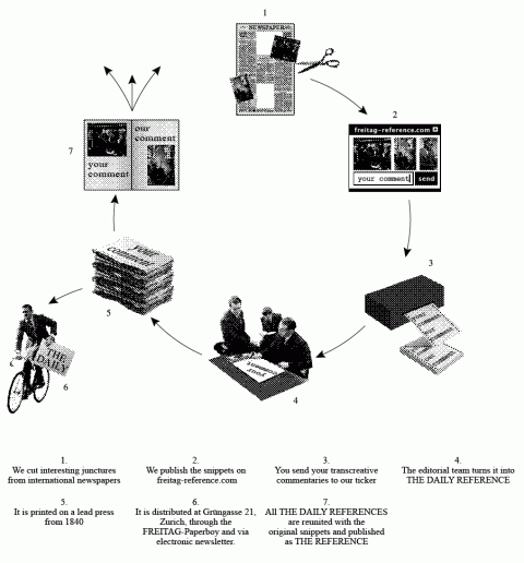
More than 15 years after they started FREITAG, they finally know what they’re about: cycles. They cycle to work. They cycle tarps. And they think in cycles. So they are devoting one month (this month) to creating a newspaper called THE DAILY REFERENCE which cycles content:

How does it work?

1. They get newspapers
2. They cut them up
3. They transcreate, you transcreate
4. They manufacture a recontextualized print product

From September 3rd through 30th, daily at 8:00am a team with the Bros. and guests comes together for coffee and snippets at the REFERENCE editorial space in Zurich. They cut up newspapers like they cut up tarps – with an eye for visual junctures – and comment on them in 140-character statements. The same snippets are uploaded for your own 140-character transcreation which reach Grüngasse by means of a ticker. Best line wins.

The next morning at 8:00am THE DAILY REFERENCE is sealed: The ultimate commentary makes the front page. The others are collected on the B-side and printed on their lead press for distribution. This happens every day. For the finissage on September 30th, all THE DAILY REFERENCES are reunited and published simply as THE REFERENCE. A user aided, cycled content compilation that mimicks FREITAG, in thought, word and deed.

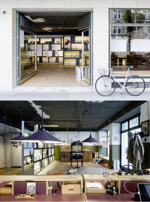
From September 3rd through September 30th, the REFERENCE editorial space is open at Grüngasse in Zurich (Mo-Fr 7.30am thru 7.00pm, Sat 11am thru 5.00pm). During this time, what used to be the two founders’ studio is turned into a newsroom and printing facility – with a two hundred year old bookpress, a coffee machine, the REFERENCE line on display and the Bros. (no promises, but yes, they are working out of Grüngasse in September).

The bros are asking for your 140 character input for their daily newspaper. FREITAG would like you to send them your transcreational commentary (max. 140 characters). Make sure to start your message with the number of the snippet you are commenting on. (check on their site and scroll down to THE DAILY REFERENCE section.)

The REFERENCE editorial space will also serve as reading room, where coffee, current international newspapers and the new product line are on display for your enjoyment.

You can go by the REFERENCE editorial space and hand deliver your 140-character commentary. And, if you’re lucky, you get to say hi to the bros. You can watch the editorial team in action and get your copy of THE DAILY REFERENCE if you show up after 5pm. And, of course, you get to check out their new bag collection and buy a REFERENCE bag.

And I’ll be at the editorial space sometime wednesday (september 8th) mid-afternoon myself. Why? I’ll let you know a little bit later today. Check back!


More info: Freitag-Reference.ch | freitag.ch
Map to REFERENCE Editorial Space
LIKEA CAMERA

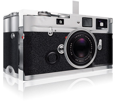
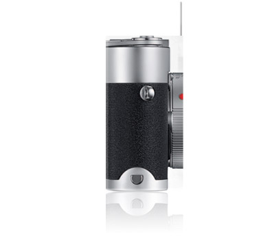
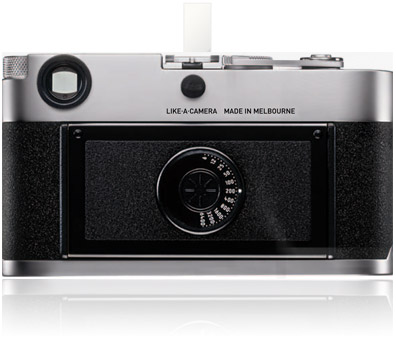
Pared down to the absolute essentials, the LIKEA MPH does away with the superfluous. Hand assembled by your good self, the MPH dismisses that which is not absolutely necessary. No battery, no light meter, no mechanical shutter, no embellishment – just your eye, a lightproof box and the emulsion.

LIKEA CAMERA

#mademesmile

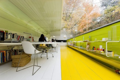
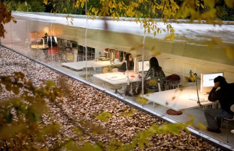
An Office in the Forest

(photos iwan baan)

Spanish architecture firm SelgasCano has designed their own office in the middle of the forest. I have no words. Gasping for air. This is unbelievably cool. Thumbs up!

(via cielbleu)

minimalist advertising

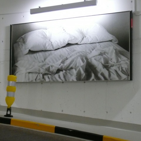
We all know, the Swiss are minimalists when it comes to their aesthetics. But, now, can any of my Swiss readers explain this ad campaign to me? Are the Swiss going über-minimalist and don’t even explain what an ad is for? Sure, it made me look.

Quipsologies Redesign

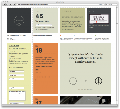
Quipsologies underwent a beautiful redesign. (Glad to see I am not the only one embracing dotted lines. Welcome to the family, Armin!)

They added a little silly widget poking fun at blogger’s obsessions. Bloggers like Coudal, Kottke, Draplin and moi. Made me smile.

Imagine a world without Photoshop

I’ll never take bevels and drop shadows for granted anymore. Thank you Photoshop:

aworldwithoutphotoshop.com

(thanks matthew)

Steve Jobs at Stanford

Drawing from some of the most pivotal points in his life, Steve Jobs, chief executive officer and co-founder of Apple Computer and of Pixar Animation Studios, urged graduates to pursue their dreams and see the opportunities in life’s setbacks — including death itself — at the university’s 114th Commencement on June 12, 2005.

(thank you for the tip, jones family)

Updated: LiveView

LiveView for iPhone & iPad is a Mobile Application Design & Prototyping Tool. Designers like me will love it to develop pixel–perfect graphics for the iPhone and iPad quickly and easily with a live view of your canvas/artboard while you work. With your iPhone or iPad tethered via WiFi, you can interact with software prototypes and demos running on your Mac to communicate and iterate your concepts quickly. Excellent!

UPDATE 1: The setup of LiveView is supereasy and this is handsdown a lifesaver when designing for an iPhone or iPad. I can instantly see how my design translates to the iPhone screen. Can you tell I am ridiculously excited about this app? Nicholas, put up a donate button on your site! You deserve a token of our gratitude. Or send me your address and I’ll send you cookies. SOMETHING! #yay

UPDATE 2: I am beyond thrilled to see that Nicholas updated the app so that it now supports the iPhone 4 Retina display as well iPads.

LiveView by Nicholas Zambetti

Zurich/CreativeMornings

Big news! CreativeMornings is expanding. Zurich is going to be the first city kicking off a CreativeMornings chapter. The two main forces helping me in this effort are Daniel Frei and Thomas Kupferschmied. They have been amazing in helping me get the Zurich chapter off the ground. And we are going to set the bar high with this first one. How?

Our first official Zurich/CreativeMornings event will be held at the Zurich Google headquarters. Our speaker will be Ario Jafarzadeh, User Experience Designer on Gmail. Ario will talk about user experience design at Google and provide insights from the brand new Gmail Priority Inbox feature which launched today. We are excited that Steve Rogers, Director of User Experience EMEA will give a short introduction prior to Ario’s talk.

(I can’t wait to hear what Ario will share with us. Yes, I’ll be attending.)

We are thrilled (!!!) that Google offered to host and sponsor our first official Zurich/CreativeMornings. Get ready for a real treat. Don’t know what I am talking about? Check out this swissmiss post.

You’ll be able to sign up for the Zurich/CreativeMornings starting september 6th, 11am, Zurich Time, over at zurichcreativemornings.eventbrite.com. There are 100 spots available and we will fill up quickly, so, mark your calendars!

You can follow the Zurich chapter on twitter.com/Zurich_CM.

Until we have the actual CreativeMornings site running, you can see what’s happening in the zurich chapter by filtering the swissmiss content by zurich/creativemornings.

Oh, and if this wasn’t enough, we will be kicking off the LosAngeles/CreativeMornings chapter in October. Are we excited? YES WE ARE!

ABOUT ZURICH/CREATIVEMORNINGS

Zurich/CreativeMornings is a brandnew monthly breakfast lecture series originally started by NYC based Tina Roth Eisenberg. The Zurich/CreativeMornings chapter is run by Zurich based Daniel Frei and Thomas Kupferschmied.

Each event includes a 20 minute lecture, followed by a 20 minute group discussion. The gathering begins at 8:30am with the topic presentation starting at 9:00am and everyone taking off for work at 10am. Zurich/CreativeMornings are free of charge!

Check out pictures of previous NewYork/CreativeMornings over at Flickr.

View all the taped NewYork/CreativeMorning talks we’ve put up on the web so far over at Vimeo.

Gmail Priority Inbox

Email is great, except when there’s too much of it. Gmail is rolling out a new feature today, called Priority Inbox. It automatically identifies your important email and separates it out from everything else, so you can focus on what really matters.

Gmail has always been pretty good at filtering junk mail into the “spam” folder. But today, in addition to spam, people get a lot of mail that isn’t outright junk but isn’t very important—bologna, or “bacn.” So they’ve evolved Gmail’s filter to address this problem and extended it to not only classify outright spam, but also to help users separate this “bologna” from the important stuff. In a way, Priority Inbox is like your personal assistant, helping you focus on the messages that matter without requiring you to set up complex rules.

As messages come in, Gmail automatically flags some of them as important. Gmail uses a variety of signals to predict which messages are important, including the people you email most (if you email Bob a lot, a message from Bob is probably important) and which messages you open and reply to (these are likely more important than the ones you skip over). And as you use Gmail, it will get better at categorizing messages for you. You can help it get better by clicking the or buttons at the top of the inbox to correctly mark a conversation as important or not important. (You can even set up filters to always mark certain things important or unimportant, or rearrange and customize the three inbox sections.)

Priority Inbox will be rolling out to all Gmail users, including those of you who use Google Apps, over the next week or so. Once you see the “New! Priority Inbox” link in the top right corner of your Gmail account (or the new Priority Inbox tab in Gmail Settings), take a look.

Email overload? Try Priority Inbox

Can’t wait to try this. Patiently waiting…

Handkerchief Wedding Invitation

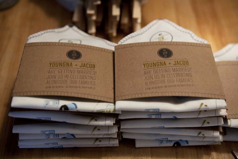
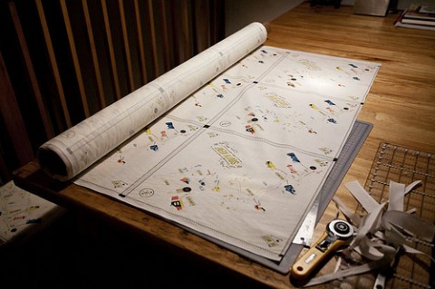
If I wasn’t married already, this is the invitation I’d want: Map on handkerschief featuring directions to the wedding venue. Location font is based on iconic “Greetings from …” postcards. Congrats on the fabulous idea and the upcoming wedding, Youngna.

Design + letterpressing by Kelli Anderson
Fabric printing by Spoonflower
Sewing, folding, ironing, envelope typing, stamping by Youngna

UPDATE: Kelli, the designer just sent me a link to her blog post where she explains the entire process in detail. What a talent.

Old School, meet New School

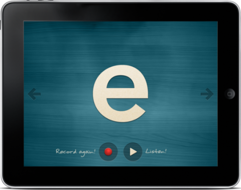
Montessorium is the force behind some amazingly beautiful and fun iPhone/iPad apps for kids. Intro to Letters brings the alphabet to your child’s fingertips. Based on the Montessori activity known as Sand Paper Letters, these activities utilize sight, sound and touch to help your child learn the letters, while also learning the correct method of creating them.

Can I just say how impressed I am by the overall design of these apps? They are gorgeous. Montessorium.com

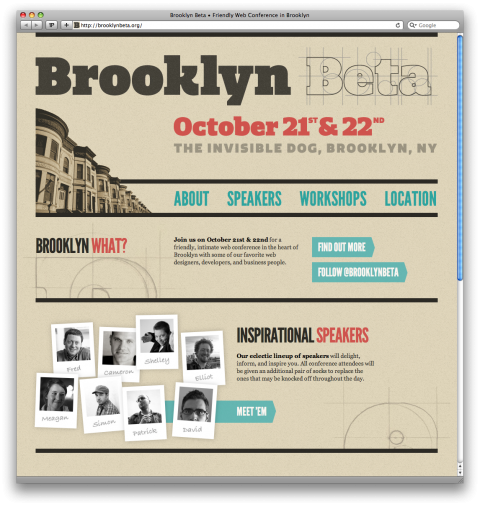
Brooklyn Beta

My fab studio mates Cameron and Chris have been working hard in getting a brand new Brooklyn based web conference off the ground: Brooklyn Beta!

Chris and Cameron want Brooklyn Beta to be the friendliest web conference you’ve ever attended. Their goal for the conference is to inspire you to “make your own stuff.” They’d love to see what the Web would be like if all you talented web people started using your magical abilities to bring your own ideas to life.

They hope you’ll leave inspired and anxious to build something of your own to beta in 2011. If that happens, you’ll have a hard time wiping the smiles off their faces.

BrooklynBeta, the site, launched today and while you can not register yet for the conference day you can register for the Workshops.

Please note that space is extremely limited. They want this to be an intimate conference where attendees play just as important a role as speakers. The workshops will sell out pretty quickly! So, go and register quickly.

See you there! Brooklyn Beta!

Follow BrooklynBeta on Twitter.

DEWS

DEWS toothbrush does away with concerns about whether your toothbrush is resting on an unhygienic surface. When the toothbrush is set down, it will sway momentarily until it reaches a position of balance, much like a tumble doll. DEWS has been designed with ergonomic considerations, and its weight allows for comfortable brushing.

Is this the perfect kids toothbrush? YES!

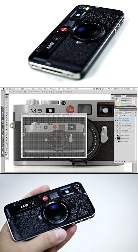
Leica or iPhone?

I just gasped: San-Francisco-based photographer Joey Celis produced a custom sticker for his iPhone, skinning it to look like a Leica M9.

“Sorry but I won’t be making these to sell,” writes Celis, who makes a living as a stock photographer. “It’s just a one-off for personal use.” Oh, what a mistake. If he won’t sell it, someone else will. I absolutely want one. #wishlisted

(via core77)

Dedo Message Board

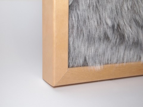
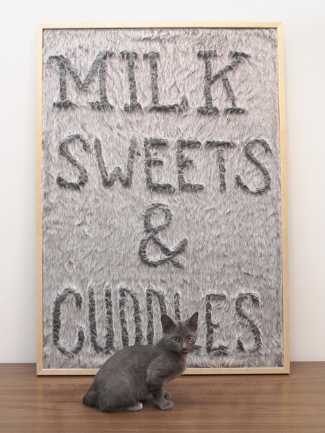
Gonçalo Campos pointed me to his most recent design called Dedo Message Board. It put a big smile on my face and know that my long distance roomate BB would sure get a kick out of this. Dedo Board let’s you leave messages and play, just by simply dragging your finger trough the fur you leave a trail, a drawing. Oh, how much fun could be had with this. Tempting.

Allunaggio Seat


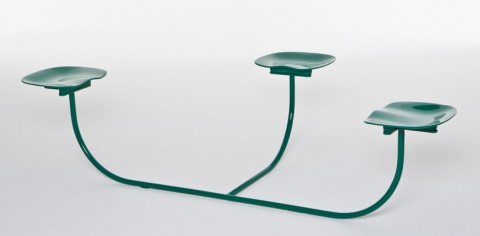
I would love this Zanotta’s Allunaggio seat for our studio, but of course, in bright red. Designed by Goncalo Campos.

TeuxDeux: New Features + iPhone App

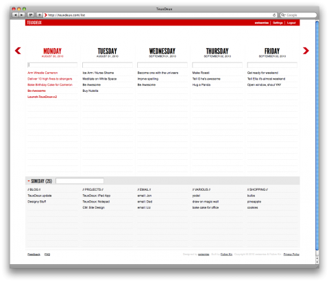
Big happy news from Team TeuxDeux: We just launched a bunch of new features AND, hold on to your seats, you can now take your to-do’s with you when on the go with our TeuxDeux iPhone App! Yay!

The iPhone App does everything the web version does, and of course, syncs seamlessly. Use the web version when at home or work and then take TeuxDeux on the go with our iPhone App. (We are working on the Android app, please be patient!) Here’s a cool feature that you probably didn’t expect to find: The iPhone App allows for multiple accounts: Share one with your spouse and use it for your shopping list, or have one with your team at work and use it as a project list. Endless possibilities, really. Watch our Demo Video below to get an idea how the App works.

For those of you who are not familiar with TeuxDeux: It’s a simple, designy, browser-based to-do app that my studio mates Cameron, Evan and I launched last december. Within hours of announcing, FastCompany called us the Best To-Do App of 2009. For the first time ever, I got to experience the ‘swissmiss effect’. (Within 24h we had over 10k users.)

We’ve been blown away by how passionate our users are. We get daily “I love you TeuxDeux!” Tweets. Lucky us! (Check out what people say about us on twitter.) Also, our users were mighty vocal about what features they’d like to see included in a future version. We listened: Starting today, you can enjoy your TeuxDeux in a fluid view, this means, if you have a big monitor that allows for a wide browser window, the columns stretch and allow for longer to-do’s. (If you want to keep the old view, just got into your settings tab and select ‘skinny view’.)

Up until yesterday, the only way to move forward in your list was by jumping one day at a time. Gone are the days of moving turtle speed. We upgraded you to cheetah-rabbit status. You can either jump 5 days at a time or even jump into a specific date in the future with the calendar widget. Simply click on the forward arrow and see your speed options revealed. (Thanks to the Dribbble Users for helping us figure out how to do this in the most elegant way possible. Special thanks go to Davin Risk.)

So, in short, TeuxDeux got flexible, faster AND mobile. (iPhone App)

Here’s a video explaining all the new features:

So, the question really is: What deux yeux have to deux teuxday?

Sign up for a free account.
Get the iPhone App.


New to TeuxDeux? Watch our Intro Video.
Already a pro? Watch our New Features video!
View a Demo of our iPhone App.

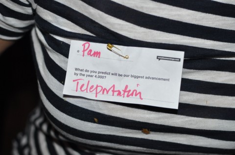
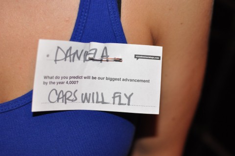
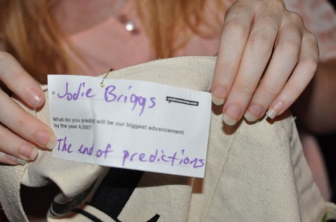
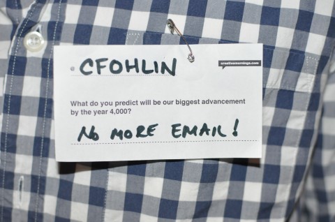
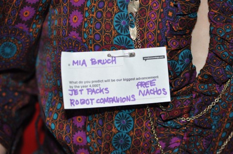
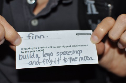
Our biggest advancement in the year 4,000?

At today’s CreativeMorning with Rachel Sussman I asked the following Icebreakertag question: What do you predict will be our biggest advancement in the year 4,000? See some of the anwsers below and all of them over on Flickr.

Filter Articles by Length

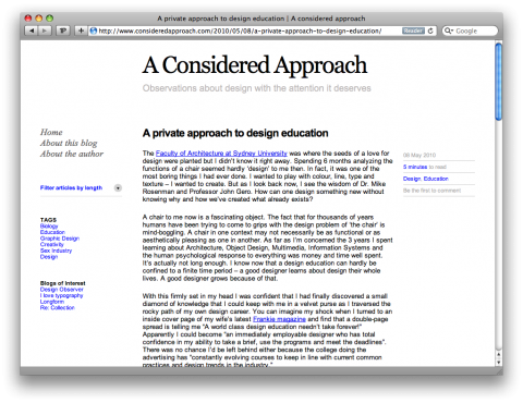
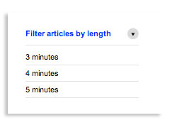
Matt, an Australia based Interaction designer, left a comment on an earlier swissmiss post and that’s how I discovered his blog A Considered Approach. What caught my attention was his site feature that lets you filter his articles by length.

This has me wondering: Is this just a sad sign of our times? Or is it just a very clever way of engaging a visitor to read more posts? And then I was chuckling… Given how incredibly short and visual most of my posts are, this filtering mechanism would have to be broken down into seconds for swissmiss.

consideredapproach.com

Paul Rand Retrospective

For Paul Rand’s posthumous induction into The One Club Hall of Fame, Imaginary Forces created this short film, combining original animation with a videotaped interview of Rand himself, that encapsulated his unique and timeless contribution to the design community.

(via mfa in interaction design)

Art…

“Art is an idea that’s found perfect form. There are too many possibilities. No matter how perfectly you do something, it can still be improved.”
—Paul Rand

Book gone jewelry

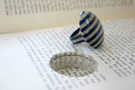
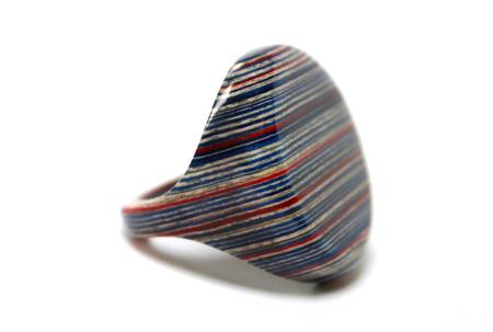
Jeremy May of LITTLEFLY has captured the beauty of paper via a unique laminating process. He makes jewelry out of books by laminating hundreds sheets of paper together. The paper is selected and carefully removed from a book, and the jewellery re-inserted in the excavated space. Each piece is impossible to replicate, and is unique to the wearer. Every thought about turning your favorite book into a ring?

LittleFly.co.uk

(via stylingrooms)

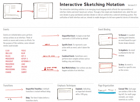
Interactive Sketching Notation 0.1

The interactive sketching notation is an emerging visual language which affords the representation of interface states and event-based user actions. Through a few simple and standardized rules, what the user sees (drawn in greys and blacks) and does (drawn in red) are unified into a coherent sketching system. This unification of both interface and use, intends to enable designers to tell more powerful stories of interaction.

Hat tip to by Jakub Linowski for creating and *sharing*!

(via Free Wireframing Kits, UI Design Kits, PDFs and Resources on SmashingMagazine)