Topos Graphics together with friend Sarah Riegelmann designed this “Gashole magnet”, as part of a personal anti-SUV guerilla campaign.
Yes, made me smile.
Topos Graphics together with friend Sarah Riegelmann designed this “Gashole magnet”, as part of a personal anti-SUV guerilla campaign.
Yes, made me smile.
How incredibly stunning is this GIVE graphic by Topos Graphics?
Inspired by the act of giving rather than by giving a gift, Topos Graphics gifted an idea for their 2007 mailer—GIVE. The lettering to them was both a form of giving the gift that keeps on giving and wrapping their intention—the ribbon having no clear beginning and no defined end. And to point at their intention (rather than the gift) we took away the preciousness of the print by adding a marked history to the paper. By crumpling and re-flattening the print it was as if the gift had already been given and the wrapping paper already effectively been tossed into the recycling pile. With that in mind, it was the thought that counted—and still counts.
Their edition numbered 212. Every package included a signed and numbered print within acid-free plastic, each labeled with a Happy Holidays sticker that they had custom-printed to be used within a pricing gun.
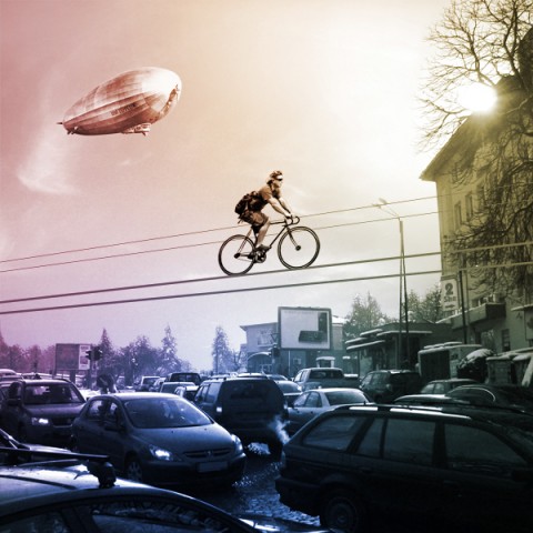
Kolelinia is a concept for riding bikes on a new type of bicycle-lanes, based on steel wires. Definitely made me look and chuckle.
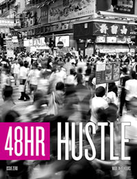
The first 48 Hour Magazine is out! What a fantastic experiment in using new tools to erase media’s old limits. As the name suggests, 48h was written, photographed, illustrated, designed, and edited in two days.
From noon on May 7th through noon on the 9th, a team circled up around the original Rolling Stone conference table in Mother Jones’ offices to transform 1,502 submissions from around the world into a chorus of voices, all harmonizing around the same theme: hustle. 48 Hour Magazine features 60 pages of writers and artists from your favorite magazines sharing space with previously unpublished new talent, shaped by some of the best editors in the business.
Phenomenal. Refreshing. I love it.
Preview the issue on MagCloud.
Buy Issue Zero.
Check out the images of the making of over on flickr.
(via @ideas_economy)
We had a very special visitor at the studio today: The space-suit-loving StarDuck!
(thanks for the smile Florian)
(via mailchimp)
We live in The Age Of Everything. Why commit? There are 80 milllion Millennials aged 9-28 in the U.S. alone. Half are already in college or the workforce, and the women will be a tornado. They group around shared affinity more than shared nationality, they’re prosumers not consumers, and they care more about peer recommendation than corporate reputation. They grew up in a world where change is too fast to process, but they know one thing: if you wait a minute or two, something better is sure to be along. They live on an IV drip of real-time connection, and are fiercely interdependent. If you’re a company, failing to consider their preferences would be, in their own vernacular, WOMBAT–a waste of money, brains and time.
“Daddy, What’s a Brand?” and 9 More Awkward Questions for Uncertain Times, by Graham Button
This bookshelf called Hold On Tight by Colleen & Eric took my breath away. It comes with an integrated bookend (a cube with an oversized wing-nut that you can loosen and slide on a track to make room for more books). It’s minimal and brilliant. Make that cube white or red and I am in heaven.
Our little family had the pleasure to take part in Maxwell Gillingham-Ryan’s latest Apartment Therapy book project: Big Book of Small Spaces. During a photo shoot last year they captured our bedroom, home office and Ella’s bedroom. (above)
I was so excited to see the final product, having heard so much about it! The apartments they feature are truly inspiring. Wonderful to see how everyone embraced the challenge of ‘small’.
The inspiring book is coming out this week! Yay!
You can preview the book here.
The lovely folks of PAWLING print studio sent me a set of their adorable onesies which have quickly become our favorites at casa swissmiss. They are on heavy rotation on the little man. (He is sporting on in the above picture) The front of each onesie features a screenprinted minimal animal illustration. Yes for simplicity!
My friend Douglas Levere pointed me to one of his new projects called PrintCollection.com.
Print Collection publishes new images each day. Fall in love with one? No problem, order a museum quality print for your home or office. I wouldn’t mind a copy of this Flatiron Print, or this Amundsen Blimp.
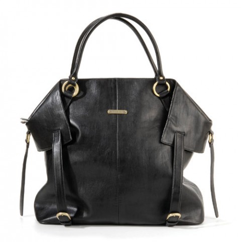
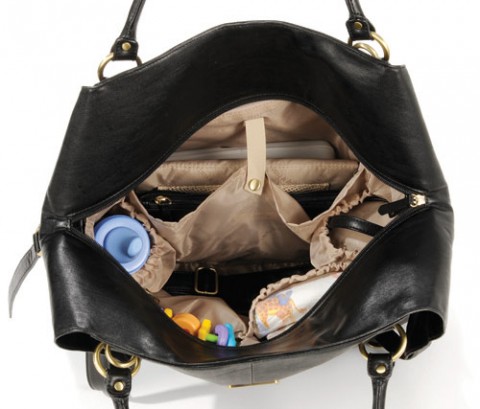
Now that’s a stylish diaper bag. Hello there, Charlie. It’s by a new brand called Timi & Leslie.
Hyperactivitypography from A to Z is an activity book for typographers
illustrated in a nostalgic vintage style to give it a sweet and childlike look.
The book is packed with activities, ranging from silly to hard core nerdiness.
It’s great to test your skills on and to learn new things while having fun.
Who said typography had to be stiff and boring?
You can flip through the book or buy it on www.hyperactivitypography.com!
(via thinkingaloud)
Our speaker at the April 2010 CreativeMornings was Oliver Jeffers generously hosted by Harper CollinsSy Abudu for offering her video and editing skills.
2010/04 Oliver Jeffers from CreativeMornings on Vimeo.
I had the honor to be part of this very cool project by The Type Directors Club called Beautifully Banal.
TDC and Cardon Copy asked 16 designers to find a classified/personal newspaper ad from our local community to “hijack” typographically. When redesigned, the once banal and disposable classified ads are reinterpreted by the designer into a one-of-a-kind collectible poster. Each poster will be auctioned on Tuesday evening, May 11th (starting at 6:00 pm), with proceeds to benefit the TDC Scholarship Fund.
I also happen to give a talk that night, right before the auction. To register please email the TDC (email on the bottom of this page) or call 1-212-633-8943.
UPDATE: One of my readers, Erik Wessel, pointed out that my classified seems to be from a puppy mill. I had no idea and am sorry to be giving this breeder additional attention with my poster. If you do get a puppy (or a poodle for that matter) please make sure to go through breeders that treat their animals with respect and dignity.
I am *not* endorsing the sale of puppies like this or this breeder, and I simply chose this ad because the idea of “poodles, all colors” was attractive to me as a designer.
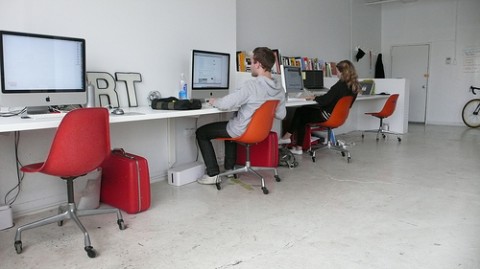
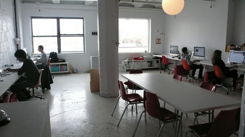
Two of our wonderful studio mates are leaving us. One of them needs more space and the other is moving across the Atlantic! (Booo!) This means, two desks are becoming available, one on june 1st and one on july 1st. If you know anyone that would make a good addition to our awesome collaborative workspace, send them our way.
Who are we (currently) at #612a?
Cameron Kozcon of FictiveKin (my partner in crime on TeuxDeux), Chesley Andrews* of Dossier Studio, Max Ritt of swissmiss studio, Chris Shiflett of Analog, William Spencer Copy Writer Extraordinnaire, Jessica Hische* Type Goddess and Jennifer Ward of Minor Details.
* = studiomates leaving us
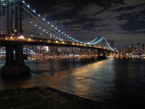
We are located in DUMBO, Brooklyn, right on the water. Here, this could be your view: EveryDayEastRiver.Tumblr.com
For a mere $500 a month, you get:
– An approx 6ft long desk
– Did I mention the east river/manhattan view already?
– Wifi
– Water
– Access to a scanner and laser printer
– For all of you coffee addicts, we have an amazing Nespresso Coffee Maker.
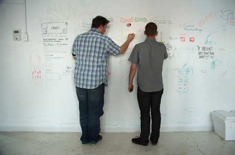
– A HUGE Ideapaint wall for brainstorming
– And then, here’s one of our best assets, you get to stream music to our Geneva XL.
– On Friday’s we usually have Beer and Beetles Rockband evenings.
– Lots of geek talk over lunch
– Oh, and let’s not forget our awesome new neighbors, Workshop, which we totally consider an asset as well to have next door!
Interested in renting a desk at @612a? Email me and tell us why you think you’d be a good fit! (We secretly hope for some developers to join us!)
UPDATE: Chesley (dossierstudio) will be moving to Stockholm, Sweden beginning of July. She is hoping to find a similar shared studio space. Know of any? Get in touch with her: http://scr.im/235h (Oh, and she’ll also need an apartment in case you hear of anything!)
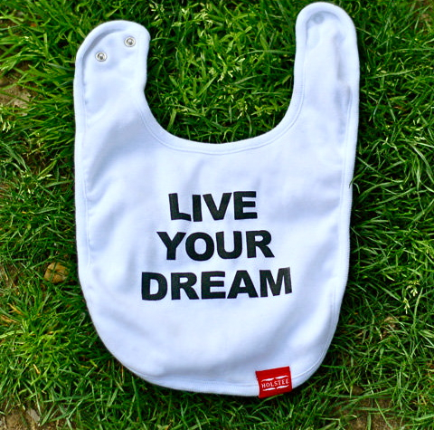
If this bib doesn’t make you smile, I don’t know what does. (Com’on Tilo (swissmister), don’t let anything stop you, you’re only 3months but hey, Live your dream!)
Lisa Strausfeld of Pentagram has designed an interactive data visualization for GE, a calculator that converts energy consumption into accessible units like cupcakes baked, sitcoms watched, etc.
Learn more about the project over on Pentragrams blog.
The Rhode Island School of Design just announced their Annual Graduate Thesis Exhibition. The show opens May 20 and is on view through June 5, 2010.
For the first time, the 2010 RISD Graphic Design MFA candidates have elected to stage a special extension to the exhibition in the form of a fully-functioning shop called “Make, Do.” During the course of the exhibition and in other cities throughout the summer, these designers will apply formal and conceptual research from their thesis projects to a variety of products including books, T-shirts, office products, housewares, and more. In so doing, “Make, Do” acknowledges the exhibition’s Convention Center context and design’s role in the marketplace more generally. Taken along with the exhibition’s highly interdisciplinary curatorial strategy, “Make, Do” serves as a platform for questions about art and commerce, theory and practice, and design’s value both within the academy and beyond.
For more information on the graduate exhibition visit: GradExhibition2010.risd.edu.
For more info about Make, Do, visit makedoshop.com, and blog.makedoshop.com
This is a video of a marketing stunt that KLM did in Manchester Airport last month. It shows a guy reclining in an “invisible chair”. (There must be a metal tube going down his extended leg with an area to sit on, all hidden in his pants. Clever.)
(via likecool)
This durable tote is modeled after the plastic bag you’ve seen everywhere, with one important difference: it’s reusable. Made in the USA of natural organic Grade A canvas, it measures 16.5” x 16.5” and has a roomy 6” gusset to hold plenty of groceries. The design is screen printed and faithful to the original, right down to the last “s” (it’s upside down)
How clever is this Wheel of Nutrition plate, using visualization to support healthier eating habits. It was created by Hafsteinn Juliusson, Rui Pereira and Joana Pais.
(via brainpicker)