Now this Knife Block made me look. Would be nice if it could hold more knifes though.
(via stilsucht)
Now this Knife Block made me look. Would be nice if it could hold more knifes though.
(via stilsucht)
Making unusual connections is the basis of creativity.
– From Mind in the Making, by Ellen Galinsky
The Shaker Project is a site showcasing an impressive (!) collection of salt and pepper shakers. Yes, that’s it. Not more and not less.
(thank you Craig)
Hey, who’s hanging out in your tea? Oh, it’s Teabag Royalty!
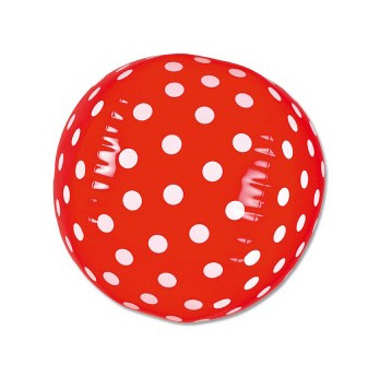
Yes, we are ready for summer, here at casa swissmiss. And this Beach Ball gets the swissmiss sign of approval.
Longform.org, created by Brooklyn based Aaron Lammer, collects the best in long form journalism and then helps you add the articles to your Instapaper account. *Love* the idea and the execution! Hat tip!
(via @craigmod)
I have the honor to be on a panel discussing “Designers Developing Additional Revenue Streams” this coming tuesday, May4th, organized by Spark. Also on the panel are Stuart Constantine of Core77 and Angela Voulangas. The panel will be moderated by Jennifer Rittner.
Tuesday, May 4th
Spark Speak Designers Developing Additional Revenue Streams
Where: Noble Desktop 594 Broadway, Suite 1202, New York, NY 10012 | MAP
Time: 6:30pm time to chat; 7:00pm discussion begins
Cost: Free for Spark members and $10 for non-members
RSVP: [email protected]
For more info click here.
When does jewelry ever make you smile?
Exactly.
Well, Hairy Sock’s designs did.
(via a comment by paulius fried on swissmiss)
I had to research Origami folding instructions for a current client and stumbled upon this Origami Club Site and now all I want to do is fold. fold. fold.
(image philippe desarzens)
At last week’s CreativeMornings I had the pleasure to meet Martina Salisbury of TwoSeven who handed me one of her business cards. I noticed the amazing font on the card and was told it is Brauer Neue. It is similar to Trade Gothic Condensed just a little softer with the rounded corners. Instant new favorite.
Brauer was originally designed by Pierre Miedinger for the Zurich based brewery Braueri Huerlimann as part of the company’s corporate design in 1974. The typeface was extensively used on anything from beer bottles and beer mats to pub signs and promotional material, from letterheads to the company’s signage system, until the brewery was bought by Carlsberg in the early 1990s.
Elektrosmog extended the basic characters of Miedinger’s original ink drawings to a full character set, adding all special glyphs and symbols to make up a complete typeface – including a bonus font offering the brewery’s cherished brand logos.
I can’t remember when I was last so excited about a typeface. (And I can’t remember when I was last as annoyed by browsing a site looking for a font like I just did on lineto.com. While I do appreciate the playfullnes with that pop-up navigation system it is simply not intiutive intuitive and I don’t feel I got to get a real glance at the typeface, hence keeping me from buying it.)
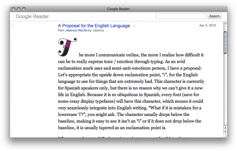
Re-Readers is a new “skin” for Google Reader by John Holdun that strips it down even more than the rest. If you are interested, you may install the style as a userscript, download the stylesheet, or use the bookmarklet to swap on the fly. Refe to Helvetireader for detailed installation instructions.
(via minimal mac)
Agreed with Khoi: Highly informative, useful and generously detailed slide deck from Drew Houston, the co-founder and CEO of everybody’s favorite cloud storage startup, Dropbox. Definitely worth reading.
In this time of “twittering” it will be a great gift to tell someone something in the “old (romantic) way” – a Tweet for Love Notes by mo man tai.
Likebutton.me shows you what people you know like on the internet right now. I am not a Facebook fan, but this definitely made me look. Please note, you can add your own urls at the bottom. Powerful.


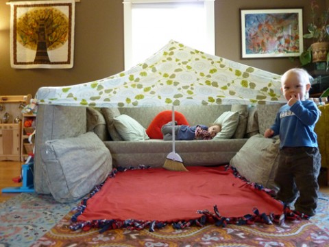
bBUILD rounded up a (mostly) admirable collection of Couch Cushion Architecture projects, taken from a randomly conducted search on the internet. Join them as they take a critical analysis of the architecture, methods and design philosophies of living room furniture re-appropriation.
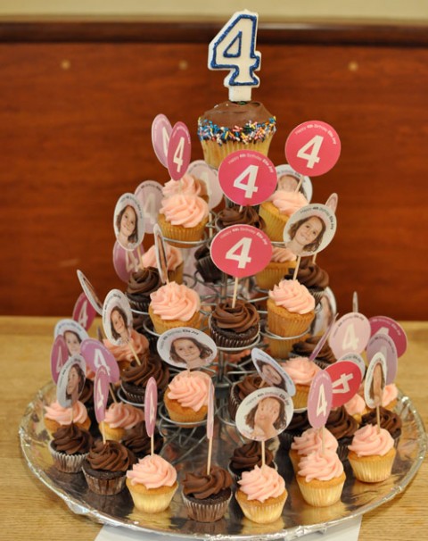

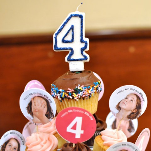
For those of you who have been reading my blog for a few years, you know I have this tradition of making cupcakes for my daughter’s birthday with her face on it. Wednesday was Ella Joy’s 4th Birthday and so we did it again: printing, cutting, glueing. This time she even helped with the production. I love this little birthday tradition we’ve started but I am wondering what age she’ll come up to me and say: “Mom, I appreciate your efforts, but it’s ok now, no more faces on cupcakes, alright?”
Here are the prior versions for when she turned three, two and one!
If G and I would get married right now, I have a feeling he would go for this 2×4 ring as his wedding band. Designed by Brooklyn based Aaron Ruff, the ring is available in oxidized sterling, vermeil.
Kyle Van Horn got inspired to print the below poster after he saw the quote on my blog. I love creative chain reactions like this! Yay Hooray!
Our speaker at the March 2010 CreativeMornings was Maxwell Gillingham-Ryan of Apartment Therapy hosted at the fabulous Galapagos Art Space in Brooklyn. Enjoy Maxwell’s wonderfully personal talk in the video below. A big giant thank you to Sy Abudu who has been generously offering her video and editing skills.
2010/03 Maxwell Gillingham-Ryan from CreativeMornings on Vimeo.