Who knew I could drool over the design of an Axe? Check out these by Best Made Co.
(via made in england)
Who knew I could drool over the design of an Axe? Check out these by Best Made Co.
(via made in england)
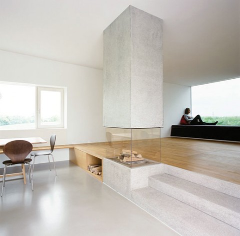
This is officially the fireplace (and room around it) of my dreams. It’s part of ‘Raumstation Irnharting’ in Gunskirchen / Austria by x architekten (AT).
Artist: lunchbreath
More: View all Core-Toons

Dear readers, I am looking to find architecture firms (or design firms in general) that managed to successfully incorporate a blog into their site. Do any come to mind? Would you mind to leave urls in a comment below? Thanks so much!
Mobile Mobile – an interactive installation by James Theophane.
Wow, this unusual wall storage shelf-thingy called Imeüble made me look. Designed by Bjørn Jørund Blikstad, a newly educated furniture designer with a masters degree from 2009 from Oslo National Academy of the Arts.
(via @designglut)
A beautiful video about an ex-con and his dog. Made me cry. (no, I don’t have that category…)
Last Minutes with ODEN from phos pictures on Vimeo.
Directed/Edited: Eliot Rausch
Director of Photography: Luke Korver, Matt Taylor
Song: Big Red Machine / Justin Vernon + Aaron Dessner
A game based on Typography? Yes, please! Think you know your Arial from your Helvetica, your sans from your sans serifs? Then step up to the plate. With three levels of game play from the ease-yourself-in, ‘Somewhat Difficult’ through to the incredibly challenging ‘Exceedingly Difficult’, there’s lots of fun to be had for novices and typographic experts alike. Check out the Beautifully designed Font Game by John Boardley, Justin Stahl and Kari Kari Pätilä.
Gasp for air — this is so amazing! As Sub-Studio explains the Dirt-Poster:
Designed by Roland Reiner Tiangco, Dirt Poster requires your participation to complete it. The back side of each poster is covered with a layer of ink, which you need to “paint” onto the front side the poster, to reveal the message that has been spot-varnished onto the paper. Awesome! The poster is limited edition and can be bought for $80.
The future belongs to the few of us still willing to get our hands dirty.
(via sub-studio)
Web 2.0 Suicide Machine is a sad sign of our times: With one click Web 2.0 suicide machine takes you off all social networks so you can have a ‘real’ life again. (I find the name of the app/service fairly disturbing. Wish they would have used a more uplifting spin.)
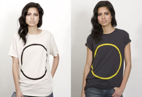
I love the simplicity of the Circle Geometry Lesson T-Shirts by Lincoln Mayne.
Didn’t you always want to put one of your best life moments in a jar?
Google Browser Size is a visualization of browser window sizes for people who visit Google. For example, the “90%” contour means that 90% of people visiting Google have their browser window open to at least this size or larger. This is useful for ensuring that important parts of a page’s user interface are visible by a wide audience. On the example page that you see when you first visit this site, there is a “donate now” button which falls within the 80% contour, meaning that 20% of users cannot see this button when they first visit the page. 20% is a significant number; knowing this fact would encourage the designer to move the button much higher in the page so it can be seen without scrolling.”
Google Browser Size is an excellent resource. I will come back often. Now, Google, let’s make it look nicer!
(thank you john!)
For those that follow my blog closely, they know that I am a big fan of Geneva Sound Systems. I have the GenevaSound XL in my studio and the GenevaSound M at home. Last summer, two weeks into our Switzerland trip, I looked at my husband and said: “I want to go home, I miss my Genevas!”
And yes, for full disclosure, Geneva is currently my client and we are *this* close to launching their new e-commerce site. But, I couldn’t wait to share the latest model that they just came out with, the supersmall GenevaSound S. I was lucky enough to get a demo in my studio and I was blown away, by how small the S is and how cool the swivveling dock is at the top. When not in use, the iPod dock disappears. And the TouchLight Controls are just the ultimate cool. The GenvaSound S is definitely on my wishlist to get for our bedroom!
(Now if only I didn’t have to link to their old site and our new one was already up, sigh!)
Matt Robinson in collaboration with Tom Wrigglesworth compared a selection of the most commonly used typefaces for how economical they are with the amount of ink which they use at the same point size. Large scale renditions of the typefaces were drawn out with ballpoint pens, allowing the remaining ink levels to display the ink efficiency of each typeface. Measuring Type.
(via core77)
Polaroid SX-70 Promotional Film from Ekim on Vimeo.
(via jackcheng)
Slip our HandiSleeve by Umbra around your to-go cup of coffee and you’ve got a convenient handle! It’s designed so that it fits around disposable cups and in most automobile cupholders.
(via holycool)
These Acoustic listening devices were developed for the Dutch army as part of air defense systems research between World Wars 1 and 2. Made me look! Oh my!
I absolutely love the concept of this Hydropal Filter Water Bottle which filters tap water so you don’t have to buy and throw away bottled water. But please, somebody come up with a snazzier design. (sigh)
My daughter’s head would explode if she found out that there is such a thing as a pink christmas tree. (She is in a full on pink phase!) Made me chuckle!
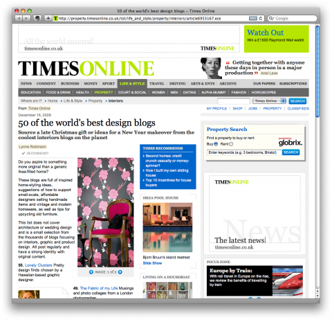

I just almost fell off my chair! I got an email from Nick Wyke of the TimesOnline letting me know that swissmiss has been selected as one of the 50 world’s best design blogs. I am speechless. Thank you TimesOnline!
Wire Frame 10″ Letters. Wheeeee!
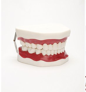
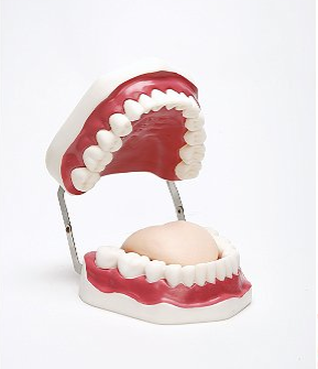
I am trying all kinds of tricks to get our 3.5year old Ella excited about brushing her teeth. The latest thing is to turn off the light in the bathroom and brush her teeth in the dark with a flashlight. Oh, the things we do as parents. I think this Oral Hygiene Model would help her understand better HOW we need to brush teeth. I might just have to order one…