We Are Colorblind is a pattern library for design around color blindness. About 8% of the male population has some sort of color blindness. The color blind have the inability to clearly distinguish different colors of the spectrum, they tend to see colors in a limited range of hues. Because of this, the color blind have trouble with a lot of websites.
Tic Tic Tac Wafer’s Keyboard
As I doused my keyboard with coffee this morning, I am now using my Wafer’s Keyboard for the rest of the day:
(thank you @dave)
Ceramic Speakers
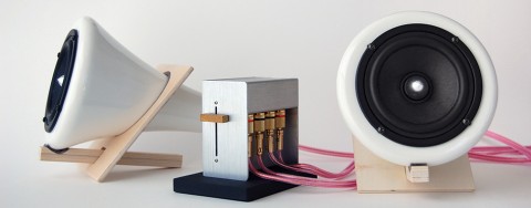
Joey Roth, the force behind the much talked about Sorapot now has come out with a new, non tea-related product: Ceramic Speakers.
The Ceramic Speakers are made from porcelain, cork, and Baltic birch. Each material is minimally finished, left to add its natural beauty to the design. The included amplifier is made from stainless steel sheet metal, with a cast iron base and paulownia volume slider. Aside from the electronic components, plastic is completely avoided in the system’s construction.
Puzzle Serving Board
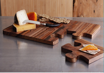
The Puzzle Serving Board is probably not all that practical if you serve creamy/runny cheeses on it but it sure is a conversation starter.
Oy!

Early morning at swissmiss studio. I just succesfully doused my keyboard with coffee. Le big sigh.
cortex
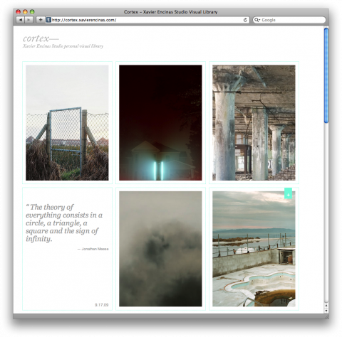
Cortex is Xavier Encinas Studio’s Personal Visual Library. Wonderfully inspiring. Note to self: Need to ‘look’ and take pictures again.
Tissue Paper Cover Book Series
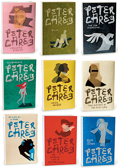
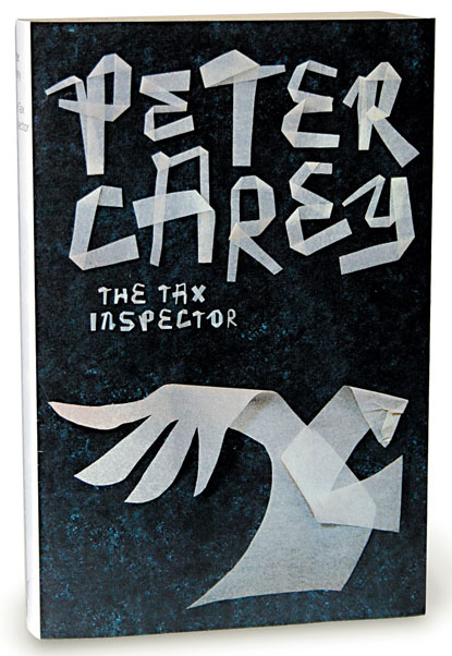
I fully agree with Bauldoff, this tissue paper book cover series by Jenny Grigg is wonderful.
Sandwich Shop Identity
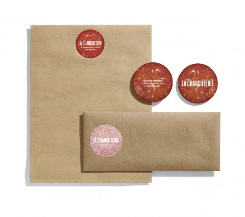
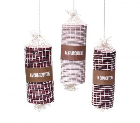
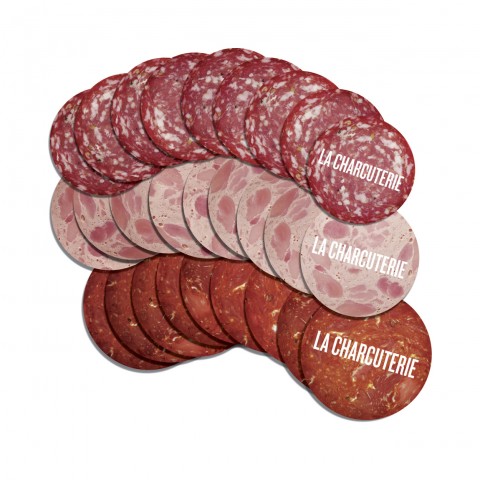
This Sandwich Shop Identity made me chuckle. La Charcuterie is a deli/restaurant hybrid well-known around Vancouver for serving up sandwiches filled with deli meats. To play off this, business cards were created to look like cold cuts then were strung in netting similar to the way salami’s and other cured meats are hung in delis. Finally, Rethink printed meat stickers for the letterhead and envelopes made of butcher paper— the same paper they wrap their sandwiches in.
A simple alternative to Indexhibit: Stacey
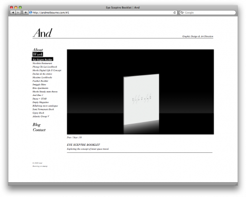
Anthony Kolber is a graphic designer who got frustrated with trying to customize Indexhibit for his friend’s portfolio sites. So he decided to create something to make it simpler, it’s a php app called Stacey.
Stacey’s aim is to make the customizing part easier. You edit html files as html, the installation consists of dropping files onto your server and content editing is handled by creating folders and putting images inside them. There is no ‘admin’ interface, it’s all done via basic ftp.
You can see it working and download it at: http://staceyapp.com
At the moment it is running these sites: aestheticallyloyal.com, andmelbourne.com & hollyrose.com.au
Don’t Kill Good Ideas
(thank you sis)
AIGA/NY: Dog and Pony Show
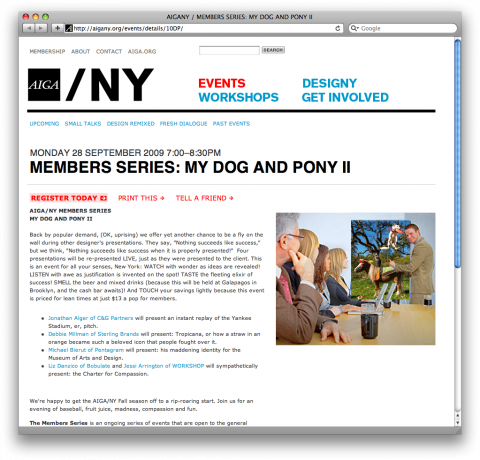
AIGA/NY is on fire! I just bought tickets to two events within 4 days of each other. First, Ji Lee’s presentation this thursday and then monday’s Dog and Pony Show at Galapagos in DUMBO. The line up of presenters is breath-taking:
– Jonathan Alger of C&G Partners will present an instant replay of the Yankee Stadium, er, pitch.
– Debbie Millman of Sterling Brands will present: Tropicana, or how a straw in an orange became such a beloved icon that people fought over it.
– Michael Bierut of Pentagram will present: his maddening identity for the Museum of Arts and Design.
– Liz Danzico of Bobulate and Jessi Arrington of WORKSHOP will sympathetically present: the Charter for Compassion.
See you there?
Artwiculate
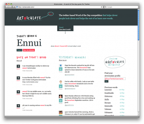
The fabulous team at Atto made another nifty site called Artwiculate: The twitter-based Word of the Day competition helps clever people look clever and helps the rest of us learn new words. To play, just use today’s word in context in one of your tweets. That’s it. Your tweet will appear on the artwiculate.com site where people can tell you if they like it. You’ll get points if they like it or retweet it.
Follow them on twitter: @artwiculate
Spaghetti and Meatballs
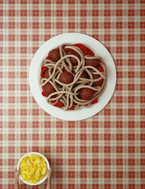
David Sykes is continuing his food series. His latest: Spaghetti Hoops. (the cheese is gym socks and towels) There are rumors he might do a limited run of prints. Yay!
(thank you jon)
Good manners never go out of style
Some of the most well known people I know never assume people they talk to know who they are. Sequoia Capital partner Roelof Botha, for example, introduces himself to me every time I see him, and asks if now is a good time to talk. I’ve known him since 2006, and it’s far from necessary. But I always appreciate how polite he is. Want to be like Roelof someday? A good start is basic business etiquette. Just because someone can’t register your face, name and workplace in less than the second it takes for you to say hello to them doesn’t mean they don’t want to help you out. Just help to avoid that awkward moment by giving them all the information they need. And then watch body language for your cue to wrap things up.
Excellent article by Michael Arrington on how good manners never go out of style: Greetings!
(via @mikemcderment)
iStoryTime

I seriously don’t know how my parents were ever able to take my sister and me to a restaurant and actually enjoy a meal without having a device like the iPhone at their fingertips. My iPhone is loaded up with educational fun games for Ella and I am happy to have discovered iStoryTime:
Aiming to provide a more enriching experience than simply playing with the buttons or watching movies, iStoryTime is a new iPhone application that’s designed to bring stories to life. iStoryTime’s self-navigating and self-narrating book application is designed for use even by two-year-olds, flipping the pages automatically while the child follows along. Kids can choose between two narrators—an adult or a child’s voice—or read the book on their own. In addition, the words to the story are included onscreen so beginning readers can make associations between what they hear and the words they see.
(via springwise)
The Awesomeness Manifesto
What is awesomeness? Awesomeness happens when thick — real, meaningful — value is created by people who love what they do, added to insanely great stuff, and multiplied by communities who are delighted and inspired because they are authentically better off. That’s a better kind of innovation, built for 21st century economics.
The Awesomeness Manifesto, by Umair Haque.
(via GOOD)
