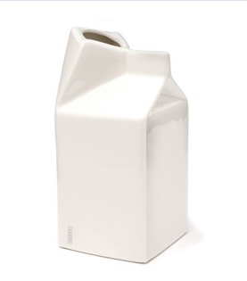
Porcelain Milk Jug

Milk Container

It’s time our office gets a presentable milk container for when clients come and we have coffee at our conference table. I see a purchase of this Porcelain Milk Jug in my near future.

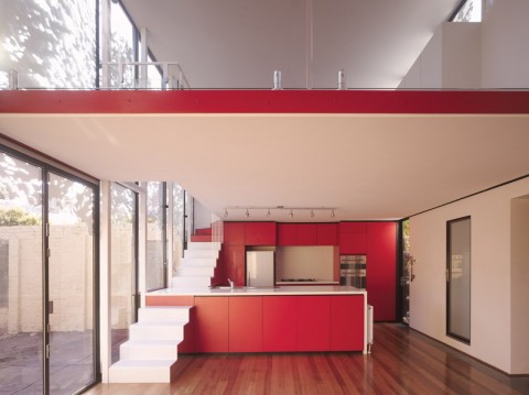
andrew maynard architects

andrew maynard architects

How incredibly surprising is this stairs/kitchen surface integration?

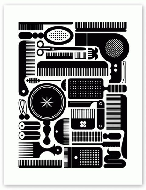
katie kirk

Illustration by katie kirk

Lovely Illustration by Kate Kirk.

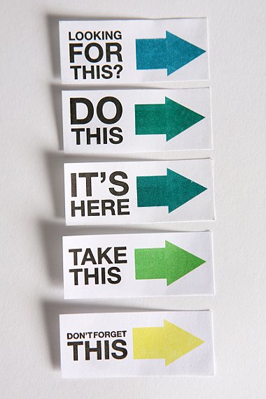
Get The Hint Stickies

Get The Hint Stickies

Made me smile: Get the Hint Stickies

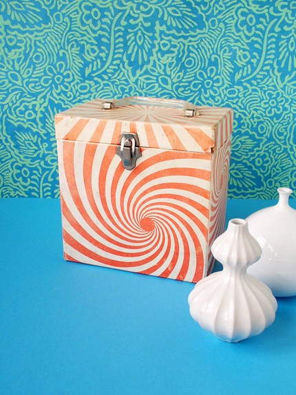
Orange 45 record box – vintage

Orange 45 record box - vintage

How incredibly cool is this vintage Orange 45 record box?

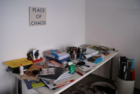
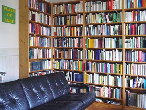
Places Of Places
cimg4786jpg
orig_eam_soldjpg
orig_lust_soldjpg

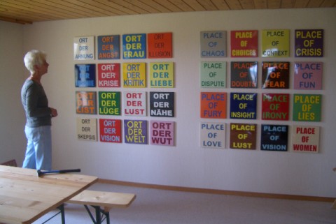
Hans-Ruedi Fricker is a friend and artist living in Trogen, Appenzell, the region in Switzerland where I grew up. I had the pleasure to enjoy a cup of coffee outside his amazingly idyllic farmhouse during my my vacation. He told me about all the interesting projects he has cooking, one of them Places Of Places.

The online living room project “placeofplaces.com” combines traditional artwork, networking strategies and space awareness. The picture transformed to a sign.

Here’s how it works: Hans-Ruedi offers typographic enameled metal signs for your home. Once you get the sign, he kindly asks you to take a picture of the sign so he can put it on his site. This gives the project a slightly voyeuristic element, allowing you to see where his art ends up.

A language block consists of 16 differently coloured signs, each 30 x 30 cm in size. Each “place” is available in 16 colours. So a block is made of 16 x 16 = 256 unique signs. A sign costs US$ 200.

I am ridiculously excited to soon be the proud owner of a red and white Place Of Choices sign.

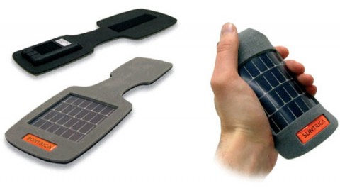
SolarStrap

SolarStrap: Charge Your Gadgets While Traveling

The SolarStrap is a thin and lightweight solar panel on a wearable badge. It’s made in Finland by Suntrica and weighs about 2 ounces. It’s easy to put the SolarStrap on any bag, backpack or shirt thanks to a folding tab. It stores solar energy in a small battery, than can be used to charge up your cellphone, iPod or any other gadget. It retails for about $40.

The Man With the Golden Arm (1955)

Saul Bass’s stark opening sequence for The Man With the Golden Arm (1955).

(via existingvisual)

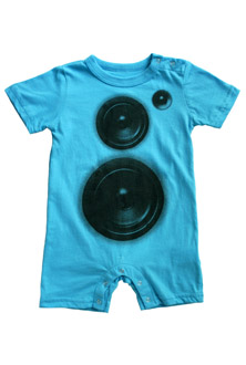
mini rotation speaker romper

minirotation_speaker_romper

Mini rotation speaker romper. Made me laugh!

Blanka Scale Series

Blanka Scale Series

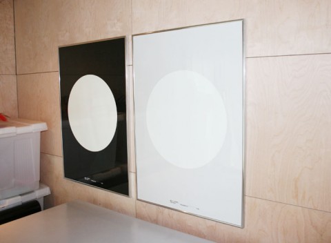
Blanka Scale Poster Series. Beautiful.

Digital Clock

digital clockuntitled-1jpgimgjpg

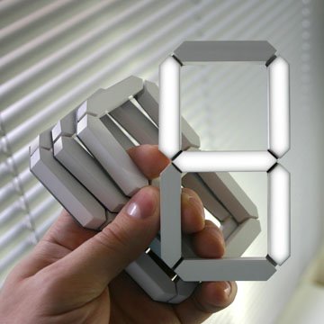
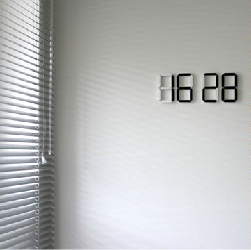
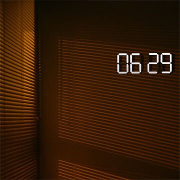
Digital clock: only figures, no case, only the necessary – only accurate time. Each figure has self-contained power supply and independent control, it can be fixed to any surface autonomously. A light sensor will switch the clock to an invert mode: the figures are white in the dark time of day and black at daytime. Yes, Please!

(via BBlinks / Coudal)

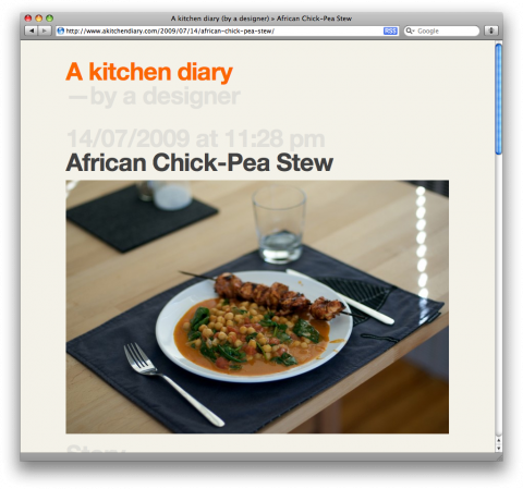
A kitchen diary

african-chick-pea-stew

Art Director Xavier Encinas started a simple, typography driven Kitchen Diary. Wonderful!

(Jolayne, you are one lucky lady!)

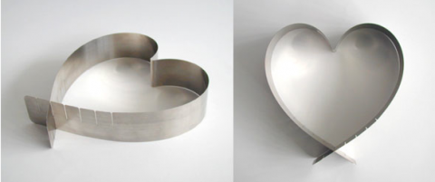
Variable Heart Cake Form

variable heart cake form

The variable heart cake form, designed by Swiss Zimmerli Design, is a folded sheet steel band. Adjust the size of desired heart as needed. Lovely. (Kurt Zimmerli also designed the famous SIGG Bottle)

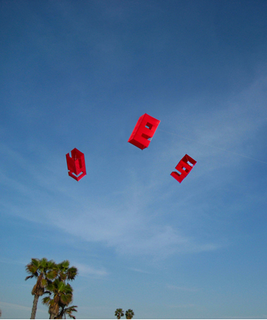
Letter-Box-Kite

Letterbox Kites

Andrew Byrom made giant 3D letters from fabric and wood. They kept blowing away, so he made letter kites.

(via @veerupdate)

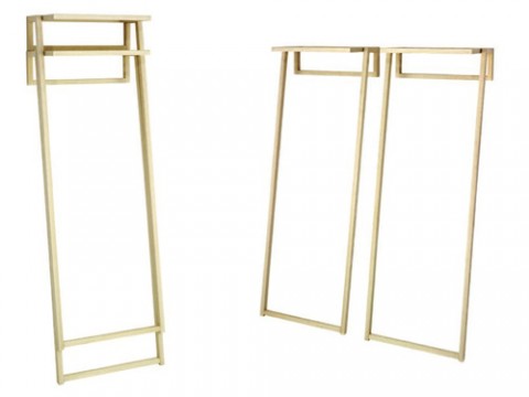
Staple

staple-taschidejpg

Seemingly weightless, STAPLE is typical of the best in modern interior design. A solid wood coat rack, it quite simply rests against the wall: minimalist Zen style and top-level craftsmanship in wood. It’s ideal if rooms are small but the flow of visitors is larger: STAPLE can be stacked to save space when it’s not needed. Before the guests arrive, the vertically stacked units are simply rested next to one another against the wall – and coat storage space multiplies immediately!

Coat hangers can be attached to the horizontal rod at the front, and as an option three metal coat hooks can be attached to the rod at the rear.

iQ font – When driving becomes writing

iQ font – When driving becomes writing / Full making of from wireless on Vimeo.

Two typographers ( Pierre & Damien / plmd.me ) and a pro race pilot (Stef van Campenhoudt) collaborated to design a font with a car.
The car movements were tracked using a custom software, designed by interactive artist Zachary Lieberman. ( openframeworks.cc )

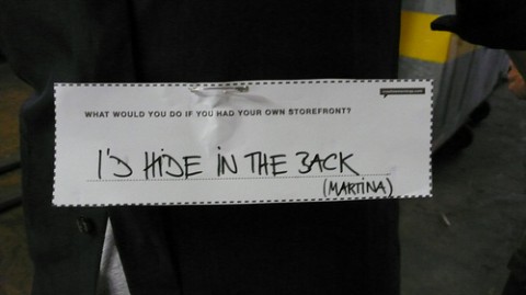
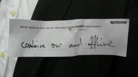
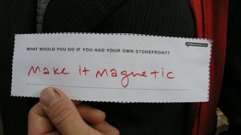
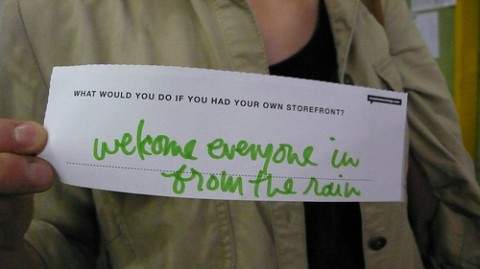
What would you do if you had your own storefront?

3730870351_c8b745bb8bjpg
3730893381_bc45dca8e4jpg
3730889833_fd8f542f5ajpg1

3730911447_0b7daa71f1jpg

At today’s CreativeMornings at FREITAG in Zurich, I asked the question “What would you do if you had your own storefront?” Here are (some of) the answers in a flickr set. (These tags are meant to help break the ice and facilitate a conversation!)

So, what about you? What would you do if you had your own storefront?

Impressions of Today’s CreativeMornings with Daniel Freitag

Today’s first Switzerland based CreativeMornings was a huge success. When I first approached FREITAG for hosting, I flat-out told them that I had no idea if people would actually show up. I know by now that the NYC events fill up quickly, but would I be able to gather a crowd in Zurich? The answer is: YES! We had over a 160 r.s.v.p’s and I’d say a good 150 showed up despite nasty rain. (Oh, swiss summer, where are you?)

Daniel Freitag, one of the co-founders of Freitag was our speaker and he was simply fantastic. He was flexible enough to spontaneously hold the presentation in English as it turned out that we had about 8 english-speaking only guests. (To all of you that didn’t come because we thought the event would be in swiss-german, I am very sorry!)

Daniel is a great presenter and was an overall gracious, humble host. He even gave a small group of us a tour of the Container Store nearby, as well their graphic design and prototyping atelier. All day I kept saying to G how impressed I was by Daniel’s warmth and generosity.

Below are a few visual impressions of the event. My fab cousin Thilo Hoffmann was so kind to tape the presentation and I will try to get it up asap.

freitag_setup
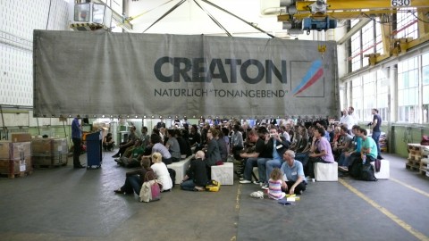
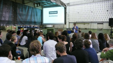
The set up at the Freitag Factory could not have been any better. These guys are thorough. A *big* thank you to the Freitag team and Sascha Koeglmeier in particular who was simply a delight to organize this with. Everything was meticulously thought out and prepared – oh, so, swiss!

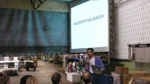
recontextualisation
In his presentation Daniel was talking about their take on recontextualization. Take their bags made out of truck tarp and seat belts, their store built out of Containers as well their Truck Tarp Presentation Room.

creative_morning
Daniel Freitag presenting under the Truck Tarp ‘Tent’. Fantastic!

answering_olivers_question
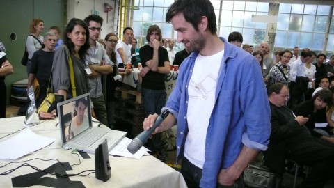
Daniel Freitag answering Oliver Reichenstein’s questions. Oliver, of Information Architects was our virtual guest dialing in from Tokyo. Oliver, it was a pleasure to have you!

jung_von_beckmountains_of_gipfeli
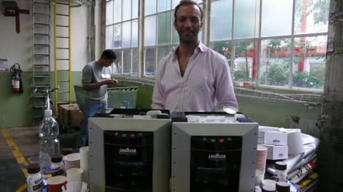
Jens of Jung von Beck was our delightful breakfast-man! He showed up with two Lavazza espresso makers and lots of yummee bakery stuff – wheee! A big thank you to MailChimp and ROD Communications for sponsoring breakfast! I was particularly happy about the mountains of Gipfeli! :)

out_of_ideas
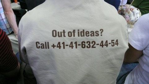
I was standing behind this shirt wearing CreativeMorning guest and was tempted to dial the number a few times.

freitag_benches_klein
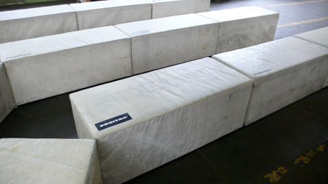
How fantastic are these Freitag Benches? (not available for sale yet, unfortunately) I would love a few of these in our studio!

Here are all the photos of today’s event. Did you take pictures? If so, please consider adding them to our creativemornings group.

Did you attend today’s CreativeMornings? Did you write a post about it? Or do you have some thoughts/feedback? Write it in a comment below. Did you take some pictures?

Follow @creativemorning on twitter and be the first to know when the next event with Allegra Burnette of MoMA NYC is accepting r.s.v.p’s.

today: swissmiss in tagesanzeiger

swissmiss in Tagesanzeiger

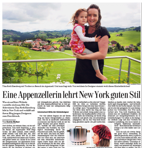
I am excited and feel honored by today’s article about me in the Tagesanzeiger, one of Switzerland’s biggest newspapers. (Even our little Ella Joy made it in the picture. Yay!) A big thank you to Katrin Hafner, the lovely journalist and the photographer Thomas Burla who both came out to the Appenzeller hills for the interview/photo shoot.

Article (pdf), in german only. (English translation below)

UPDATE:

My wonderful friend and talented writer Martina Kink was so generous to translate the article. Voila, here it is:

You can’t miss with swissmiss, by Katrin Hafner
(translated by Martina Kink)

Tina Roth Eisenberg, aka swissmiss, is a Swiss designer living in New York. Her blog, swiss-miss.com, is not just hugely popular among young creatives, but also exactly the kind of break young unknown designers need to make it. Whatever Tina posts becomes an instant hit.

“You see that white house over there? That’s where I grew up.” Tina Roth Eisenberg is at the wheel as Appenzell, one of Switzerland’s most picturesque landscapes, flies by. She’s driving fast, she’s talking fast, she’s thinking even faster. Her laugh – HA! – is like a little explosion. Tina, a communications designer, moved to New York 10 years ago and has slowly but steadily made her way to the top of the design scene. She has worked as a consultant for MOMA, is repeatedly asked to be on the jury of design competitions and headhunters are constantly at her heels. Today, Tina owns her own design studio in Brooklyn, where she also lives with her husband and 3 year old daughter. The girl from Switzerland has come a long way.

Internet agent to the young, willing and able.

4 years ago, Tina started to feature design objects on her blog, mostly furniture, accessoires and books. She presents them with little text and amazing photos, and always makes sure to give credit to the artist or producer by linking to the respective websites. She definitely has a knack for finding good style on the web and whatever sparks her interest and curiosity or just plain makes her laugh appears on her blog. Whether it’s a drain stopper, a commercial for organic eggs from Swiss supermarket Migros or an interview with industrial designer Dieter Rams, it’s on there, and it’s neatly archived. This way, she manages about 30 new posts each day.
Her blog is not about selling things. Tina believes in creativity and networking and made it her quest to feature other designers and creatives, for free. This is exactly what made her insanly popular, and rightly so: Her website swiss-miss.com is the single most linked Swiss blog ever. Her readership grows day by day, and by now, she has more than half a million clicks per month. This enables her to almost live off the network she created.

A little R&R with Röschti

Tina is sitting on the terrace of her rental vacation home in Appenzell, Switzerland, surrounded by green hills and the sound of cowbells that make a nice change from NYPD sirens. She’s dressed in all black, with very little make-up and jewellery. Her iPhone and Macbook are nowhere to be seen, and inside her husband and daughter are having pasta.

“My blog is huge” she says, and there’s not a trace of arrogance in that statement. The fact that Khoi Vinh, head of design at New York Times online, reads her blog leaves her both proud and incredulous: “Can you believe that?!”
If swissmiss posts a product on her blog, it might very well be sold out within hours. She has that kind of influence and power, and she has changed at least one young designer’s life: He pitched his idea to her via email: a tray with cut-out letters that you can use to make letter-shaped cookies or ice. “Pure simple design with humor – it made my typographic heart beat faster”. Tina presented the idea on her blog, where Urban Outfitters discovered it and immediately placed a big order. This is what makes swissmiss happy: “There’s nothing better than to help a designer who’s just starting out and give him a chance. Everybody wins: The artist gets public knowledge, I get a kick out of it, and to my readers, I’m kind of a taste-maker, somebody who shows them the good stuff. It’s like being an advocat for young undiscovered talent.”

Curbing consumption with style

What exactly is good design, Ms. Roth Eisenberg? Pause. It’s totally subjective, she answers. Is she afraid of being considered an expert? “A lot of people expect way too much of me. I just point out what I love and think is amazing, that’s all”. But she does it in a totally consequent manner. Swissmiss constantly finds rare design gems on the web that nobody knows about and that you don’t see on any other blog. She boosts the economy by showing her very own style. People love that. There are readers who gladly and proudly announce they furnished their whole appartment swissmiss style.
In times of globalisation we all long for individuality, but we need help. The internet is a good way to go, but it is also enormous and you can easily get lost. Tina is sort of a gate keeper: She knows her way around the jungle and she is happy to help you out. Especially when it comes to furniture, her love for smart design is obvious: intelligent, functional, minimalist – classic Swiss design à la USM Haller and Corbusier.

Calling herself “Swiss designer gone New York” also proved to be a very smart move, as she readily admits: “Americans love everything that even remotely sounds Swiss.” Lately, the Swiss Tourism Board noticed her influence and approached her about travel tips for Switzerland on her blog. “Why not?” Tina says. “I love Switzerland. I just can’t picture myself living here again – it’s just way too slow for me.”

Back to Brooklyn

Pure luck is what brought Tina to New York, and she also refers to good luck when it comes to her amazing career. “I got lucky” she says, “after my Masters at Munich’s University of Art, I was looking for a 2 month internship in New York. I got a working contract and a visa out of it.” She also lucked out when it comes to her upcoming lectures at the New York School of Visual Arts, or when she totally hit the hipster nerve with her Creative Mornings. Every month, Tina invites designers and everybody interested to a creative breakfast meeting, with presentations, Q&As, disussions, and the possibility to network. By now, these mornings in New York are booked solid within minutes after she announces them on her blog. Apparently the creatives of New York just long for personal contacts beyond their screens after all. And it seems we all just lucked out a little for knowing about swissmiss and her blog.

And Tina? After all these years in New York, she still longs for her daily Swiss products. Before she gets on the plane back to Brooklyn, she always makes sure to stock up on deodorants, spices from Schmid-Metzg, and her favorite socks. HA!

makoto yabuki

White Box from makoto yabuki on Vimeo.

(via fantastic sharesomecandy)

How to ‘open’ a banana:

(via ifiwerethekeys)

Is 30minutes too much to ask?

If we reply to any RFPs in the future, we’ll be letting the prospective clients know that our submission will be online and that we’ll be measuring how much time is spent reviewing it. And we encourage other shops to do the same. If agencies are going to spend weeks preparing their response, the least any client can do is commit 30 minutes to look at it.

Zappos pitch underscores what’s wrong with the review process, by Mike Wolfsohn

(via @michaelSurtees)

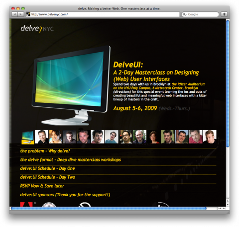
Delve NYC

Delve UI

Here’s an event that made me look: DelveUI: A 2-Day Masterclass on Designing (Web) User Interfaces. Think of Delve as the antidote to the bloated conference experience. Basically small, affordable & frequent vs. overwhelming, occasional & costly. Each DELVE consists of a series of masterclasses conducted by expert practitioners, authors and thinkers of the biggest topics facing those of us who design and develop for digital, interactive spaces. Fantastic!

(thank you rob)
Fasten Seat Belts to the World