MoMA Line of People Project

moma_fence_banner

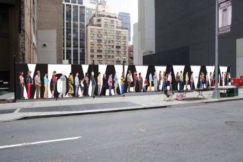
What: Photo shoot for a new banner that will cover the west-lot fence on 53rd Street for the duration of the year
When: Wednesday–Friday, June 17–19, 10:00 a.m.–7:00 p.m.
Who: You!
Where: The lobby near the film desk at the 11 West 53rd Street entrance
How: A professional MoMA photographer will be taking full-length photographs of visitors, staff members, friends, and family. A selection of these pictures will then be assembled into a graphic rendering of the legendary MoMA ticketing line, which often extends alongside the 53rd street fence.

The MoMA is looking for people of all ages and backgrounds to show a real slice of New York. If you’d like to participate, please visit the MoMA set in the lobby near the film desk (enter at 11 West 53rd Street) on June 17, 18, or 19. They also encourage you to stop by their set during special extended hours, from 10:00–11:00 a.m. and from 6:00–7:00 p.m. Come as you are, dressed as you like—the more colorful the better!

While they cannot guarantee that your photograph will be used on the final banner, you will be able to download your professionally shot, full-length, high-resolution photograph from the MoMA Flickr site in the week following the photo shoot. Participants will also receive a free admission pass to the Museum!

In order for them to anticipate attendance, please RSVP with the date and time you think you might be able to attend. Kids, extended family, artist friends, and MoMA members are all welcome.
swissmiss in “Vårt Nya Hem”

vartnya_hem

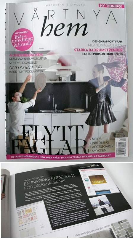
I just received a copy of “Vårt Nya Hem” (Our New Home), a Swedish Interior Magazine that features a small article on swissmiss. I don’t understand a word of swedish, so I just hope, it’s a nice article.

Thank you Eva!

AIGA/NY | Seymour Chwast Today!

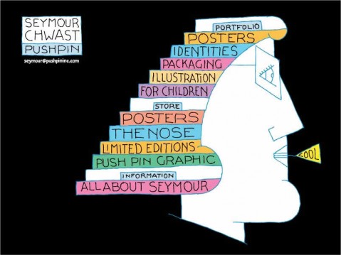
Seymour Chwast of Pushpin

Here’s an event you shouldn’t miss: Seymour Chwast, the quintessential New York designer/illustrator/painter, is launching his newest book with AIGA/NY tonight, June 16th, 2009.

Chwast and Steven Heller will flip through the book chapter by chapter and allow us to listen in on their various and variegated commentary. Chwast has promised to expose his obsessions, as well as his fears, follies and successes.

For those of you who don’t know, Chwast has illustrated for most major magazines and has designed and illustrated over 30 children’s books. He is co-founder of Push Pin Studios and is a root source for the spread of comic expressionism across America. His posters are held in many museums including Pompidou Center Gallery (Paris), Stedelijk Museum (Amsterdam), the Museum of Modern Art (New York), the Library of Congress (Washington D.C.) and the Israel Museum. He is in the Art Directors Hall of Fame and he is the recipient of the AIGA medal.

It’s killing me that I can’t attend. But maybe you can? Make sure to register! Please report back!

Oh, and here’s a link to the book. (thanks Ben)

Paper Pot

Paper Pot

Paper Pot is designed to be used for both toilet and tissue paper. Simple and beautiful! I want one! Or two!

(via notcot)

Deadline

(thank you peter/ via booooooom)

Art Basel | Jannis Kounellis

Anne Karin Furunes
Anne Karin Furunes

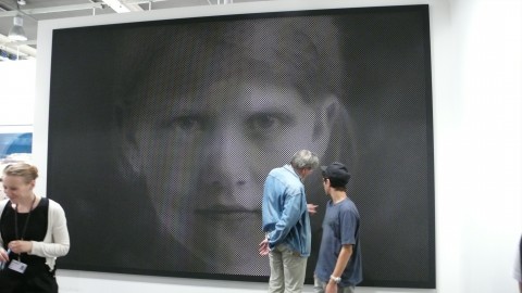
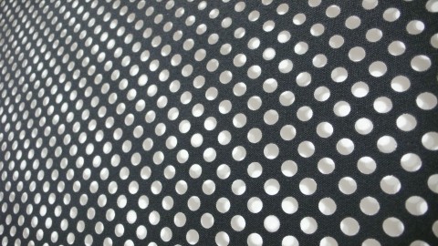
Anne-Karin Furunes’s gigantic piece took my breath away for a second. The lady at the Gallery Anhava Booth told me that the Norwegian painter is known for her works employing perforation technique. Based on photographs, these pieces have a black or white canvas perforated by the artist in imitation of the screen of a photograph. One the one hand, Furunes’s works are paintings dwelling in light, while on the other hand they express the authenticity and intensity of early beautiful monochrome photographs. I learned that this large-scale portrait, pictured above, was made specifically for Art Basel 09. Stunning.

Art Basel | Jack Pierson

Jack Pierson
Jack Pierson

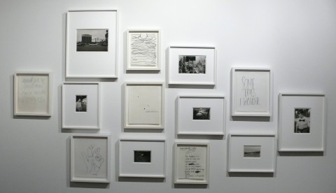
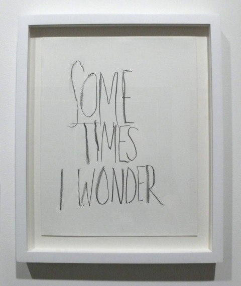
The “Sometimes I Wonder” Detail of Jack Pierson’s piece at the Cheim & Reid Gallery Booth made me chuckle. Don’t we all?

Art Basel | Jorge Macchi

Jorge MacchiJorge Macchi

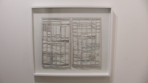
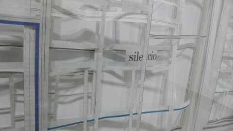
The Graphic Designer in me was instantly drawn to this piece by Jorge Macchi. Tempted to do the same but with website-layouts.

Art Basel | Sudarshan Shetty

Sudarshan ShettySudarshan ShettySudarshan Shetty

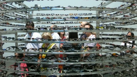
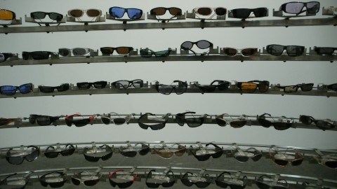
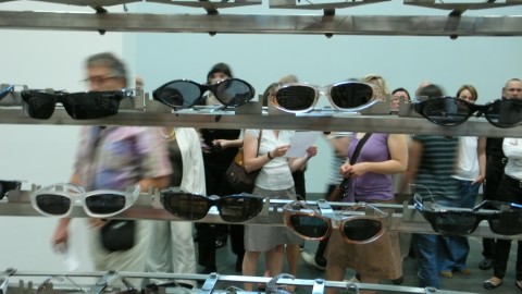
Sudarshan Shetty’s Untitled Piece (from the “Leaving Home” series) was amusing and absurd at the same time. Sudarshan uses a veriety of everyday materials to create kinetic sculptures. This large work refers to the idea of homes as a physical enclosure with many eyes: an imposing stainless steel chamber with a myriad of plastic sunglasses in lieu of windows. After visitors enter the chamber, the politics of viewing is immediately reversed – the eyeglasses turn to scrutinize the new inhabitant of this small enclosure, placing them under the dispassionate surveillance of invisible viewers.

Art Basel | Jeppe Hein

Jeppe HeinJeppe HeinJeppe Hein

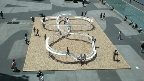
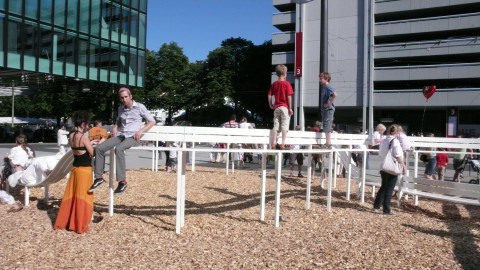
Jeppe Hein’s Loop Bench is part art piece, part bench, part slide. I had an fantastic time watching people (young and old) interact with it.
Art Basel | Tatiana Trouvé

Tatiana Trouve

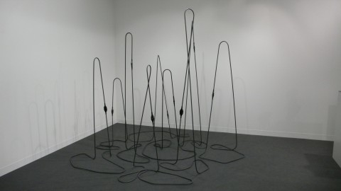
Tatiana Trouvé’s untitled “Cable Sculpture” made me think of my cable mess under my desk in my office, just of course, in a much more artsy and aesthetic way. Definitely made me look.

Art Basel | Roman Signer

Roman SignerRoman Signer

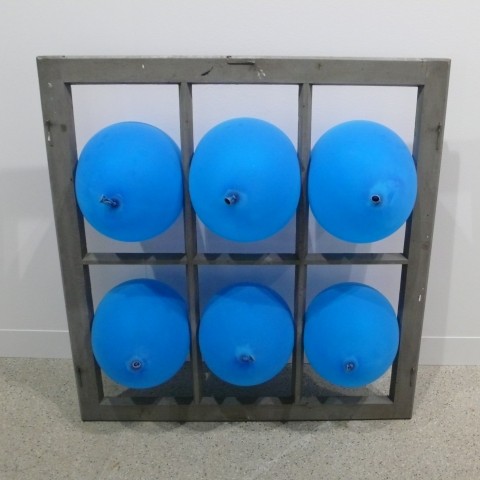
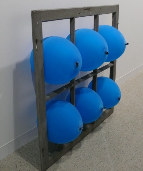
Roman Signers blue balloons stuck in an old window over at the Stampa Galerie Booth had me chuckle. (I unfortunately couldn’t find the real name of the piece in my notes. Pardon my ignorance, and please let me know if you happen to know it.)

Art Basel | Peter Wuethrich

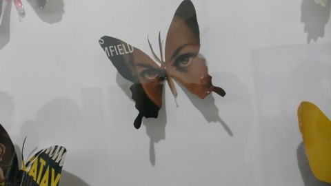
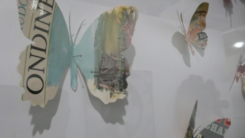
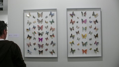
How incredibly poetic are these Bookcoverbutterflies by Peter Wuethrich?

l1160261l1160260l1160263

Art Basel | Jorinde Voigt

jorinde voigtJorinde Voigtjorinde voigt

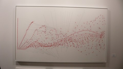
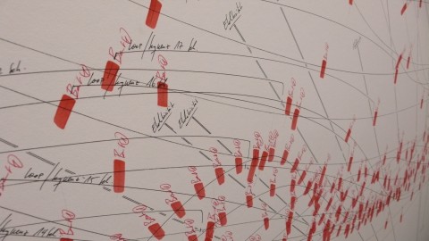
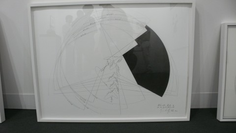
Jorinde Voigt’s pieces at Galerie Klueser caught my attention. In her work the young Berlin artist describes her environment by transforming everyday phenomena such as eagle flight paths, kisses, Top Ten song etc into an abstract system or representation, using her own visual language.

Basel | Made me look

Here are a few photographic impressions of my first day in Basel. Enjoy!
Old Basel Houses

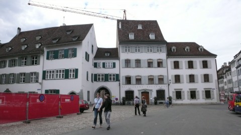
Beautiful Old Houses/Architecture everywhere. And so nicely kept! Go swiss!

window shutters

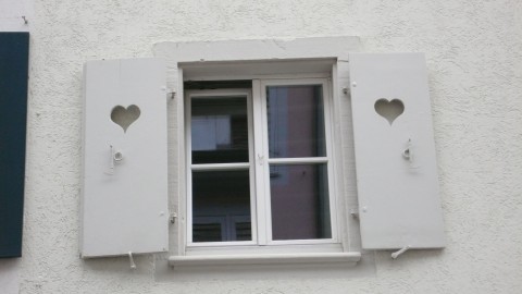
Awww… those romantic swiss!

Bike Rack

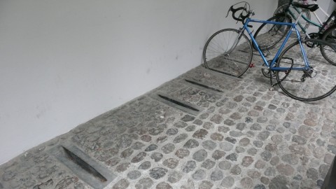
How smart and beautifully minimalistic is this ‘bike rack’?

l1160085

Yay for vintage typography!

l1160108

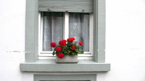
Want to really show off your swissness? Put red Geranium on your window sill. G, I think we should try this in Brooklyn!

Basel | Seven Sisters

Seven Sistersseven sisters

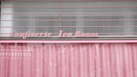
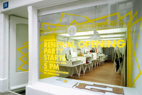
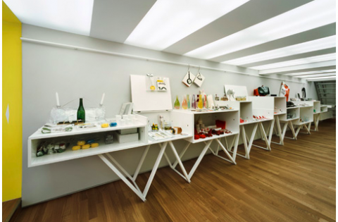
During a wonderful guided tour of beautiful Basel, we came upon this little gem of a design store called Seven Sisters. While I do have to simply accept that every design store now seems to be carrying the same items (new york, paris, tokyo, all the same?) I must say I really liked the vibe of Seven Sisters. Small, Personal and Modern. Make sure to stop by if you happen to be in Basel or check out their site!

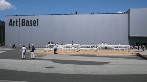
Art Basel

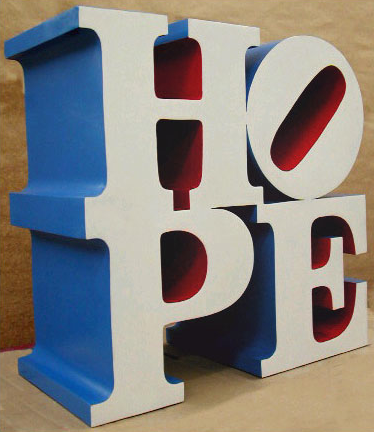
HOPE
Indiana Robert ,”Hope”, painted aluminium 2009

I am off to Art Basel. Hopefully I’ll come back with a suitecase filled with bloggity art and design goodness from the swiss alps.

Are you going to Art Basel? Do you know anyone that is exhibiting that I should go see?

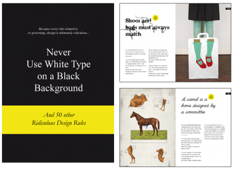
50 Ridiculous Design Rules

never use white type on a black background

Design has many rules that claim to be big truths and full of wisdom. Designers all go by rules that work for them. However, their rules may not work for someone else, or for a particular piece of design work. When a rule is forced upon you, it stops working and becomes a joke, like “Never use a PC,” or “Leave it until the last minute,” or the most famous of them all, “Less is more.”

The problem is that every rule related to, or governing, design is ultimately ridiculous. In this book we have collected the most talked-about rules and the viewpoints of designers and thought leaders who live by them or hate them..

Never Use White Type on a Black Background: And 50 Other Ridiculous Design Rules

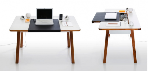
StudioDesk

studio desk

StudioDesk has been specifically designed for laptop users and allows for a clutter free working environment while still connected to all your peripherals. This is music to my ears!

(thank you @alba)

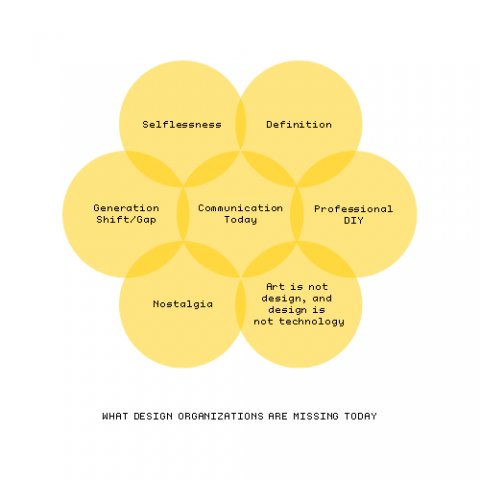
What Design Organizations are missing today

designnow

Thoughts on AIGA and the Design Industry in general by Michael Surtees: AIGA makes a turn for the better hopefully. And I agree with Michael, I am ridiculously excited that Debbie Millman is now president of the AIGA.

Watch Debbie Millman’s initial speech as national president of AIGA. This speech was at the AIGA Portland Oregon National Leadership Conference June 3-8, 2009.

On Frank Gehry Being Fired

Seen over at Subtraction:

“The recent news that the developer Forest City Ratner had scrapped Frank Gehry’s design for a Nets [basketball] arena in central Brooklyn is not just a blow to the art of architecture. It is a shameful betrayal of the public trust, one that should enrage all those who care about this city… A new design by the firm Ellerbe Becket [is a] colossal, spiritless box, it would fit more comfortably in a cornfield than at one of the busiest intersections of a vibrant metropolis. Its low-budget, no-frills design embodies the crass, bottom-line mentality that puts personal profit above the public good. If it is ever built, it will create a black hole in the heart of a vital neighborhood.”

NYT: Nicolai Ouroussoff on Frank Gehry Being Fired from Atlantic Yards Project

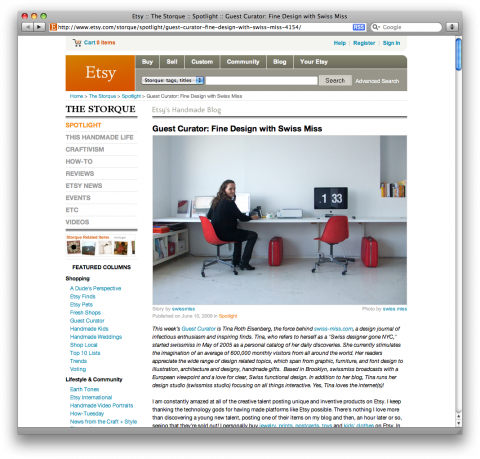
swissmiss ♥ etsy

etsy feature

Etsy gave me the opportunity to be a guest curator and show off some of my favorite picks. Have a look at what I’ve selected. Thank you Etsy!

swiss kitchen storage

0artleb03jpg0artleb04jpg

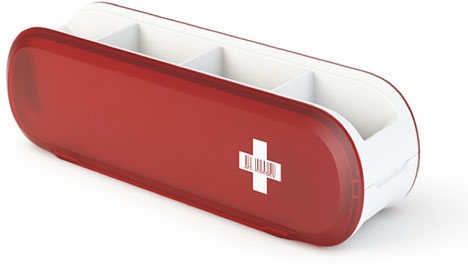
Swissarmius Cutlery Holder by Art Lebedev Studio.

(via @noodlesandbeef)

Acorn Birdhouse

acorn

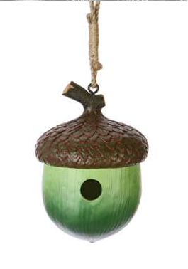
Acorn Birdhouse. It made me smile.