The Rainy Season

rain1
rain2
rain6

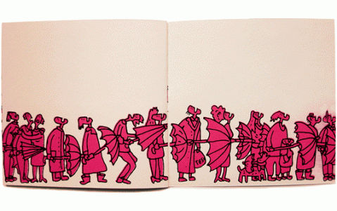
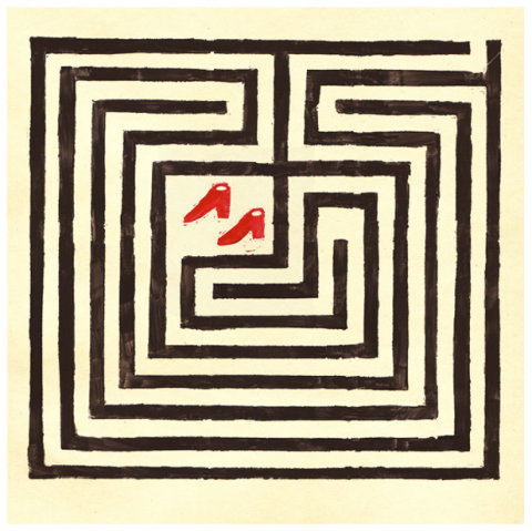
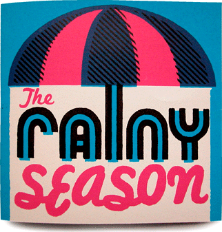
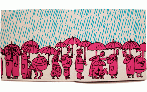
I received this silkscreened booklet called The Rainy Season by Andy Smith. It put a huge smile on my face. (G and I met because of an umbrella, so anything umbrella related is by nature dear to me.) The booklet comes in an edition of 150. Two swissmiss thumbs up! Thank you Andy!

About to meet…

André da Loba. Thank you internet(s).

picture-6

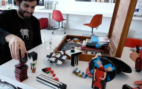
UPDATE: I had the most wonderful conversation with André. He came in with his ‘treasure chest’ (portfolio) and blew me away. His art is refreshing, surprising and whimsical. His talent abundant. He has a story that goes with each piece, which I completely love. I spent the rest of the day telling everyone that crossed my path how inspired I was by André. The best of it all: We decided to collaborate. I am thrilled.

andredaloba

Extreme Sheep | LED Art


Video made in the hills of Wales with sheep, LEDs and a camera, to create a huge amazing LED display. While I love the visual outcome of this experiment, I do feel for the sheep.

(via formfaktor / culturalfuel)

Little Cabin Necklace

il_430xn61108075jpg

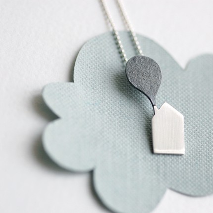
Hide away with your own tiny cabin: Little Cabin Necklace.

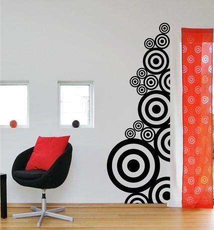
Circles!

il_430xn56626390jpg

Vinyl Wall Decals Stickers Art Graphics Circle Circles

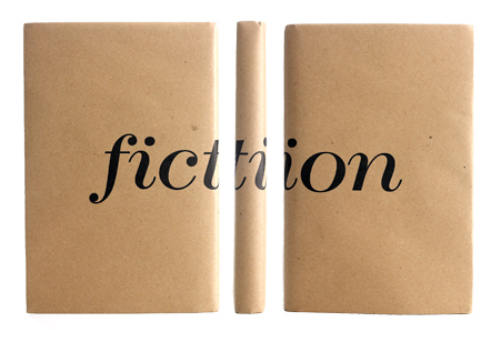
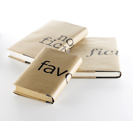
Book City Jackets

fiction_triptych_lowresthree_lowres

Book City Jackets by Jeremy Schwartz, are kraft paper book covers. They are the updated, more design-y versions of the paper bag book covers we used to make for school textbooks as kids. Made me smile and want to cover my books with these! $9 for a set of three. I think this is a fantastic gift for any booklover. Buy them here. (For all my Brooklyn readers: You can find them at the Brooklyn Flea this summer!)

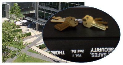
Sneakey Robbers Turn to the Social Web

sneakey_telephoto_nov_08jpg
Leave your keys in your pocket,” is the advice given by computer programmers at University of California San Diego who recently created ‘Sneakey’ software; an application that uses a digital image of a key to produce an exact copy in physical form within minutes.

Sneakey Robbers Turn to the Social Web, by Lidija Davis

(thank you donna)

Question for my readers: Green Printer

I am finalizing a branding project and am about to put my feelers out for ‘green printers’. Do you have a printer that you enjoyed working with and that puts an emphasis on eco-friendly printing? 100 instant karma points for any leads you might have.

BuckyBalls

I got my hands on BuckyBalls and what can I say other than “Totally Addictive”. Coolest toy I have seen in a long time. (BuckyBalls are 216, spherical, Neodymium magnets, so, keep them away from your little ones!)

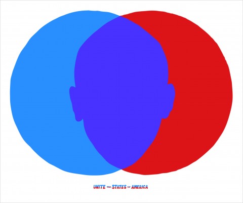
Unite The States of America

venn2

Aaron Allen, Creative Director at Wieden+Kennedy, designed this *amazing* poster for Obama’s campaign titled Unite The States Of America. Simple, powerful, beautiful. Hat tip! (They are 2-color screenprints and apparently there are a few more for sale. Email him if you’re interested. He added his email in a comment below.)

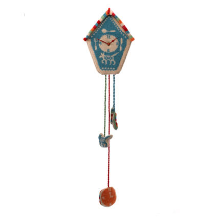
Knitted Cuckoo Clock

swatch1135sw_imagejpg

Knitted Cuckoo Clock. Made me smile.

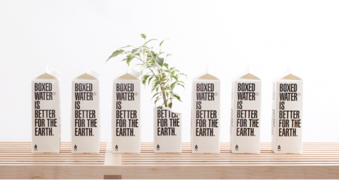
Boxed Water Is Better

picture-122

Part sustainable water company, part art project, part philanthropic project, and completely curious. Boxed Water Is Better, is a boxed water company. Started with the simple idea of creating a new bottled water brand that is kinder to the environment and gives back a bit – they found that it shouldn’t be bottled at all, but instead, boxed. So they looked to the past for inspiration in the century old beverage container and decided to keep things simple, sustainable, and beautiful.

(via bloggokin)

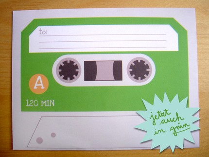
Cassette Envelopes

il_430xn29458165jpg

Cassette Envelopes. Way cool.

(via mamasaid)

ConceptShare

tour_splashjpg

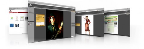
ConceptShare allows you to setup secure online workspaces for sharing designs, documents and video and invite others to review, comment and give contextual feedback anytime and anywhere without a meeting.

Procrastination by John Kelly

(via what made me look)

Made me smile.

corbata2jpg

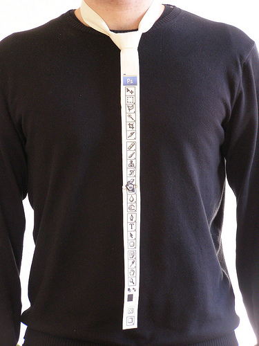
Photoshop Tie.

Greenhouse

greenhouse

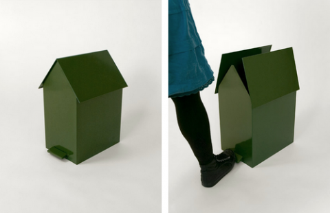
Greenhouse by Jantze Brogard Asshoff

(thank you jon)

Murals for The Library Initiative

library_ps69_620jpg
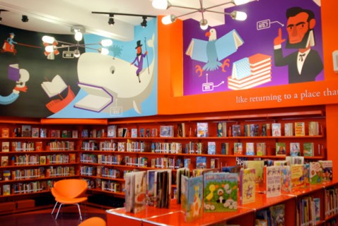
Christoph Niemann’s murals at P.S. 69 in Clason Point, the Bronx. Concealed in every image are one or more books.

Nearly nine years ago, Pentagram was asked to contribute to a visionary effort by the wonderful (and design-conscious) Robin Hood Foundation: an initiative to build new school libraries in elementary schools throughout the five boroughs of New York City. A range of talented architects would design the libraries; private companies would donate books and funds; and Pentagram would provide the graphic design, including signage, wayfinding, and a masterbrand that would tie all the sites together.

Along the way, they discovered something interesting. The libraries are usually located in older buildings with high ceilings, but the shelves in the libraries can’t be built higher than kids can reach. This means there is a space between the top shelf and the ceiling, an up-to-six-foot band around the room just begging for something special. That something turned out to be murals. And the results can now be seen in schools all over New York City, including five brand new ones in the Bronx which feature murals by Rafael Esquer, Maira Kalman, Christoph Niemann, Stefan Sagmeister and Yuko Shimizu, and Charles Wilkin.

Post over at Pentagram: Murals for The Library Initiative. Article over at the NYTimes.com.

(thank you michael)

Thoughts on SXSW

I am back at my studio after 3 days of sensory overload and networking marathon at SXSW. Deadlines are looming so I will keep this post brief. A few thoughts:
Panel discussion

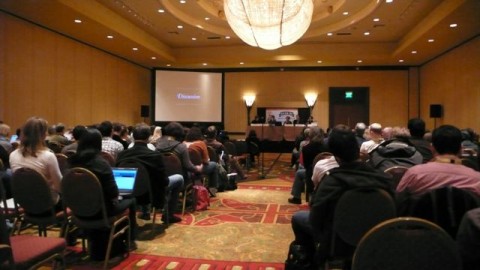
This was my first SXSW experience and I was surprised at the amount of panel discussions. I have voiced this many times before: Panel discussions don’t do it for me. It pains me to see brilliant speakers sitting up on a panel and none of them really being able to share their insights and knowledge. I always feel like that panel discussions only scratch the surface. On my second day I just simply stayed away from them and only attended single or two people presentations. And guess what, those were insightful, enlightening and inspiring.

I keep thinking that a conference like SXSW should be a little bit more playful. Put the panelists in the center of the room, hand them a microphone and have them stand and walk around. The dynamic of a panel would change and it would make it easier for the audience to participate. One thing I learned with organizing the CreativeMornings, which are always hosted at a different space, is that the ‘packaging’ of an event determines how the attendees and speakers interact. The oldschool ‘rows of chairs’ and panelists sitting on a podium far away at the end of the room is everything but facilitating exchange.

By putting speakers and the audience on the samel level you make them feel equal and it is easier to start a conversation.
l1130844
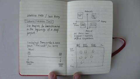
The one presentation that made the conference worth going alone was by Leah Buley of Adaptive Path. She spoke on the topic of “Being a UX Team of One” which she said will be available on Slideshare (but is currently not up yet, an older version of it is though). She gave a very insightful presentation on Brainstorming Tools they use, how she believes in Assembling and Ad Hoc Team is helpful and the Design Principles they believe in at Adaptive Path. It was refreshing to hear that at the beginning of a project, she always sits down and sketches (yes, by hand) first wireframe ideas and does not start off at the computer right away. This gets my two thumbs up! Hat tip to Leah Buley for her fantastic presentation!
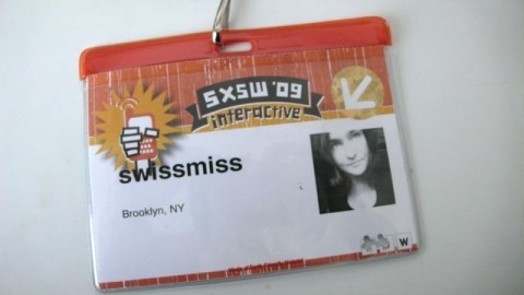
swissmiss_sxsw_badge
Why is it so hard for conference organizers to design a useful badge? It was literally impossible to read someone’s company name, let a lone where they were from. A badge simply doesn’t work if you don’t have the important information LARGE and in bold type. It’s not rocket science, is it? I literally had to walk up to people, bend down and stare at their tummy, cause that’s where the badge ends up. (I actually had them change my badge and only say swissmiss, take out my company name alltogether and it helped a little.)

Every time I get back from a conference I feel compelled to design the ‘perfect’ conference badge (or maybe it’s not even a badge per se). And then I get sucked in into my usual studio business and forget. If you are a conference organizer and want help with the badge/name information design, please get in touch. I feel strongly about this and have plenty of ideas how we can improve this and make it easier for attendees to connect and make valuable connections. After all, a huge part of why we go to conferences is to network.

I had the pleasure to meet Mike Davidson and we were discussing just this. He later pointed me to a post he wrote called Building a better conference badge.
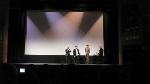
Gary Hustwit Objectified

I got to see the world premiere of Objectified, the latest documentary by Gary Hustwit. I was sitting at the screening like a kid that just entered a toy store. And I fully agree with Allan’s review over at Core77: “Perhaps the big winner in the film is Dieter Rams, already a god in design circles and sure to fortify that shrine after this film’s release. He has some of the best lines (“Good design is as little design as possible”), but comes out triumphant on the sustainability front. Bill McDonough, watch your back.”
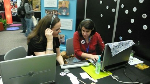
Desiree of Knowbility
One of the most touching and memorable moments for me was when Desiree of Knowbility, who is blind, showed me how she surfs the web. She pulled up swissmiss and showed me her experience of surfing my site. I learned that I need to tag my images better, or tag them, period. Desiree also showed me how she posts to her blog called Universallydesigned.net. This is defintely something I want to look into more and potentially have a CreativeMornings talk about. Do you know of any similar services like Knowbility here in the NYC area?

Now, I will tune into the #sxsw twitter stream and see what’s going on from a far. Did you attend? What were your thoughts?
CreativeMornings Video: Armin Vit of UnderConsideration

Armin Vit of UnderConsideration was our wonderful speaker at our march CreativeMornings. He spoke about branding and gave us some wonderful insights on how we are affected by it on a day to day basis. I especially loved his Chocolate Chip Cookie analogy.

The event was generously hosted at HUGE. They had me speechless when I saw the breakfast buffet. We are talking fruit salad, nutella (!), croissants and mimosas. A big virtual hug and thank you to the team over at HUGE.

I was especially excited about this month’s virtual guest, Chris Glass. I have been following Chris’ online for years now and was thrilled to finally get a chance to e-meet him via skype video.

For those of you that couldn’t make it to the event, you can watch the video below. (We apologize for the bad projection quality of Armin’s presentation.) A big thank you to Rolo for filming and editing.

Big Spaceship has an interesting post on the talk.

Off to SXSW

bingo_card_s

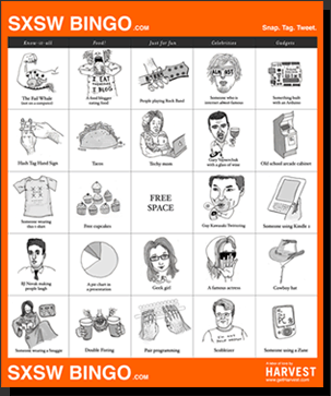
I’ll be traveling to Austin, Texas tomorrow, to attend SXSW. Very excited. I am fully prepared and ready to play SXSW Bingo. I will make sure to twitter my encounters and experiences.

Texas, here I come…

Business cards are so 2007

contxtsjpg

Contxts lets you send your contact info via text message. I agree with Tim, this is a cool idea.

Evolved Individuals

“Evolved individuals know that people who are not intuitive can be dangerous to work with, since they are guided solely by the current appearance of things that are in reality, changing. Evolved individuals seek out others who have intuition and vision – a form of intelligence that comes from cultivating the instincts, observing the direction of change, apprehending the evolution of ideas.”
— Lao Tzu

(via andybons)

Mr Switch

6a00d83501265b53ef011279447d4128a4-320wi

John Caswell is looking for a manufacturer for his playful switch plate called, well, Mr Switch!

(via minordetails)