Send a beautifully wrapped $20 bottle of water to your loved one and give one person clean water for 20 years. 100% of your donation goes to building wells. Charity: Water
(via bblinks)
Send a beautifully wrapped $20 bottle of water to your loved one and give one person clean water for 20 years. 100% of your donation goes to building wells. Charity: Water
(via bblinks)
Salutations have three simple purposes in email. They are the greeting, the email handshake. They set the tone and tempo for the communication that follows. And they establish a hierarchy, depending on whether the writer attaches a title (e.g., “Professor,” “Miss”), thereby creating a formal separation, or a lack thereof.
Anatomy of a Salutation, by Liz Danzico
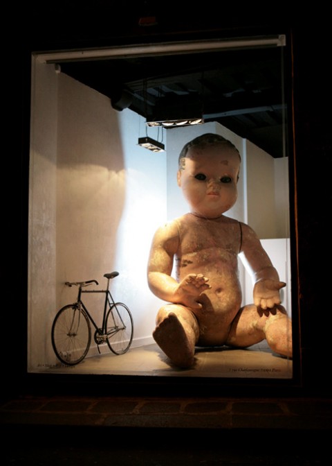
“Little is known about the orphan baby, apart that it was made in 1973 and that it resided on top of a gas station for years.” Made me look!
(via nevver)
Diego Stocco turned sandbags from his backyard into musical genius. The entire track is created entirely out of tuned sand tones. He emphasized the inner notes of the sand grains and mapped them on a sampler as a series of instruments.
Diego Stocco – Music From Sand from Diego Stocco on Vimeo.
(via holidaymatinee)
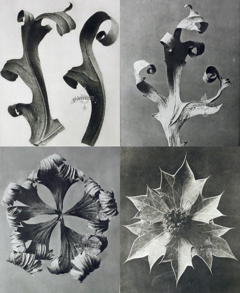
Karl Blossfeldt (1865-1932), a German artist and professor, captured these ‘art forms in nature’ and used them to instruct his students. Beautiful!
BOOMBOX from Ely Kim on Vimeo.
(via my spinning wheels)
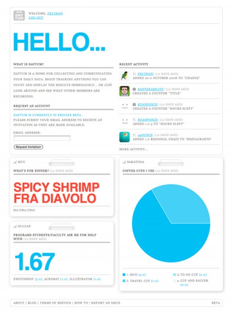
Graphic designer Nicholas Felton spends a great deal of time thinking about how to construct charts and graphs from his everyday routines. SVA’s new MFA Interaction Design Program talked to him about the effects his Annual Reports have on his everyday life, and some of his longer-term projections. Make sure to see him speak at the March 11 Dot Dot Dot Lecture.
(thank you liz)
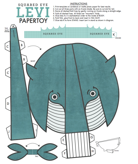
Matthew of Squared Eye just pointed me to his newly launched site. I think he should sell posters with his whale as it would look awesome in a kids room. My favorite part of their new site? Click on Contact and see what happens! Download the whale craft project here.
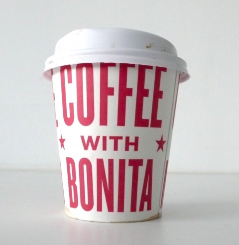
Suzanne just walked into our studio with this wonderful paper cup in her hands. It had me jump off my chair and snap photos. Oh, Bonita Diner, could you please open up a branch here in D.U.M.B.O so that I can walk around with these awesome typographic paper cups as well? (Or I’d be happy to design a similarly beautiful cup for any of the delis or cafes in the area!)
UPDATE: Cup was designed by Derick Holt.
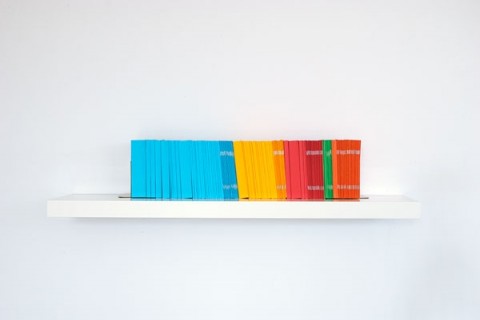
This series of guidebooks by Nikki Chung quantifies the collective experience of leisure travel by visually representing global tourist movements during one year. Using data from the UN World Tourism Organization I made a guidebook to every country in the world. The number of pages in each book corresponds to the number of tourist arrivals in that country in 2005. When viewed on a shelf, one year’s worth of ‘experience’ is presented in a condensed physical model that can be shifted and rearranged to visualize where tourists travel and where they don’t.
(thank you jon)
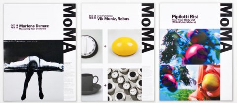
Along with the many signature artworks in its collection, The Museum of Modern Art (MoMA) possesses one of the most recognizable logotypes of any cultural institution in the world. In recent years, however, the application of this identity across the museum’s broader graphics program has been indistinct. Now MoMA has recast its identity, building on its familiar logotype to create a powerful and cohesive institutional voice. The new graphic identity has been designed by Paula Scher (Pentagram), and further developed and applied by wonderful Julia Hoffmann, MoMA’s Creative Director for Graphics and Advertising (and a Pentagram alumna).
(thank you kurt and don)
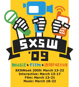
I am thrilled to have just booked my airplane and conference ticket for SXSW Interactive, March 13-17, 2009 in Austin. Still working on the hotel part, not easy…
Are you going? Are you a swissmiss reader living in Austin?
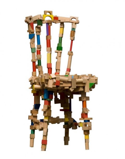
brickchair by Pepe Heykoop
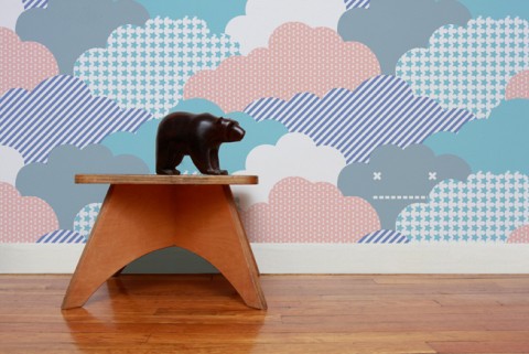
*Love* the Cloud Children’s Wallpaper by Aimee Wilder.
Increasingly, phones will allow users to look at an image of what is around them. You could be surrounded by skyscrapers but have an immediate reference map showing your destination and features of the landscape, along with your progress in real time. Part of what drives the emergence of map-based services is the vast marketing potential of analyzing consumers’ travel patterns. For example, it is now possible for marketers to identify users who are shopping for cars because they have traveled to multiple car dealerships.
The Cellphone, Navigating Our Lives, by John Markoff
Like designing, writing can straddle the line between art and craft—half blinding flashes of inspiration and unexplainable moments of brilliance (maybe a little less than half), and half moving words around, making and breaking sentences, typing commas then deleting them.
How (Not) to Write like a Designer: 5 Tricks You Didn’t Learn in Studio, by William Bostwick

Sketchbook for web designers by Vladimir Carrer. Download the various versions to print here.
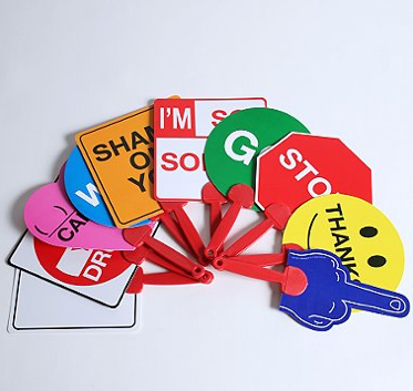
Don’t hold it in. Get it out! You’ve seen it: putting on make-up, txting, driving with one knee while snacking…it’s unacceptable! Everyone appreciates multi-tasking, but NOT while driving, please. Or, what about the jerk that steals your parking spot, or that tailgater creeping up even NOW. Sometimes, you just have to say what’s on your mind. But who’s gonna hear you in your car? 10 double-sided signs (9 pre-printed and one DIY), expressing sentiments ranging from “Shame on You” to “Are You Drunk?” Save your breath and say it with Shticks!
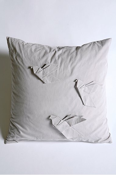
Origami Pigeon Pillow. Chirp. Chirp. Chirp.
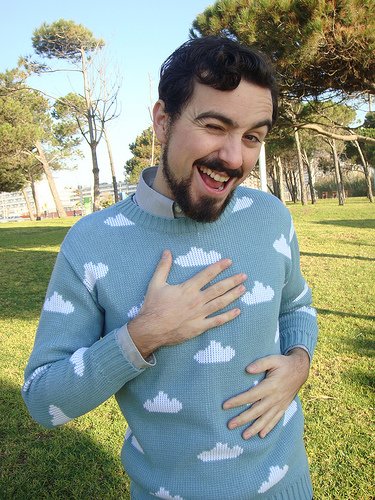
Totally made me smile on this sunny monday morning: Cloud Sweater by Sirena Con Jersey.